

mn-button
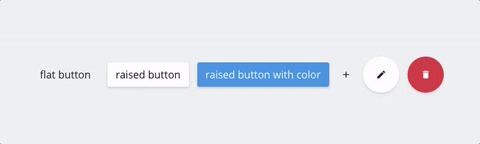
Buttons flat, raised, and action, with a minimalist design.
See the demo
Install
# to install this module
npm install --save mn-button
And bundle dependencies and main files in dist/ with your preferred tool.
Usage
And then, in your html, you can use the class .mn-button in buttons or anchor tags, i.e.
<button class="mn-button">Simple button</button>

<a href="#" class="mn-button">Other Simple button</a>
You can use the class .mn-button with others class, .raised, and .action.
- .raised - to make a button with 3d depth
- .action - to make rounded buttons, with an icon replacement the text
Raised button example
<button class="mn-button raised">Raised button</button>Action button examples
<button class="mn-button action"><<!-- icon here --></button>Action and raised button example
<button class="mn-button action raised"><<!-- icon here --></button>Note
Sometimes you use tag <button> inside a form without apply an attribute type. By default, browsers set the type for buttons inside a form as submit.
This compinent override that tags buttons inside a form, without an attribute type, will be setted to button instead submit.
