ngQuickDate
ngQuickDate is an Angular.js Date/Time picker directive. It stresses speed of data entry and simplicity while being highly configurable and easy to re-style.
Download
Only compatible with Angular 1.2.x. For a version compatible with Angular 1.0.x, checkout the angular-1.0 branch.
You can also install the package using Bower.
bower install ngQuickDateOr add it to your bower.json file:
dependencies: {
  "ngQuickDate": "~1.3.0"
}
No dependencies (besides Angular) are required, but its date parsing capabilities can be improved by 3rd party libraries. See Smarter Date/Time Parsing for more info. And it's styling can be improved by using a font icon library like Font Awesome. See the Styling and Configuration sections.
Demo
You can find some basic examples here
The Basics
To use the library, include the JS file, main CSS file, and (optionally, but recommended) the theme CSS file. Then include the module in your app:
app = angular.module("myApp", ["ngQuickDate"])The directive itself is simply called datepicker. The only required attribute is ngModel, which should be a date object.
<quick-datepicker ng-model='myDate'></quick-datepicker>- Note: This should just be
<datepicker>before version 1.3
Inline Options
There are a number of options that be configured inline with attributes. Here are a few:
| Option | Default | Description |
|---|---|---|
| date-format | "M/d/yyyy" | Date Format used in the date input box. |
| time-format | "h:mm a" | Time Format used in the time input box. |
| label-format | null | Date/Time format used on button. If null, will use combination of date and time formats. |
| placeholder | 'Click to Set Date' | Text that is shown on button when the model variable is null. |
| required | false | Makes the field required. Will set $invalid on the control and the form otherwise |
| hover-text | null | Hover text for button. |
| icon-class | null | If set, <i class='some-class'></i> will be prepended inside the button |
| disable-timepicker | false | If true, the timepicker will be disabled and the default label format will be just the date |
| disable-clear-button | false | If true, the clear button will be removed |
| on-change | null | Set to a function that will be called when the date is changed |
| default-time | null | Time that will be set when you click on a date on the calendar. Must be in 24-hour format. |
| init-value | null | Set the initial value of the date inline as a string. Will be immediately parsed and set as the value of your model. |
| date-filter | null | Set to a function to enable/disable dates. Useful for disabling weekends, etc. See more below |
Example:
<quick-datepicker ng-model='myDate' date-format='EEEE, MMMM d, yyyy' placeholder='Pick a Date' disable-timepicker='true'></quick-datepicker>Configuration Options
If you want to use a different default for any of the inline options, you can do so by configuring the datepicker during your app's configuration phase. There are also several options that may only be configured in this way.
app.config(function(ngQuickDateDefaultsProvider) {
  ngQuickDateDefaultsProvider.set('option', 'value');
  // Or with a hash
  ngQuickDateDefaultsProvider.set({option: 'value', option2: 'value2'});
})| Option | Default | Description |
|---|---|---|
| all inline options | see above table | Note that they must be in camelCase form. |
| buttonIconHtml | null | If you want to set a default button icon, set it to something like <i class='icon-calendar'></i>
|
| closeButtonHtml | 'X' | By default, the close button is just an X character. You may set it to an icon similar to buttonIconHtml
|
| nextLinkHtml | 'Next' | By default, the next month link is just text. You may set it to an icon or image. |
| prevLinkHtml | 'Prev' | By default, the previous month link is just text. You may set it to an icon or image. |
| dayAbbreviations | (see below) | The day abbreviations used in the top row of the calendar. |
| parseDateFunction | (see below) | The function used to convert strings to date objects. |
Default Day Abbreviations: ["Su", "M", "Tu", "W", "Th", "F", "Sa"]
Default Parse Date Function:
function(str) {
  var seconds = Date.parse(str);
  return isNaN(seconds) ? null : new Date(seconds);
}
Smarter Date/Time Parsing
By default, dates and times entered into the 2 input boxes are parsed using javascript's built-in Date.parse() function. This function does not support many formats and can be inconsistent across platforms. I recommend using either the Sugar.js or Date.js library instead. Of the 2, I recommend definitely Sugar.
If you'd like to use Sugar, you can configure it to work like so:
app.config(function(ngQuickDateDefaultsProvider) {
  ngQuickDateDefaultsProvider.set('parseDateFunction', function(str) {
    d = Date.create(str);
    return d.isValid() ? d : null;
  });
})
And with Date.js:
parseDateFunction: function(str) {
  return Date.parse(str);
}
Of course, you can override this parse function with any code you'd like, so you're also free to swap in another library or write your own parser.
Date Formatting
Note that when displaying dates in a well-formatted manner, Angular's Date filter is used. So if you want to customize these formats, please reference that link to see the formatting syntax. Sugar.js and Date.js have their own formatting syntax that are different from Angular's.
Date Filter Function
If you'd like to prevent the user from choosing certain dates, such as weekends or dates that have already been 'reserved', you can do so with the date-filter attribute. For example, if you want to disable weekends, you can do it like so:
<quick-datepicker ng-model='myDate' date-filter='onlyWeekdays'></quick-datepicker>$scope.onlyWeekdays = function(d) {
dayIndex = d.getDay();
return ((dayIndex != 0) && (dayIndex != 6));
}You can also set a default date filter function in the configuration options
Styling
There is a very light set of styles that allow the datepicker to function, but isn't particularly pretty. From there you can either use the default theme that's included or you can easily write your own theme.
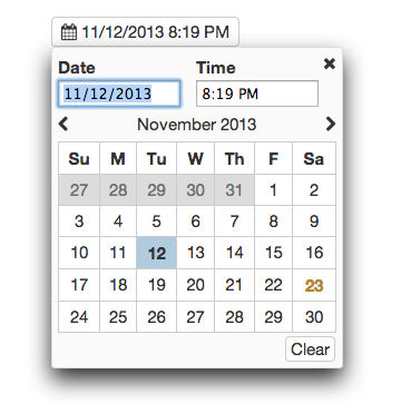
You can improve it's appearance quite a bit by using a Font Icon library like Font Awesome. To make look like the screenshot above, you'd need Font Awesome 4.0 and the following configuration:
app.config(function(ngQuickDateDefaultsProvider) {
  // Configure with icons from font-awesome
  return ngQuickDateDefaultsProvider.set({
    closeButtonHtml: "<i class='fa fa-times'></i>",
    buttonIconHtml: "<i class='fa fa-calendar'></i>",
    nextLinkHtml: "<i class='fa fa-chevron-right'></i>",
    prevLinkHtml: "<i class='fa fa-chevron-left'></i>"
  });
});
Browser Support
So far, it has only been tested in Chrome.
Contributing
Contributions are welcome. Whenever possible, please include test coverage with your contribution.
- Fork it
- Create your feature branch (
git checkout -b my-new-feature) - Commit your changes (
git commit -am 'Add some feature') - Push to the branch (
git push origin my-new-feature) - Create new Pull Request
To get the project running, you'll need NPM and Bower. Run npm install and bower install to install all dependencies. Then run grunt in the project directory to watch and compile changes. And you can run karma start to watch for changes and auto-execute unit tests.
Potential Features down the road
- Optimize for Mobile (It works fine now, but it could be slightly improved)


