DEPRECATED: the package is no longer supported. Go add yogiben:admin instead https://github.com/yogiben/meteor-admin
Meteor Admin
WARNING: the current version package is not optimised to use with autoform 5.0.0 and higher. 4.2.2 is recommended. Unfortunately I do not have enough time to update the package.
$ meteor add buduguru:admin
This package was originally a fork of yogiben:admin but was moved to its own detached repo.
Differences yogiben:admin to are:
- coffee -> vanilla js (TODO: convert readme snippets too) (this is one of main reason why it is not a fork anymore)
- AdminLTE template is updated from 1.2 to 2.0.5 (TODO: update screenshots in README)
- TODO: Integrate with
tap:i18n
Screenshots below are outdated, view the AdminLTE template demo
A complete admin dashboard solution for meteor built off the iron-router, roles and autoform packages and frontend from the open source admin dashboard template, Admin LTE.
Feedback Welcome. Please create an issue.

Getting started
0. Prerequisites
This package is designed to work with certain types of projects. Your project should be using and have configured
- Iron Router -
meteor add iron:router - Collection Helpers -
meteor add dburles:collection-helpers - An accounts system - e.g.
meteor add accounts-base accounts-password - Bootstrap 3 - e.g.
meteor add twbs:bootstrap - Fontawesome - e.g.
meteor add fortawesome:fontawesome
1. Install
CD to your app directory and run meteor add buduguru:admin then go to /admin for the setup wizzard.
2. Config
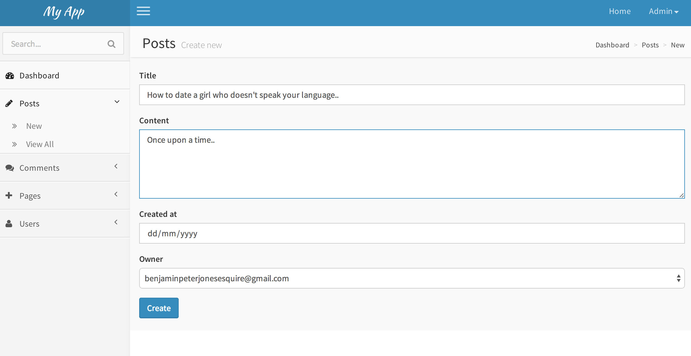
The simplest possible config with one, 'Posts', collection.
Both
AdminConfig = {
  collections: {
    Posts: {}
  }
};
This config will make the first user admin.
You can also set the adminEmails property which will will override this.
AdminConfig = {
  name: 'My App',
  adminEmails: ['name@example.com'],
  collections: {
    Posts: {}
  }
};
3. Define your data models
If you are unfamiliar with autoform or collection2 or collection-helpers you should check them out now.
You need to define and attach a schema to the collections that you want to edit via the admin dashboard. Check out the documentation.
@Schemas = {}

@Posts = new Meteor.Collection('posts');

Schemas.Posts = new SimpleSchema
    title:
        type: String
        max: 60
    content:
        type: String
        autoform:
            rows: 5
    createdAt:
        type: Date
        label: 'Date'
        autoValue: ->
            if this.isInsert
                return new Date()
    owner:
        type: String
        regEx: SimpleSchema.RegEx.Id
        autoValue: ->
            if this.isInsert
                return Meteor.userId()
        autoform:
            options: ->
                _.map Meteor.users.find().fetch(), (user)->
                    label: user.emails[0].address
                    value: user._id

Posts.attachSchema(Schemas.Posts)
4. Enjoy
Go to /admin. If you are not made an admin, re-read step 2.
Customization
The admin dashboard is heavily customisable. Most of the possibilities are represented in the config option below.
@AdminConfig =
    nonAdminRedirectRoute: 'entrySignIn',
    collections:
        Posts: {
            icon: 'pencil'
            tableColumns: [
              {label: 'Title', name: 'title'}
                {label: 'Published', name: 'published'}
                {label: 'User', name: 'owner', template: 'userEmail'}
            ]
            templates:
              new:
                name: 'postWYSIGEditor'
                data:
                  post: Session.get 'admin_doc' if Meteor.isClient
              edit:
                name: 'postWYSIGEditor'
                data:
                  post: Session.get 'admin_doc' if Meteor.isClient
        },
        Comments: {
            icon: 'comment'
            omitFields: ['owner']
            tableColumns: [
              {label: 'Content', name: 'content'}
              {label: 'Post', name: 'postTitle()'}
              {label: 'User', name: 'owner', template: 'userEmail'}
            ]
            showWidget: false
        }
    autoForm:
        omitFields: ['createdAt', 'updatedAt']
    dashboard:
        homeUrl: '/dashboard'
        widgets: [
          {
            template: 'adminCollectionWidget'
            data:
              collection: 'Posts'
              class: 'col-lg-3 col-xs-6'
          }
          {
            template: 'adminUserWidget'
            data:
              class: 'col-lg-3 col-xs-6'
          }
        ]

Comments.helpers({
  postTitle: function () {
    if (this.post) {
      return Posts.findOne(this.post).title;
    }
  }
})
Collections
AdminConfig.collections tells the dashboard which collections to manage based on the global variable name.
@AdminConfig =
  collections:
    Posts: {},
    Comments: {}
  }
It is possible to configure the way the collection is managed.
Comments: {
            icon: 'comment'
            omitFields: ['updatedAt']
            tableColumns: [
              {label: 'Content', name: 'content'}
              {label: 'Post', name: 'postTitle()'}
              {label: 'User', name: 'owner', template: 'userEmail'}
            ]
            showWidget: false
            color: 'red'
        }
icon is the icon code from Font Awesome.
tableColumns an array of objects that describe the columns that will appear in the admin dashboard.
-
{label: 'Content', name:'content'}will display thecontentproperty of the mongo doc. -
{label: 'Post', name: 'postTitle()'}will usepostTitlecollection helper (seedburles:collection-helperspackage). -
{label: 'Joined', name: 'createdAt', template: 'prettyDate'}will displaycreatedAtfield usingprettyDatetemplate. Following object will be set as the context:
{
  value: // current cell value
  doc:   // current document
}
fields is an array of field names - set when the form should only show these fields. From AutoForm.
omitFields hides fields that we don't want appearing in the add / edit screens like 'updatedAt' for example. From AutoForm.
showWidget when set to false hides the corresponding widget from the dashboard.
color styles the widget. See the LTE Admin documentation.
Custom Templates
The default admin templates are autoForm instances based on the schemas assigned to the collections. If they don't do the job, you specify a custom template to use for each of the new,edit and view screens for each collection.
@AdminConfig =
    ...
    collections:
        Posts: {
            templates:
              new:
                name: 'postWYSIGEditor'
              edit:
                name: 'postWYSIGEditor'
                data:
                  post: Session.get 'admin_doc' if Meteor.isClient
The /admin/Posts/new and /admin/Posts/edit will not use the postWYSIGEditor template that you've defined somewhere in your code. The edit view will be rendered with a data context (here the document being edited).
Custom templates are most used when you need to use an {{#autoForm}} instead of the default {{> quickForm}}.
Autoform
@AdminConfig =
    ...
    autoForm:
        omitFields: ['createdAt', 'updatedAt']
Here you can specify globally the fields that should never appear in your new and update views. This is typically meta information likes dates.
Important don't omit fields unless the schema specifies either an autoValue or optional is set to true. See autoForm.
Dashboard
Here you can customise the look and feel of the dashboard.
@AdminConfig =
    ...
    dashboard:
        homeUrl: '/dashboard'
        skin: 'black'
        widgets: [
          {
            template: 'adminCollectionWidget'
            data:
              collection: 'Posts'
              class: 'col-lg-3 col-xs-6'
          }
          {
            template: 'adminUserWidget'
            data:
              class: 'col-lg-3 col-xs-6'
          }
        ]
homeUrl is the href property of the 'Home' button. Defaults to /.
skin defaults to 'blue' but there is also a black skin avaiable.
widgets is an array of objects specifying template names and data contexts. Make sure to specify the class in the data context. If set, the widgets property will override the collection widgets which appear by default.
Extending Dashboard
There are few things you can do to integrate your package with meteor-admin. Remember to wrap it in Meteor.startup on client.
Create custom path to admin dashboard
AdminDashboard.path '/:collection/delete'
Note: you can omit the leading slash (it will be inserted automatically).
Add sidebar item with single link
AdminDashboard.addSidebarItem 'New User', AdminDashboard.path('/Users/new'), icon: 'plus'
Add sidebar item with multiple links
AdminDashboard.addSidebarItem 'Analytics',
    icon: 'line-chart'
    urls: [
      { title: 'Statistics', url: AdminDashboard.path('/analytics/statistics') },
      { title: 'Settings', url: AdminDashboard.path('/analytics/settings') }
    ]
Add link to collection item
This will iterate through all collection items in sidebar and call your function. If you return an object with the title and url properties the link will be added. Otherwise it will be ignored.
AdminDashboard.addCollectionItem (collection, path) ->
    if collection == 'Users'
        title: 'Delete'
        url: path + '/delete'
Add custom route
If you want to add your own sub route of admin dashboard (using iron:router package) there are three key things to follow
1) Use AdminDashboard.path to get the path
2) Use AdminController
3) Set admin_title (and optionally admin_subtitle) session variable
e.g.
Router.route 'analytics',
    path: AdminDashboard.path('analytics')
    controller: 'AdminController'
    onAfterAction: ->
        Session.set 'admin_title', 'Analytics'

