
AngularJS TableView (example)
A data grid for AngularJS.
- Native AngularJS implementation, no jQuery
- Fluid configuration allows you to use only the features you need (sortable, filterable, selectable, editable, ...)
- Complete customisation by using AngularJS templates (aka. ng-template) and directive configuration.
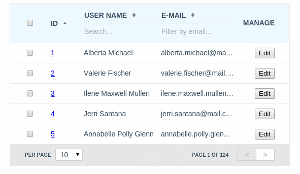
Table of contents
Quick Start
Dependencies
- No dependencies
Downloading TableView using npm
AngularJS TableView is registered as a package on npm. You can install the latest version of TableView with the command:
npm install angular.tableview
This will install TableView in the node_modules directory. Within node_modules/angular.tableview/dist/ you will find a compressed release files.
Downloading TableView using Bower
AngularJS TableView is also registered as a package with Bower. You can install the latest version of TableView with the command:
bower install angular.tableview
This will install TableView to Bower's install directory, the default being bower_components. Within bower_components/angular.tableview/dist/ you will find a compressed release files.
Make sure to embed it in your HTML document:
<script src="path/to/angular.min.js"></script>
<script src="path/to/dist/angular.tableview.min.js"></script>
<!-- Required CSS --> <link href="path/to/dist/angular.tableview.min.css" rel="stylesheet" />
<!-- Theme CSS --> <link href="path/to/dist/angular.tableview.material.min.css" rel="stylesheet" />
Turn on tableview module in the your awesome application:
var application = angular.module("app", ["tableview"]);
Pass grid configuration via tableview attribute:
<div tableview="configuration"></div>In the case if you need to completely change default template of tableview directive, you can define path to your template via tableview-template-url attribute:
<div tableview="configuration" tableview-theme="'material'" tableview-template-url="path/to/your/template.html"></div>Directive attributes:
| Attribute | Type | Details |
|---|---|---|
| tableview |
required Object |
TableView instance configuration object |
| tableview-theme |
optional String |
The name of TableView theme to be used here |
| tableview-template-url |
optional String |
Path to your custom template of the TableView |
All that you needed is to define in your controller configuration and data provider function that receives current request object and callback function as arguments and should provide response object for the current request to the instance of TableView via calling of callback function by passing response object as argument.
[index.html]
<html ng-app="app">
  <head>
    <script type="text/javascript" src="angular.min.js"></script>
    <script type="text/javascript" src="angular.tableview.min.js"></script>
    <link rel="stylesheet" type="text/css" href="angular.tableview.min.css" />
    <script type="text/javascript" src="script.js"></script>
  </head>
  <body ng-controller="Ctrl">
    <h1>AngularJS TableView Example</h1>
    <div tableview="configuration"></div>
  </body>
</html>
[script.js]
angular
.module("app", ["tableview"]);
.controller("Ctrl", function ($scope) {

  $scope.configuration = {
    columns: [
      {field: "id"},
      {field: "name", title:"Name"},
      {field: "email", title:"Email"}
    ],
    provider: provider
  };

  function provider (request, callback) {
    asyncRequestToServer (request, function (response) {
      callback(response);
    });
  }

});
Reference API
All properties of the REQUEST object are [optional]
| Property | Type | Details |
|---|---|---|
| limit | Integer | How many entries should to be requested from the server |
| page | Integer | The page number, that should to be requested from the server |
| like | Object | An object that describes filtering by fields, where name of property is field name and value of property is search string |
| order | Array | An array of objects that describes fields with sorting order by which should be sorted result entries |
| order[x] | Object | An object that describes sorting order by the field |
| order[x].field | String | The property that defines field name by which should to be sorted result entries |
| order[x].sorting | String ASC|DESC
|
The property that defines sorting order for the field name by which should to be sorted result entries (ASC or DESC) |
var request = {
  limit: 10,
  page: 1,
  order: [
    {field:"id", sorting:"ASC"},
    {field:"name", sorting:"DESC"},
    {field:"email", sorting:"DESC"},
    // ...
  ],
  like: {
    "name": "John",
    "email": "smith@",
    // ...
  }
};| Property | Type | Details |
|---|---|---|
| limit | Integer | Limit that was returned from the server to show results in the TableView. Used for correction of the mapping |
| page | Integer | The page number, that was returned from the server. Used for correction of the mapping when it needed (when filters has been applied for example) |
| amount | Integer | Summary amount of the records that available by the sent request. Used for calculation and building of the pager section |
| rows | Array | An array of objects (entries) to display considering to request |
var response = {
  limit: 10,
  page: 1,
  amount: 12345,
  rows: [
    { "id":123 , "name":"John", "email":"smith@gmail.com" },
 // {...}
  ]
};
CONFIGURATION object structure
All properties of the CONFIGURATION object except columns and provider are [optional]
| Property | Type | Details |
|---|---|---|
| provider |
required Function |
Accepted arguments: (request, callback). The function that receives current request object and callback function as arguments and should provide response object for the current request to the instance of TableView via calling of callback function by passing response object as argument |
| columns |
required Array |
Array of column Objects with definitions of visible columns |
| column.field |
optional String |
The name of field in DB that can be used for the sorting and filtering logic. In additional it creates CSS class "column-{{field_name}}" that can be used for UI customisation |
| column.name |
optional String |
An unique name of the field that can be used for UI customisation from CSS via using of CSS class "column-{{name}}" when field is not defined |
| column.title |
optional String |
The column title |
| column.placeholder |
optional String |
Placeholder for the filter input. Default: "Search..." |
| column.sortable |
optional Boolean |
Enables sorting logic for the column. Requires field property. In additional it creates CSS classes "sortable" and "sortable-{{asc |
| column.filterable |
optional Boolean |
Enables filtering logic for the column. Requires "field" property. In additional it creates CSS class "filterable" that can be used for UI customisation |
| column.editable |
optional Object,Boolean |
Enables editable logic for the column. Requires "field" property. In additional it creates CSS class "editable" that can be used for UI customisation |
| column.editable.type |
optional String |
Available values: text, textarea. Default: text. The type of HTML tag (input or textarea) that will be used in edition mode |
| column.editable.validate |
optional Function |
Accepted arguments: (column, row, field, value). Should return an object: { status: Boolean, message: String }. The function that will be used for validation of the field before changing of the model in edition mode. |
| column.editable.change |
optional Function |
Accepted arguments: (column, row, field, value). The function that can be used for saving of changed fields on the server. |
| column.template |
optional Object |
The list of templates that should to be replaced for the current column cell by using custom templates (see AngularJS ng-template). The name of property is reserved word, that used to define replacement area in TableView template file. |
| column.template["head.cell"] |
optional String |
An identifier of template to be used as cell of table header |
| column.template["body.cell"] |
optional String |
An identifier of template to be used as cell of table body |
| column.template["body.cell.edit"] |
optional String |
An identifier of template to be used as cell of table body in edition (see: editable) mode |
| column.template["foot.cell"] |
optional String |
An identifier of template to be used as cell of table footer. Requires of template["foot"] generic template implementation. |
| template |
optional Object |
The list of templates that should to be replaced by using custom templates (see AngularJS ng-template). The name of property is reserved word, that used to define replacement area in TableView template file |
| template["head.cell"] |
optional String |
An identifier of the generic template to be used as cell of table header |
| template["head.cell.select"] |
optional String |
An identifier of the template that contains implementation of toggle selection logic for all rows on the page when selectable logic used |
| template["body.cell"] |
optional String |
An identifier of the generic template to be used as cell of table body |
| template["body.cell.edit"] |
optional String |
An identifier of the generic template to be used as cell of table body in edition (see: editable) mode |
| template["body.cell.select"] |
optional String |
An identifier of the template that contains implementation of toggle selection logic for the current row when selectable logic used |
| template["foot"] |
optional String |
An identifier of the generic template to be used as table header. Not implemented by default |
| template["pager"] |
optional String |
An identifier of the generic template to be used as pager section of the table |
| template["pager.limit"] |
optional String |
An identifier of the generic template to be used as pager limit section of the pager |
| template["pager.controls"] |
optional String |
An identifier of the generic template to be used as pager limit controls section of the pager |
| template["pager.selection"] |
optional String |
An identifier of the generic template to be used as selection controls section when selectableBy mode enabled |
| request |
optional Object |
Initial custom request object that can be used to provide stored request from previous user session |
| multisorting |
optional Boolean |
Turns on multicolumns sorting logic |
| selectableBy |
optional String |
Turns on rows selection logic by primary key field |
| scrollable |
optional Object |
Turns on scrollable logic for the table area and allows to provide custom styles for scrollable area such as {maxHeight: "400px"}
|
| limits |
optional Array |
Default: [10, 25, 50, 100]. Custom list of limit numbers |
| theme |
optional String |
The name of the custom TableView theme to be used for the current instance (The material theme as example is available in dist/angular.tableview.material.min.css) |
$scope.configuration = {
  template: {
    "head.cell": "your/custom/angular/template.name.html",
    "body.cell": "embed.to.the.view.angular.template.id",
  },
  columns: [
    {
      field: "field_name",
      name: "name",
      title: "Id",
      placeholder: "Filter placeholder string",
      sortable:true,
      filterable:false,
      editable: {
        type: "textarea",
        validate: fieldValidator,
        change: saveValidChangedField
      },
      template: {
        "head.cell": "your/custom/angular/template.name.html",
        "body.cell": "embed.to.the.view.angular.template.id",
      },
    },
    {
      field: "simple_editable_field",
      title: "Title",
      editable: true
    }
    // ...
  ],
  provider: dataProvider,
  request: {/* see `REQUEST` structure */},
  multisorting: false,
  limits: [10, 50, 100],
  scrollable: {
    maxHeight: "400px"
  },
  selectableBy: "id",
  theme: "material"
};

function dataProvider (request, callback) {
  callback(response);
}

function fieldValidator (column, row, field, value) {
  var status = typeof value == "string" && value.trim().length;
  return {
    message: status ? "" : "The field '" + column.title + "' can not be empty",
    status: status
  };
}

function saveValidChangedField (column, row, field, value) {
  console.log (
    arguments.callee.name + "(column, row, field, value) =>",
    field,
    "=",
    value,
    column,
    row
  );
}
$tableViewProvider configuration
To define global configuration for your application you can use $tableViewProvider.
For example:
var app = angular.module("app", ["tableview"]);

app.config(function($tableViewProvider){
  $tableViewProvider.theme = "material";
  $tableViewProvider.templateUrl = "path/to/your/complete/template.html";
  $tableViewProvider.template = {
    "head.cell": "your/custom/angular/template.name.html",
    // ...
  };
});
The list of configuration-dependency CSS classes that provided in the default template
| CSS Class | Area | Details |
|---|---|---|
column-name
|
[tableview]>.holder>table>thead|tbody>tr>th|td
|
To identify current column by the columns configuration. The name is a value of column.name or column.field object property |
| filterable | [tableview]>.holder>table>thead|tbody>tr>th|td
|
To identify that is the column is the filterable by the columns configuration |
| sortable | [tableview]>.holder>table>thead|tbody>tr>th|td
|
To identify that is the column is the sortable by the columns configuration |
sortable-asc|desc
|
[tableview]>.holder>table>thead|tbody>tr>th|td
|
To identify the sorting order of the column |
| selectable | [tableview]>.holder>table>thead|tbody>tr>th|td
|
For customization of the selection column |
| selected | [tableview]>.holder>table>thead|tbody>tr |
To identify that the row is selected |
| scrollable | [tableview] | To identify that the table is scrollable |
| editable | [tableview]>.holder>table>thead|tbody>tr>th|td
|
To identify that the column is editable by the columns configuration |
| edition | [tableview]>.holder>table>tbody>tr>th|td
|
To identify that the cell is editable and in edition mode |
| invalid | [tableview]>.holder>table>tbody>tr>th|td
|
To identify that the cell is editable and in edition mode and has been invalidated by the field validator |
