Easy Element
Creates cross-browser V1 spec web components (custom elements) from native HTML, CSS, and JavaScript classes.
Intended for ease of use, simplicity, and performance.
Install
$ npm install --save-dev easy-element

# Or to create a new web component project with Yeoman (recommended):
$ npm install -g yo generator-easy-element
$ yo easy-element
How it Works
- An HTML template determines the internal structure of your web component.
- Style your web component with CSS, using a preprocessor if you want.
- A JavaScript class defines how it behaves.
At a minimum, only one of the above is required to build a web component with Easy Element.
Usage
Simplest
Here's a web component that acts like a highlighter marker with just some CSS. It could be used in an HTML page like so.
<p>Some words are <high-light>more important</high-light> than others.</p>
All you need is a CSS file.
/* src/high-light.css */
:host {
  background-color: lightgreen;
}
Then build.
More Complex
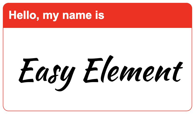
For an element with an internal structure, like our <name-tag> logo at the top, you can create an HTML file with a template and a style.
<!-- src/name-tag.html -->
<template>
  <header class="name-tag_header">Hello, my name is</header>
  <div class="name-tag_name-container">
    <slot></slot>
  </div>
</template>
<!--
  We recommend using BEM-like class names if you support old browsers.
-->
<style>
  :host {
    border: 1px solid red;
    display: inline-block;
    width: 400px;
  }
  .name-tag_header {
    background-color: red;
    color: white;
    font-size: 1.5em;
    padding: 0.5em;
  }
  .name-tag_name-container {
    background-color: white;
    font-size: 3em;
    padding: 1em 0.5em;
    text-align: center;
  }
</style>
Adding functionality
For components that do stuff, you'll need some JavaScript. Here's a sad button that changes its hue of blue when clicked.

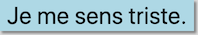
We'll split it between three files in our src folder, because we can.
<!-- src/blue-button.html -->
<button><slot>Je me sens triste.</slot></button>
/* src/blue-button.css */
:host button {
background-color: blue;
border: 0;
box-shadow: 2px 2px 2px gray;
color: white;
font-size: 1.5em;
}
/* You could write `blue-button.light` instead of `:host(.light)` if you prefer. */
:host(.light) button {
background-color: lightblue;
color: black;
}// src/blue-button.js
class BlueButton {
connectedCallback() {
// `querySelector` is aliased to work both with and without shadow DOM
this.querySelector('button').addEventListener('click', event => {
// `this` refers to the `<blue-button>` element
this.classList.toggle('light')
})
}
}What's the JavaScript API for your custom element? Native HTMLElement.
Browser Support
Tested with Chrome, IE 10, Edge, FireFox, and Safari.
When you build with Easy Element it creates two JavaScript files: one ending in .es5.js and another ending in .class.js for old and new browsers respectively. Which one you use depends on whether the browsers you care about support ES6 classes and shadow DOM.
New browsers
If you only support new browsers, congratulations! Just add your element's class-based script to your HTML.
<srcipt src="/dist/name-tag.class.js"></script>Or when using a module bundler like webpack you can instead do this in your JavaScript (assuming it's somewhere your bundler can find it).
import 'name-tag'Most browsers
For a wider range of browser support install @webcomponents/webcomponentsjs polyfills to use <name-tag>.
$ npm install --save '@webcomponents/webcomponentsjs'Then include these scripts in your HTML.
<script src="/node_modules/@webcomponents/webcomponentsjs/custom-elements-es5-adapter.js"></script>
<script src="/node_modules/@webcomponents/webcomponentsjs/webcomponents-loader.js"></script>
<srcipt src="/dist/name-tag.es5.js"></script>
Commands
For the following examples you'd use npx before easy-element to run it from the command line. But in your package.json's scripts, that's not necessary.
build
# Build from .html, .css, and .js files in src, and output to dist
$ easy-element build src

# Build from one source file, output to public
$ easy-element build my-element.html --output public

# Bundle all the elements in src and minify
$ easy-element build src --bundle --minify
watch
# Watch the src folder and re-build to dist when its contents change
$ easy-element watch src

# Watch the src folder and re-build to public when its contents change
$ easy-element watch src --output public

# Watch the src folder and build a bundle when its contents change
$ easy-element watch src --bundle
demo
Make demo pages for your custom elements. Creates one for old browsers, and one for new. If you specify the output folder to be somewhere other than where your custom elements' built files live, you'll probably have to edit the script paths in your demo page.
# Create dist/index.class.html and dist/index.es5.html to show off <my-element>
$ easy-element demo src/my-element.html

# Create demo pages in a folder named public
$ easy-element demo src/my-element.html --output public

# Show off all the elements you're building from src as a bundle
$ easy-element demo src --bundle
Options
--help
Show the help text and quit.
--output or -o
Change the folder that your generated .es5.js and .class.js files are written to. Files are output to a folder named dist by default.
# Output to a folder named "exports"
$ easy-element build src --output exports
--bundle or -b
If you're building multiple web components, bundle them all together. Normally when you build a directory with a command such as easy-element build src it will output a pair of files (.class.js and .es5.js) for each element it builds. However with the --bundle flag, it will instead produce only one pair of files for the whole group: bundle.class.js and bundle.es5.js. This is especially useful if you're curating a library of custom elements instead of making individual repositories for each.
--minify or -m
Squish your output code down to one line.
--preprocessor or -p
Specify which CSS preprocessor to use. Valid options are:
scsssasspostcss
# Build from the src folder with SASS syntax
$ easy-element build src --preprocessor sassCSS Preprocessing
Easy Element supports postcss and Sass.
To use postcss you must also place a postcss.config.js file at the base of your project.
If you're building an HTML file you can specify the preprocessor in your style tag.
<style preprocessor="scss">
/* ... */
</style>
If your styles live in a file ending in .scss or .sass then easy-element will figure out which preprocesser syntax to use.
Example Elements
Take a look at the repository's test/src folder to see the different elements we built to test Easy Element.
<pilatch-card> is an actual thing built with Easy Element, and the reason this tool exists.
<star-rating> is a simple user-feedback thingy.
Transformations
ES6
New stuff like const, let, class, arrow functions, template literals, etc. are transpiled down in the ES5 output.
:host
Shadow DOM has the concept of the host element. We don't support that in ES5-land because polyfills are slow. So when you have CSS selectors that use :host ...
/* my-element.css */
:host { ... }
:host(.enabled) { ... }
...they are converted to the following for the .es5.js output file.
my-element { ... }
my-element.enabled { ... }
The reverse is true for the .class.js output file where Shadow DOM is a real thing. CSS selectors containing your custom element's name are transformed to use :host and :host(...) as necessary.
Boilerplate
The JavaScript class you define will automatically extend HTMLElement so you don't have to.
We'll also do customElements.define(...) at the appropriate time.
If you don't have a class for your element, no worries. Easy Element makes one for you.
Querying
If you support older browsers, we recommend you only query with this.querySelector and this.querySelectorAll. See the section on caveats for an explanation why.
this.querySelector and this.querySelectorAll are aliased to this.shadowRoot.querySelector and this.shadowRoot.querySelectorAll respectively in the class-based output, so you can expect the same results in both old and new browsers.
Events
You can use this.addEventListener and expect feature parity in old and new browsers. It'll be aliased to this.shadowRoot.addEventListener in the class-based output.
<slot>
If you don't give your element an internal HTML structure, then in the class-based output its shadowRoot will contain a <slot>. This is to retain feature parity with older browsers and allow for fast creation of presentational elements.
Partials
Easy Element understands that partials' file-names start with underscores, and will not attempt to transform them into web components. So you can @import './_colors.scss'; and whatnot without surprises.
Distinctions
What makes Easy Element different from other options?
Well, if web developers want to handle events within a custom element, Easy ELement lets them do so using native JavaScript like addEventListener. So they probably already know how to do this. Compare this to a library like stencil where the developer is expected to import event-related decorators and learn to use a proprietary interface.
Easy Element is intended for lightweight custom elements that are short-lived because a virtual-DOM renderer (such as Elm, Mithril, React, Vue etc.) is frequently creating and destroying them. We do not intend to directly support data-binding like Angular and Polymer do. Though you can use web components created by Easy Element with any of these technologies, (we have done testing on this), our first priority is virtual DOM performance.
If you want something more complex, there are more feature-complete libraries out there.
Or you can use Easy Element as a starting point to build your custom element, then use the generated JavaScript in the .class.js file with other tools, as it is V1 spec compliant.
Caveats
Style Encapsulation
For performance reasons, no attempt is made to polyfill shadow DOM for old browsers. The ES5 output will add your <template>'s contents to the element's inner HTML, and your styles will be appended to document.head. So encapsulate your styles by starting your selectors with your element's tag-name or :host or use something like BEM.
The class-based output will use shadow DOM.
Slots
Slots behave differently between the generated ES5 code and the class-based output with Shadow DOM. For instance, assignedNodes won't return what you want in ES5-land. If you want full slot support, look elsewhere.
Shadow Root
Do not rely on this.shadowRoot in your JavaScript class if you support older browsers, as that will not work in the ES5 output. To manipulate the innards of your web component and retain feature parity, limit yourself to use of this.querySelector and this.querySelectorAll to get references to elements. Anything else (such as this.innerHTML or this.lastElementChild or this.childNodes or this.shadowRoot etc.) would not return the same answers between the ES5 and class-based implementations.
Shadowy Styles
Easy Element has no way of knowing whether your CSS selector was intended to style the element itself or one of its child elements. This can be an issue when stlying shadow DOM because all the styles get dumped into the shadow root. That means if you have an element that renders like this:
<vehicle-picker class="electric">
  <an-option>car</an-option>
  <an-option>motorcycle</an-option>
</vehicle-picker>
Then your styles that include a rule of .electric { ... } would not style the host element in the class-based output, but a rule like :host(.electric) { ... } would have the desired effect. In the ES5 output, your custom element would probably be rendered as you intended either way.
Extending
Extending classes other than HTMLElement is not yet supported. It may be in the future.

![dependabot[bot]](https://avatars.githubusercontent.com/u/49699333?size=120)