IntegralUI Web, v23.4
IntegralUI Web includes 50+ native Web Components and services that can help you build modern web applications in JavaScript, Angular, AngularJS, React and Vue.
Here is a brief overview of what is included:
Components
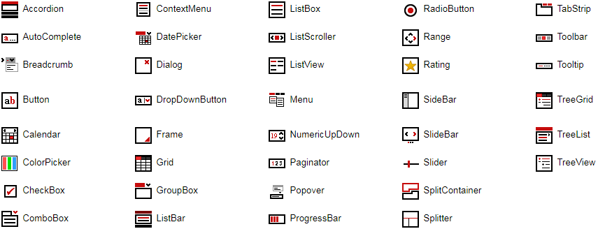
Accordion - Displays a list of expandable groups in vertical layout
AutoComplete - Represents a text box with a dropdown list where you can choose among suggested options
Breadcrumb - Used for navigation, where each item can have a link that is automatically separated
Button - Represents a button
ButtonGroup - Manages actions of multiple buttons arranged in group
Calendar - Enables the user to select a date using a visual monthly calendar display
Card - A flip card with two sides
CheckBox - Represents a check box
ContextMenu - Represents a shortcut menu
DatePicker - Allows the user to select a date by using a drop-down calendar
Dialog - Displays a modal window
DockPanel - Create dynamic layouts with docking panels
DropDown - Represents a dropdown window
DropDownButton - Represents a button with option to show a dropdown list
DropDownFilter - A dropdown component with different filter oprerations
Grid - Displays tabular data sets
GroupBox - An expandable container with header and content
Label - A fully customizable label with different alignments relative to attached element
ListBar - Displays a list of expandable groups with items
ListBox - Displays a collection of items with content in custom layouts
ListScroller - Displays a scrollable item list in horizontal or vertical layout
ListView - Displays a collection of items using several different views
Loading - Shows animations during loading progression
Menu - Allows you to create static or dynamic menus
NumericUpDown - Displays a numeric value and allows changes within a range of defined minimum and maximum values
Paginator - Allows you to divide the content in multiple views in single page
Panel - Generic container with option for content alignment
Popover - Displays custom HTML content over specified element
PivotGrid - Summarizes the data of a more extensive table
ProgressBar - Visualize the progression of an operation
RadioButton - Represents a radio button
Rating - Visualizes ratings
Select - Allows you to select an item from a dropdown list
SideBar - Allows you to add a custom content panel that appears by sliding from page side over main content
SidePanel - Allows you to add custom content panel that appears by sliding from page side
SlideBar - Animates slides composed of custom content
Slider - Allows changes to a numeric value within a range of defined minimum and maximum values
SplitContainer - Consists of two resizable panels separated by a splitter with tabs and command buttons
SplitImage - Allows you to visually compare differences between two images
Splitter - Allows you to resize two block elements during run-time
TabStrip - Consists of multiple scrollable panels that share the same space
Toaster - Allows you to display notification messages (Toasts) with different alert levels
Tooltip - Adds a tooltip to an element
TreeGrid - Displays hierarchical data structures in multiple columns
TreeList - Allows you to navigate through tree hierarchy showing only one list at a time
TreeView - Displays hierarchical data structures
Window - Movable and sizable windows
Services
Common - Includes a set of common functions usable in most applications
Data - Includes a set of data related functions for different operations like: add/remove, search, etc.
DragDrop - Provides a way to use drag drop operations between custom components or elements.
Filter - Includes a set of related functions for filter operations
All components are inheritable, you can further extend functionalities of specific component by simple create a subclass of component main class.
Dependencies
IntegralUI Web is built on top of LitElement. All necessary files from that library are already included in the /external subfolder of this repository.
DEMO
Online QuickStart App - An online demo of each component included
Installation
Install the repository by running
npm install https://github.com/lidorsystems/integralui-web.gitor directly from NPM
npm i integralui-webNote A detailed information is available here: How to Use IntegralUI Web Components. Explains how to setup and use components for each framework: Angular, React or Vanilla JavaScript.
In general, you need to open your application and add a reference to a component you want to use. For example, if you are using the IntegralUI TreeView component:
Angular
import 'integralui-web/components/integralui.treeview';React
import IntegralUITreeViewComponent from 'integralui-web/wrappers/react.integralui.treeview.js';Note Currently ReactJS doesn't have full support for Web Components. Mainly because of the way data is passed to the component via attributes and their own synthetic event system. For this reason, you can use available wrappers located under /wrappers directory, which are ReactJS components that provide all public API from an IntegralUI component.
Vanilla JavaScript
<script type="module" src="integralui-web/components/integralui.treeview.js"></script>Icons
Because of the web component specification that defines URLs to be always relative to the main document, the path that leads to the icons used by the IntegralUI Web components needs to be set. In addition you may also need to copy/paste the /icons folder in your application folder. Depending on the framework of your choosing this may differ.
Angular
Follow these steps:
- Copy/Paste the content of the integralui-web/icons folder under /assets/integralui-web/icons subfolder in your Angular application.
- Set the resourcePath property of IntegralUI Web components to point to the location set in your /assets folder. In this case, for TreeView for example:
<iui-treeview [resourcePath]="'assets/integralui-web/icons'"></iui-treeview>React
Follow these steps:
- Copy/Paste the content of the integralui-web/icons folder under /public/integralui-web/icons subfolder in your React application.
- Set the resourcePath property of IntegralUI Web components to point to the location set in your /public folder. In this case, for TreeView for example:
<IntegralUITreeViewComponent resourcePath="integralui-web/icons"></IntegralUITreeViewComponent>Vanilla JavaScript
Set the resourcePath property of IntegralUI Web components to point to /integralui-web/icons folder. In this case, for TreeView for example:
<iui-treeview resource-path="../../integralui-web/icons"></iui-treeview>QuickStart App
There is a demo application with source code that contains samples for each component included in the IntegralUI Web library. It can help you to get started quickly with learning about the components and write tests immediatelly.
From IntegralUI Web - QuickStart you can download a demo app for Angular, AngularJS, React and Vanilla JavaScript. A detailed information about each of these quick-start demos is available in ReadMe file, located in the root folder of the demo app.
License Information
You may use this version for the limited purposes of demonstrations, trials or design-time evaluations.
This project has been released under the IntegralUI Web License, and may not be used except in compliance with the License. A copy of the License should have been installed in the product's root installation directory or it can be found here: License Agreement.
This SOFTWARE is provided "AS IS", WITHOUT WARRANTY OF ANY KIND, either express or implied. See the License for the specific language governing rights and limitations under the License.
