Lime SCSS Framework
Lime scss framework is a lightweight scss framework based on flexbox, without JavaScript dependency.
How to use
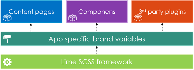
$ npm install lime-scssThis scss framework has got fully modular built, so you can use it smaller and bigger web projects easily. All core feature is overridable, so you can easily implement any kind brand into it. You can find the most important elements under \core library and you can customize your whole final .css from here. Because of the modular and separated build you can integrate any kind of 3rd party plugin or component what has got variables and connet with your brand guideline.
├── node_modules
├── dist (or build)
│   ├── css
│   │   ├── **/*.css
│   ├── img
│   │   ├── **/*.jpg/png/svg
│   ├── js
│   │   ├── **/*.js
│   ├── index.html
├── app
│   ├── scss
│   │   ├── **/*.scss
│   │   ├── bundle.scss
│   ├── img
│   │   ├── **/*.jpg/png/svg
│   ├── ts
│   │   ├── **/*.ts
│   └── components/templates/page
│   │   ├── component-specific/*.scss
│   │   ├── component-specific/*.ts
│   │   ├── component-specific/*.html
│   ├── index.html

├── package.json
└── .gitignore
Your bundle.scss
Here is a sample how the project bundle should look like.
├── bundle.scss
│   ├── 1.) overrides
│   ├── 2.) include lime-scss
│   ├── 3.) include your icons or 3rd party components with overrides
│   ├── 4.) other layout specific styles - header, footer, etc.
As you see above you should add your component or page specifis scss via Webpack to create the final minified and bundled .css
/*
   Override the defined variables and implement your brand.
   You can keep the lime-scss folder and file structure to override the variables.
*/

1.)
@import "./scss/base/global.scss";
@import "./scss/base/colors.scss";
etc...

// Or you can put it one file like bootsrap as you wish
@import "./scss/my-theme.scss";

2.)
//import Lime scss
@import "~@lime-scss/scss/lime-bundle.scss";

3.)
//Include your icons/components etc...
@import "./scss/my-icons.scss";
@import "~@some-grid-plugin/*.scss";

4.)
// Application specific not framework and plugin related styles. This is just sample file names!
@import "header.scss";
@import "footer.scss";
After all this your build process you should import also the page/component specific scss, and minify it.
The most important principles of this framework
Flexbox grid system
- A modern grid system should be based on flexbox
- Much more flexible than bootstrap (not only n/12 col width)
- Pull, push capability
- Horizontal and vertical alignment options via flexbox (around, between etc.)
- More and customizable media breakpoint
Lightweight
- The core framework should only contains the fully customizable grid layout
- Not contain a UI element what has got JavaScript dependency
- A framework should contains only the most frequently used elements (typography, form, buttons, image, table, callout)
Modular and flexible
- For the framework you could add more UI elements easily what without change the core
- All of the core components should be overrideable with easily
- Separate the scss architecture because of readability
Built in support for mobiles and tablets
- Most of the css/scss frameworks has got lack of support for specific mobile and tablet devices because of pixel density
Philisophy
- Based on the SMACSS principles
- The class naming convention is very important in a framework, it should be clear, tidy, meaningful and familiar for everybody
Other frameworks size
| Framework | Size (gzip) | Difference |
|---|---|---|
| Lime SCSS | 12.935KB | - |
| Bootstrap 3.x | 19.764KB | +160% |
| Bootstrap 4.x | 21.044KB | +170% |
| Foundation | 16.858KB | +135% |
| Bulma | 21.705KB | +175% |
