ng-popover
Fully customizable and easy-to-use AngularJS 1.x directive for elegant multi-directional popovers. Independent of jQuery or any CSS framework.
Installation
npm install ng-popover
Demo
http://tarun-dugar.github.io/ng-popover/
Features
A simple AngularJS(1.x) directive which creates a simple but fully customizable popover. Options:
- Use an external template or just a string for the popover content.
- Open the popover using either a click or mouseover.
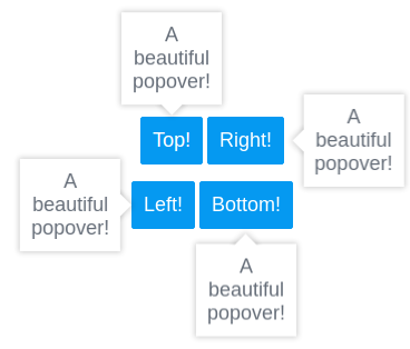
- Specify the direction of the popover - top, bottom, left, right.
- Decide whether you want to close the popover by click or when the mouse cursor leaves the popover area.
- Comes with a box shadow, a triangular tip and a floating effect.
Usage
- Include angular-popover.js(or min.js) after loading AngularJS.
- Include angular-popover.css.
- Add the angular-popover module to your project:
```javascript
var app = angular.module('yourModuleName', ['angular-popover'])
```
- Add the angular-popover directive along with multiple attributes:
```html
<div angular-popover direction="top" template="hey there!">
```
- IMPORTANT: Keep in mind, the 'position' property of the element to which the directive is applied will be set to 'relative' if the current value of 'position' is 'static'.
Options
###template Use the template attribute when you just want to add some text inside the popover. This avoids the hassle of creating an external template everytime.
###template-url When you want to load the popover with an external template, set template-url to the path of your template.
###mode
Decide on what event you want the popover to open - click or mouseover. If not specified, the click event will be used.
###close-on-click
Set close-on-click to true if you want the popover to close on click irrespective of the mode. If not set, the popover closes on click only if the mode is click.
###close-on-mouseleave
Set close-on-mouseleave to true if you want the popover to close on mouseleave irrespective of the mode. If not set, the popover closes on mouseleave only if the mode is mouseover.
###padding Set the padding for the popover content just like in CSS.
###background-color Set the background-color of the popover.
###text-color Set the color of the text in the popover.
