React.js Bootstrap Tree View
A prototype version of my jQuery based Tree View for Twitter Bootstrap
Dependencies
The project has very few dependencies, but you will need the following.
Getting Started
Install
Npm:
$ npm install react-bootstrap-treeviewBower:
$ bower install react-bootstrap-treeviewManual:
Old fashion, downloadable files can be found here
Usage
Include the correct styles, it's mainly just bootstrap but we add a few tweaks as well.
<!-- Required CSS -->
<link href="path/to/bootstrap.css" rel="stylesheet">
<link href="path/to/react-bootstrap-treeview.css" rel="stylesheet">
Add required libraries.
<!-- Required JavaScript -->
<script src="path/to/react.js"></script>
<script src="path/to/react-bootstrap-tree.js"></script>
Then, a basic initialization would look like.
React.render(
    <TreeView data={data} />,
    document.getElementById('treeview')
);
Example
Putting it all together a minimal implementation might look like this.
<html>
  <head>
    <title>React + Bootstrap Tree View</title>
    <link href="path/to/bootstrap.css" rel="stylesheet">
    <link href="path/to/react-bootstrap-treeview.css" rel="stylesheet">
  </head>
  <body>
    <div class="container">
      <h1>React + Bootstrap Tree View</h1>
      <br/>
      <div class="row">
        <div id="treeview"></div>
      </div>
    </div>
    <script src="path/to/react.js"></script>
    <script src="path/to/JSXTransformer.js"></script>
    <script src="path/to/react-bootstrap-treeview.js"></script>
    <script type="text/jsx">
        React.render(
                <TreeView data={data} />,
                document.getElementById('treeview')
            );
    </script>
  </body>
</html>
Data Structure
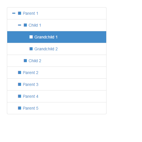
In order to define the hierarchical structure needed for the tree it's necessary to provide a nested array of JavaScript objects.
Example
var tree = [
  {
    text: "Parent 1",
    nodes: [
      {
        text: "Child 1",
        nodes: [
          {
            text: "Grandchild 1"
          },
          {
            text: "Grandchild 2"
          }
        ]
      },
      {
        text: "Child 2"
      }
    ]
  },
  {
    text: "Parent 2"
  },
  {
    text: "Parent 3"
  },
  {
    text: "Parent 4"
  },
  {
    text: "Parent 5"
  }
];
At the lowest level a tree node is a represented as a simple JavaScript object. This one required property text will build you a tree.
{
  text: "Node 1"
}
If you want to do more, here's the full node specification
{
  text: "Node 1",
  icon: "glyphicon glyphicon-stop",
  color: "#000000",
  backColor: "#FFFFFF",
  href: "#node-1",
  state: {
    expanded: true,
    selected: true
  },
  tags: ['available'],
  nodes: [
    {},
    ...
  ]
}
Node Properties
The following properties are defined to allow node level overrides, such as node specific icons, colours and tags.
text
String Mandatory
The text value displayed for a given tree node, typically to the right of the nodes icon.
icon
String Optional
The icon displayed on a given node, typically to the left of the text.
For simplicity we directly leverage Bootstraps Glyphicons support and as such you should provide both the base class and individual icon class separated by a space.
By providing the base class you retain full control over the icons used. If you want to use your own then just add your class to this icon field.
color
String Optional
The foreground color used on a given node, overrides global color option.
backColor
String Optional
The background color used on a given node, overrides global color option.
href
String Optional
Used in conjunction with global enableLinks option to specify anchor tag URL on a given node.
state
Object Optional
Describes a node's initial state.
state.expanded
Boolean Default: false
Whether or not a node is expanded i.e. open. Takes precedence over global option levels.
state.selected
Boolean Default: false
Whether or not a node is selected.
tags
Array of Strings Optional
Used in conjunction with global showTags option to add additional information to the right of each node; using Bootstrap Badges
Options
Options allow you to customise the treeview's default appearance and behaviour. They are passed to the react component as properties on initialization.
// Example: initializing the treeview
// expanded to 5 levels
// with a background color of green
React.render(
    <TreeView data={data}
                levels={5}
                backColor={"green"} />,
    document.getElementById('treeview')
);
The following is a list of all available options.
data
Array of Objects. No default, expects data
This is the core data to be displayed by the tree view.
backColor
String, any legal color value. Default: inherits from Bootstrap.css.
Sets the default background color used by all nodes, except when overridden on a per node basis in data.
borderColor
String, any legal color value. Default: inherits from Bootstrap.css.
Sets the border color for the component; set showBorder to false if you don't want a visible border.
collapseIcon
String, class name(s). Default: "glyphicon glyphicon-minus" as defined by Bootstrap Glyphicons
Sets the icon to be used on a collapsible tree node.
color
String, any legal color value. Default: inherits from Bootstrap.css.
Sets the default foreground color used by all nodes, except when overridden on a per node basis in data.
emptyIcon
String, class name(s). Default: "glyphicon" as defined by Bootstrap Glyphicons
Sets the icon to be used on a tree node with no child nodes.
enableLinks
Boolean. Default: false
Whether or not to present node text as a hyperlink. The href value of which must be provided in the data structure on a per node basis.
expandIcon
String, class name(s). Default: "glyphicon glyphicon-plus" as defined by Bootstrap Glyphicons
Sets the icon to be used on an expandable tree node.
highlightSelected
Boolean. Default: true
Whether or not to highlight the selected node.
levels
Integer. Default: 2
Sets the number of hierarchical levels deep the tree will be expanded to by default.
nodeIcon
String, class name(s). Default: "glyphicon glyphicon-stop" as defined by Bootstrap Glyphicons
Sets the default icon to be used on all nodes, except when overridden on a per node basis in data.
selectedBackColor
String, any legal color value. Default: '#428bca'.
Sets the background color of the selected node.
selectedColor
String, any legal color value. Default: '#FFFFFF'.
Sets the foreground color of the selected node.
showBorder
Boolean. Default: true
Whether or not to display a border around nodes.
showTags
Boolean. Default: false
Whether or not to display tags to the right of each node. The values of which must be provided in the data structure on a per node basis.
Copyright and Licensing
Copyright 2013 Jonathan Miles
Licensed under the Apache License, Version 2.0 (the "License"); you may not use this file except in compliance with the License. You may obtain a copy of the License at http://www.apache.org/licenses/LICENSE-2.0
Unless required by applicable law or agreed to in writing, software distributed under the License is distributed on an "AS IS" BASIS, WITHOUT WARRANTIES OR CONDITIONS OF ANY KIND, either express or implied. See the License for the specific language governing permissions and limitations under the License.
