

Features in Brief
- 49 position
- Live refresh of tooltip options.
- Live element checking (element removed? -> tooltip should disappear).
- Gravity: find a better position if it won't fit to the screen.
- DOM targets: append into the root or into another target element.
- Placements: outside, inside, border, center
- Click activated and sticky tooltips.
- Custom HTML content
- Interactive tooltips
- In/Out delays
- Auto-hide
- Icon support
- Skins, sizes, schemes
- Animations support
- Mixins (CSS only, JS based coming soon)
- Custom event callbacks
- UMD Support
Introduction
At the company I working for we use many tooltips for several purposes. Especially our admin area/control panel side has heavy tooltip usage. There were several unusual requests which always required to develop new features into our existing plugin. Now I've created Protip, a new generation of tooltips. It's not so lightweight but it doesn't intends to be. We needed a solution which can fit into every scenario we face with.
Installation
The simple way
Include the protip.min.css file in your <head> tag:
<link rel="stylesheet" href="//min.gitcdn.xyz/repo/wintercounter/Protip/master/protip.min.css">Include the protip.min.js file before your closing </body> tag (but after jQuery is included):
<script src="//min.gitcdn.xyz/repo/wintercounter/Protip/master/protip.min.js"></script>Get files using npm
npm install protip --save
Get files using bower
bower install protip
Initialize plugin
To initialize the plugin just insert $.protip(); in your $(document).ready(); section in case you already have.
If you don't then create one:
$(document).ready(function(){
    $.protip();
});
You may pass a configuration object here also: $.protip([configObject]);
Usage
Configuration
You may need some global configurations on the behaviors of your tooltips. You can pass some configuration options at initialization as an object.
// Available options with default values
$.protip({
    /** @type String    Selector for protips */
    selector:           C.DEFAULT_SELECTOR,
    /** @type String    Namespace of the data attributes */
    namespace:          C.DEFAULT_NAMESPACE,
    /** @type String    Template of protip element */
    protipTemplate:     C.TEMPLATE_PROTIP,
    /** @type String    Template of the arrow element */
    arrowTemplate:      C.TEMPLATE_ARROW,
    /** @type String    Template of protip icon */
    iconTemplate:       C.TEMPLATE_ICON,
    /** @type Boolean   Should we observe whole document for assertions and removals */
    observer:           true,
    /** @type Number    Default time for onResize event timeout. */
    delayResize:        100,
    /** @type Object    Default data-pt-* values for a tooltip */
    defaults:           {...}
});| Property | Default | Details |
|---|---|---|
| selector | .protip | We will use this selector to identify elements with protip. |
| namespace | pt | data-[NAMESPACE]-* |
| protipTemplate | See code | Template of a protip. Variables ({}) will get replaced. |
| arrowTemplate | See code | Template of a protip arrow. |
| iconTemplate | See code | Template of a protip with icon. |
| observer | true | If true, we will watch for changes in the DOM and check if a protip needs to be showed or removed. |
| delayResize | 100 | Default time for onResize event timeout. After a resize, we need to reposition the tooltips, but don't want to run on every fired resize event. |
| defaults | {...} | Default (global) values for a tooltip. Override any available data-pt-* attributes. |
Attach tooltips to elements
Tooltips are controlled over data attributes. Seriously, you can control every aspect of your tooltip from the markup, no additional JavaScript code is required.
<a href="#bar" class="protip" data-pt-title="You must be at least 18!">
    Go to the bar!
</a>
What I did here was that added a protip class to my element, then defined a tooltip text in the in the data-pt-title attribute. Protip related attributes will always get a pt namespace so Protip won't conflict with your existing data attributes.
Available attributes [data-pt-*]
| Attribute | Default | Type | Details |
|---|---|---|---|
| trigger | 'hover' | String | How you want to trigger this tooltip? Available values: hover, click, click2, sticky (sticky will be shown on load; click2 won't listen to body clicks) |
| title | null | String | The tooltip content text. Alternatively you may provide a selector (ID or class) starting with # or . to get data (even whole HTML) from another DOM element's content. Example: <div id="tooltipContent"><em>This is my tooltips content</em></div>. Also you may use :next, :prev or :this which allows you to get the content of the next, prev or this element immediatelly. |
| delay-in | 0 | Number | Delay of showing a tooltip. Handy in cases when you want to prevent tooltips on quick mouseovers. |
| delay-out | 0 | Number | Delay of hiding the tooltip. Handy in cases you have clickable content in the tooltip for example. |
| interactive | false | Bool | If true, protip will use a default 250ms as delayOut for clickable contents. |
| gravity | true | Bool, String | Gravity will check your tooltip before showing it and it will search for better positions if the tooltip won't fit to viewport. Gravity has multiple options available, there is a separate section in the documentation about gravity. |
| offset-top | 0 | Int | Adjust the Y position of the tooltip. |
| offset-left | 0 | Int | Adjust the X position of the tooltip. |
| position | 'bottom' | String | Preferred position. Check Positions section for available options and details. |
| placement | 'outside' | String | Placement of the tooltip inside the element. Available values are: outside, inside, border and center. |
| classes | null | String | These classes will be added to the tooltip which may enable additional styling for example. |
| arrow | true | Bool | Hide arrow from this tooltip. At initialization there is an option to set the size of the arrow. Protip will calculate this into positions. |
| width | 300 | Int, String | This is the default max-width for the tooltip. If you need fixed width, write as this: 300! |
| icon | false | Bool, String | Adds icon template to the tooltip markup with the specified icon class. |
| observer | false | Bool | If true, we will attach an observer to the source element and watch for changes. For example if you change the data-pt-title attribute, the tooltip title will be changed also. |
| target | 'body' | Bool, String | We will append the tooltip to this selector. Use true if you want to append into the source element. |
| skin | 'default' | Bool, String | Skin to apply only to this tooltip. (Currently available: default, square) |
| size | 'normal' | String | tiny, small, normal, big, large |
| scheme | 'pro' | String | Color scheme to use. See the scheme list |
| animate | undefined | Bool, String | Animation type based on Animate.css. See Animations |
| auto-hide | false | Bool, Number | Tooltip will hide itself automatically after this timeout (milliseconds). |
| auto-show | false | Bool | Automatically show tooltip for this element on load (stickies will be shown anyway). |
| mixin | undefined | String | Tooltip mixins to use. Separated by spaces. |
jQuery Helpers
var el = $('.el');

// Set tooltip to the element.
el.protipSet([options]);

// Show the tooltip of this element. Same as set, but it will also show.
el.protipShow([options]);

// Hide the tooltip of this element.
el.protipHide();

// Toggle the tooltip of this element.
el.protipToggle();

// Hide all tooltips inside of this element.
el.protipHideInside();

// Show all tooltips inside of this element.
el.protipShowInside();

// Toggle all tooltips inside of this element.
el.protipToggleInside();

// Custom show event
el.on('protipshow', function(ItemInstance){});

// Custom hide event
el.on('protiphide', function(ItemInstance){});

// Custom ready event
// Note that ready will fires after 10ms after it's actually ready.
// This helps your scripts to catch up.
el.on('protipready', function(ItemInstance){});

// Use console.log(ItemInstance) in the callback to check what options you have.
Example
<div class="my-el protip" data-pt-title="My element"></div>var el = $('.my-el');
// Shows tooltip with title: "My element"
el.protipShow();
// Shows tooltip with title: "My new title"
el.protipShow({
title: 'My new title'
});
// Changed trigger from hover to click
el.protipSet({
trigger: 'click'
});
// Changed trigger from hover to click and also show it
el.protipShow({
trigger: 'click'
});Gravity
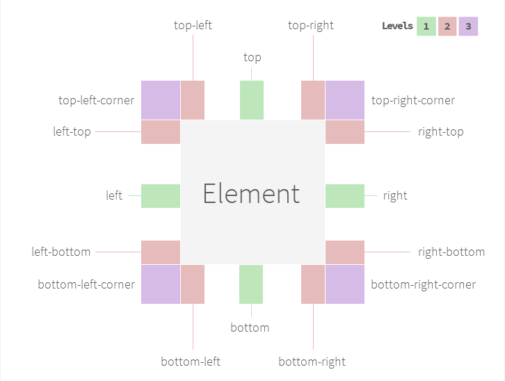
List of available positions
- corner-left-top
- top-left
- top
- top-right
- corner-right-top
- right-top
- right
- right-bottom
- bottom-left
- bottom
- bottom-right
- corner-right-bottom
- left-top
- left
- left-bottom
- corner-left-bottom
data-pt-gravity
True/False
It will enable/disable the gravity option. In case it's true, protip is going to try all positions.
The 3 level of positions
Level 1 top, right, bottom, left Level 2 All other except corners Level 3 Even corners
You may define a level number. Set to 1 in case you want to you gravity only in the most common positions. 2 will trigger both 1 and 2. 3 will trigger all of them.
Fully manual control
Sometimes you may need to have certain tooltips to have only 3 or 5 number of positions with custom offsets in all positions. There is a custom markup for this purpose:
Use only 2 position.
data-pt-gravity="top-right; bottom-left"
Use only 2 position. With custom offset. (X, Y)
data-pt-gravity="top-right 10; bottom-left -10 30"
Prioritize these position, then the others may come...
data-pt-gravity="top-right; bottom-left; ..."
Mix as you want :)
data-pt-placement
The placement attribute allows you to change the positioning behavior of the tooltip.
- outside: This is the default behavior. It will place the tooltip outside the specified element.
- inside: It will place the tooltip inside the specified element.
- border: It will place the tooltip right onto the border of the specified element.
- center: It's a special placement. It will place the tooltip to the exact center. No other positions applied.
Please note that you will probably want to disable arrows for other placements than outside.
Animations
Protip has built-in support for Animate.css (https://daneden.github.io/animate.css/). You simply need to use the same name found on the linked website.
Usage:
<div class="protip" data-pt-animate="bounceIn"></div>Protip's CSS doesn't include Animate.css. Download from here: //min.gitcdn.xyz/repo/daneden/animate.css/master/animate.css
Skins
Skins are a little bit difficult at the moment and I'm looking forward to implement a much cleaner way. Anyway the markup won't change too drastic so the currently made skins should work in the future as well. Please check Protip's SCSS files for more details. There are configurable maps, so you can easily add your own styles (schemes and sizes also).
List of available schemes
-
pro
-
blue
-
red
-
aqua
-
dark
-
dark-transparent
-
black
-
leaf
-
purple
-
pink
-
orange
-
white
Good to know stuff
.protip-target class
In case there is no data-pt-title specified, Protip will try to search a .protip-target class in the parents.
If it founds, the tooltip will be appended there else it will append right into the body (if nothing else is specified).
This is useful for example when using tooltips in overlays. Add protip-target class to your overlay container element
which will solve z-index issues and tooltip removals when closing the overlay.
.protip-open class
While a tooltip is opened, Protip will add protip-open class to your element to enable you to add custom styles for example.
.protip-close class
In case you need an element to close your tooltip (inside your tooltip, like an X or something), just add an element
with the class of protip-close which will trigger close on clicking it.
Auto-interactive link detection
Protip will try to detect if your tooltip contains a link (by searching for a tags in it). If it does founds one, your
tooltip will automatically become interactive so your users will be able to click the link inside the tooltip instead of closing it.
Why offset(top/left) is not working?
The data-pt-offset-(left/top) attributes are only have effect on the default position tooltip. If it gets re-positioned
by Gravity it won't be added to the calculations. In case you need to position re-positioned tooltips, specify it in the
data-pt-gravity tag using it's own syntax.
data-pt-gravity="top 0 -15; bottom 0 15"
Command Buffer
You are allowed to call jQuery helpers (like protipShow/protipHide) before initialization of protip. This solves the problem with JavaScript file orders and calls before Protip is initialized, your commands will run after everything is done.
MutationObserver (IE8-10 Support)
Internet Explorer supports Mutation Observers only from version 11. In case you need IE8-10 support you need to include a Mutation Observer Polyfill. Simply include this script before Protip is loaded https://github.com/megawac/MutationObserver.js
Contribution, bugs, feature requests and suggestions
Contributions are always welcome. Just fork the repository, commit your changes and create a Pull Request.
For bugs, requests, suggestions, etc. please use the GitHub issue tracker at the Protip repository.
Credits
- nano template "engine" https://github.com/trix/nano
- MutationObserver polyfill https://github.com/megawac/MutationObserver.js
Bookmarks
- I want to use these in commit messages sometimes :) http://www.emoji-cheat-sheet.com/


