react-native-tableview-simple


This cross-platform component is inspired by the iOS-TableView. Made with pure CSS, the intention is to provide a flexible and lightweight alternative to a bridged component. Don't be scared of React-Native upgrades anymore!
A possible use case might be an about- or a settings-screen with a few rows.
For displaying long datalists it is recommended to use the FlatList Component together with Cell and Separator Components. (see example or live demo with expo)
Sponsor Button and find out about GitHub Sponsors – Thanks!
 |
 |
Have a look at the examples below! :-)
Installation
- Install as dependency:
// yarn
yarn add react-native-tableview-simple
// or npm
npm i react-native-tableview-simple --S- Add needed components:
import { Cell, Section, TableView } from 'react-native-tableview-simple';Extensible
react-native-tableview-simple provides you with some predefined CSS-styles, inspired by the native TableView.
You can always mix the Cell-instances inside a Section, with other (React-Native)-Views.
Override defaults of Cell-Component
Don't repeat yourself. If you override the default props over and over again, just pass them as an object.
const cellPropsCustom = {
  cellStyle: 'Basic',
  title: 'Basic Custom',
  backgroundColor: 'black',
};


<Cell onPress={console.log} {...cellPropsCustom} />
<Cell onPress={console.log} {...cellPropsCustom} />
Separator BackgroundColor is derived from Cell BackgroundColor
The Separator-Component is a line from the left end to the right end.
According to the original iOS TableView there should be an insent on the left end.
This is done by separating the Separator-Component in two parts: SeparatorContainer (full width) and SeparatorInner (width - inset). (See: Separator.tsx)
The SeparatorContainer has the same color that the Cell-Component above.
The SeparatorInner has the default Separator Color.
Pressing a Cell Component will change the color of SeparatorInner to transparent.
Why is that so complicated?
Because just hiding the separator would make the height of the component jump.
Props
TableView
The TableView component controls the theme.
| Prop | Default | Type | Description |
|---|---|---|---|
| children | - | React.ReactNode |
Children. Should be of type Section
|
| appearance | auto |
string |
auto: System Appearance; light: Light Appearance; dark: Dark Appearance; [string]: Appearance defined through customAppearances
|
| customAppearances | - | THEME_APPEARANCE |
|
| style | - | ViewStyle |
Applied to the table wrapper |
Section
The Section component is needed to render the Cells together with Separators.
It's possible to use the Flatlist component instead (Example).
| Prop | Default | Type | Description |
|---|---|---|---|
| allowFontScaling | true |
bool |
Respect Text Size accessibility setting on iOS |
| footerComponent | - | React.Component |
Inject any component to replace original footer (optional) |
| headerComponent | - | React.Component |
Inject any component to replace original header (optional) |
| footer | - | string |
Footer value |
| footerTextColor | #6d6d72 |
string |
Text color of footer |
| footerTextStyle | {} |
Text.propTypes.style |
These styles will be applied to the footer Text-Component. |
| header | - | string |
Header value |
| headerTextColor | #6d6d72 |
string |
Text color of header |
| headerTextStyle | {} |
Text.propTypes.style |
These styles will be applied to the header Text-Component. |
| hideSeparator | false |
bool |
Hide separators |
| hideSurroundingSeparators | false |
bool |
Hide surrounding separators, best combined with roundedCorners |
| roundedCorners | false |
bool |
Enable rounded corners, best combined with hideSurroundingSeparator |
| sectionPaddingBottom | 15 |
number |
Padding bottom of section |
| sectionPaddingTop | 15 |
number |
Padding top of section |
| sectionTintColor | #EFEFF4 |
string |
Background color of section |
| separatorInsetLeft | 15 |
number |
Left inset of separator |
| separatorInsetRight | 0 |
number |
Right inset of separator |
| separatorTintColor | #C8C7CC |
string |
Color of separator |
| withSafeAreaView | true / false (on iOS <= 10) |
bool |
Render section header and footer with SafeAreaView |
Cell
The style of the Cell component is inspired by the native UITableView.
Because the Cell component is created with CSS only, its highly flexible.
The content of the cell is separated in three views, which can all be modified via props: cellImageView | cellContentView | cellAccessoryView.
To get an idea what you can modify via props, have a look at the examples below.
| Prop | Default | Type | Description |
|---|---|---|---|
| accessory | - | string |
Predefined accessory: DisclosureIndicator, Detail, DetailDisclosure, Checkmark
|
| accessoryColor | #007AFF |
string |
Color of accessory |
| accessoryColorDisclosureIndicator | #C7C7CC |
string |
Color of accessory DisclosureIndicator
|
| allowFontScaling | true |
bool |
Respect Text Size accessibility setting on iOS |
| backgroundColor | #FFF |
string |
Background color of cell |
| cellStyle | Basic |
string |
Predefined styles: Basic, RightDetail, LeftDetail, Subtitle
|
| cellAccessoryView | - | React.Component |
Replace accessory view component (e.g.: add Switch or ActivityIndicator) |
| cellContentView | - | React.Component |
Replace content view component |
| cellImageView | - | React.Component |
Replace image view component |
| children | - | React.Component |
Additional content to be displayed below the cell. (e.g: Add Picker or DateTimePicker) |
| contentContainerStyle | {} |
View.propTypes.style |
These styles will be applied to the content container which wraps all of the child views. Overrides cellStyle (e.g.: Override paddingLeft and paddingRight or set fixed height) |
| detail | - |
string or number
|
Detail value |
| detailTextProps | {} |
Text.propTypes |
These props will be applied to the (left- / right-) detail Text-Component. |
| detailTextStyle | {} |
Text.propTypes.style |
These styles will be applied to the (left- / right-) detail Text-Component. |
| disableImageResize | false |
bool |
Disable resizing of image |
| hideSeparator | false |
bool |
Hide the following Separator-Component |
| highlightActiveOpacity | 0.8 |
number |
Opacity of cell when touch is active |
| highlightUnderlayColor | black |
string |
Color of underlay that will show through when touch is active |
| isDisabled | false |
bool |
Cell is disabled. onPress will not get triggered |
| image | - | React.Component (Image) |
Image component displayed on the left. Will resized automatically |
| leftDetailColor | #007AFF |
string |
Text color of left detail |
| rightDetailColor | #8E8E93 |
string |
Text color of right detail |
| subtitleColor | #000 |
string |
Text color of subtitle |
| subtitleTextStyle | {} |
Text.propTypes.style |
These styles will be applied to the subtitle Text-Component. |
| testID | undefined |
string |
Add testID to root component |
| title | - |
string or number or React.Component
|
Title value |
| titleTextColor | #000 |
string |
Text color of title |
| titleTextProps | {} |
Text.propTypes |
These props will be applied to the title Text-Component. |
| titleTextStyle | {} |
Text.propTypes.style |
These styles will be applied to the title Text-Component (e.g.: update fontSize or fontFamily) |
| titleTextStyleDisabled | {} |
Text.propTypes.style |
These styles will be applied to the title Text-Component, when the cell is disabled |
| onPress | - |
func or false
|
If set, cell will be automaticaly initialized with TouchableHighlight |
| onPressDetailAccessory | - |
func or false
|
Listen to onPress event of detail accessory |
| withSafeAreaView | true / false (on iOS <= 10) |
bool |
Render cell with SafeAreaView |
Wrap Cell
Sometimes custom Cell components are needed.
By creating new component, which is based on Cell, its only necessary to set the props once.
...

import {
  Cell,
  Section,
  TableView,
} from 'react-native-tableview-simple';

const CellVariant = (props) => (
  <Cell
    {...props}
    cellContentView={
      <View
        style={{ alignItems: 'center', flexDirection: 'row', flex: 1, paddingVertical: 10 }}
      >
        <Text
          allowFontScaling
          numberOfLines={1}
          style={{ flex: 1, fontSize: 20 }}
        >
          {props.title}
        </Text>
      </View>
    }
  />
);

...

<TableView>
  <Section>
    <CellVariant title="Element 1" />
    <CellVariant title="Element 2" />
    <CellVariant title="Element 3" />
    <CellVariant title="Element 4" />
  </Section>
</TableView>

...
Separator
In general the Separator component is used internally by the Section component.
But additionally this component can be used together with FlatList.
See the example below.
| Prop | Default | Type | Description |
|---|---|---|---|
| backgroundColor | #EFEFF4 |
string |
Background color |
| insetLeft | 15 |
number |
Left inset of separator |
| insetRight | 0 |
number |
Right inset of separator |
| isHidden | false |
bool |
Hide separator but keeping its height |
| tintColor | #C8C7CC |
string |
Color of separator |
| withSafeAreaView | true / false (on iOS <= 10) |
bool |
Render separator with SafeAreaView |
Examples
The following examples can be found in the folder example.
To run the example project, follow these steps:
git clone https://github.com/Purii/react-native-tableview-simplecd example-
yarnornpm i - run
/example/ios/example.xcodeprojvia Xcode
Quick look
// ActivityIndicator as accessory
<Cell
title="Switch"
cellAccessoryView={<Switch />}
contentContainerStyle={{ paddingVertical: 4 }} // Adjust height
/>
// Switch as accessory
<Cell
title="ActivityIndicator"
cellAccessoryView={<ActivityIndicator />}
/>
// TextInput
<Cell
cellContentView={<TextInput style={{fontSize: 16, flex: 1}} placeholder="TextInput"/>}
/>
// Image
<Cell
title="Image"
image={
<Image
style={{ borderRadius: 5 }}
source={{
uri: 'https://facebook.github.io/react/img/logo_og.png',
}}
/>
}
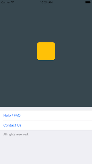
/>Use case: About-screen
/**
 * Sample React Native App
 * https://github.com/facebook/react-native
 * @flow
 */

import React, { Component } from 'react';
import { AppRegistry, ScrollView, StyleSheet, Text, View } from 'react-native';
import { Cell, Section, TableView } from 'react-native-tableview-simple';

export default class App extends Component<{}> {
  render() {
    return (
      <ScrollView contentContainerStyle={styles.stage}>
        <View
          style={{
            backgroundColor: '#37474F',
            height: 500,
            alignItems: 'center',
            justifyContent: 'center',
          }}>
          <View
            style={{
              backgroundColor: '#ffc107',
              width: 80,
              height: 80,
              borderRadius: 10,
            }}
          />
        </View>
        <TableView>
          <Section footer="All rights reserved.">
            <Cell
              title="Help / FAQ"
              titleTextColor="#007AFF"
              onPress={() => console.log('open Help/FAQ')}
            />
            <Cell
              title="Contact Us"
              titleTextColor="#007AFF"
              onPress={() => console.log('open Contact Us')}
            />
          </Section>
        </TableView>
      </ScrollView>
    );
  }
}

const styles = StyleSheet.create({
  stage: {
    backgroundColor: '#EFEFF4',
    paddingBottom: 20,
    flex: 1,
  },
});
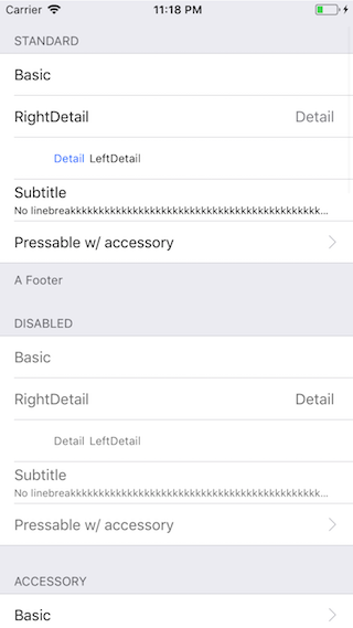
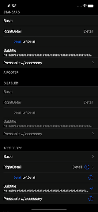
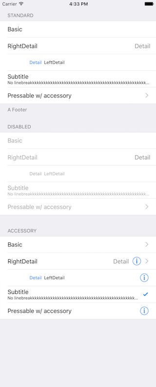
react-native-tableview-simple vs. Native iOS
The left and middle screens are build using react-native-tableview-simple. The right one is native.
react-native-tableview-simple (Dark Appearance) |
react-native-tableview-simple |
Native iOS |
|---|---|---|
|
 |
 |
/**
* Sample React Native App
* https://github.com/facebook/react-native
* @flow
*/
import React, { Component } from 'react';
import {
ActivityIndicator,
AppRegistry,
Dimensions,
Image,
ScrollView,
StyleSheet,
Switch,
Text,
TextInput,
View,
} from 'react-native';
import { Cell, Section, TableView } from 'react-native-tableview-simple';
export default class App extends Component<{}> {
render() {
return (
<ScrollView contentContainerStyle={styles.stage}>
<TableView>
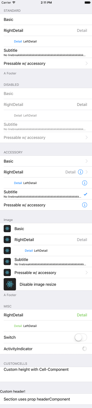
<Section header="STANDARD" footer="A Footer">
<Cell cellStyle="Basic" title="Basic" />
<Cell cellStyle="RightDetail" title="RightDetail" detail="Detail" />
<Cell cellStyle="LeftDetail" title="LeftDetail" detail="Detail" />
<Cell
cellStyle="Subtitle"
title="Subtitle"
detail="No linebreakkkkkkkkkkkkkkkkkkkkkkkkkkkkkkkkkkkkkkkkkkkkkkkkkkkkkkkkkkkkkkkkkkkk"
/>
<Cell
cellStyle="Basic"
title="Pressable w/ accessory"
accessory="DisclosureIndicator"
onPress={() => console.log('Heyho!')}
/>
</Section>
<Section header="DISABLED">
<Cell cellStyle="Basic" isDisabled title="Basic" />
<Cell
cellStyle="RightDetail"
isDisabled
title="RightDetail"
detail="Detail"
/>
<Cell
cellStyle="LeftDetail"
isDisabled
title="LeftDetail"
detail="Detail"
/>
<Cell
cellStyle="Subtitle"
isDisabled
title="Subtitle"
detail="No linebreakkkkkkkkkkkkkkkkkkkkkkkkkkkkkkkkkkkkkkkkkkkkkkkkkkkkkkkkkkkkkkkkkkkk"
/>
<Cell
cellStyle="Basic"
isDisabled
title="Pressable w/ accessory"
accessory="DisclosureIndicator"
onPress={() => console.log('Heyho!')}
/>
</Section>
<Section header="ACCESSORY">
<Cell
cellStyle="Basic"
accessory="DisclosureIndicator"
title="Basic"
/>
<Cell
cellStyle="RightDetail"
accessory="DetailDisclosure"
title="RightDetail"
detail="Detail"
/>
<Cell
cellStyle="LeftDetail"
accessory="Detail"
title="LeftDetail"
detail="Detail"
/>
<Cell
cellStyle="Subtitle"
accessory="Checkmark"
title="Subtitle"
detail="No linebreakkkkkkkkkkkkkkkkkkkkkkkkkkkkkkkkkkkkkkkkkkkkkkkkkkkkkkkkkkkkkkkkkkkk"
/>
<Cell
cellStyle="Basic"
accessory="Detail"
title="Pressable w/ accessory"
onPress={() => console.log('Heyho!')}
/>
</Section>
<Section header="Image" footer="A Footer">
<Cell
cellStyle="Basic"
title="Basic"
image={
<Image
style={{ borderRadius: 5 }}
source={{
uri: 'https://facebook.github.io/react/img/logo_og.png',
}}
/>
}
/>
<Cell
cellStyle="RightDetail"
title="RightDetail"
detail="Detail"
image={
<Image
style={{ borderRadius: 5 }}
source={{
uri: 'https://facebook.github.io/react/img/logo_og.png',
}}
/>
}
/>
<Cell
cellStyle="LeftDetail"
title="LeftDetail"
detail="Detail"
image={
<Image
style={{ borderRadius: 5 }}
source={{
uri: 'https://facebook.github.io/react/img/logo_og.png',
}}
/>
}
/>
<Cell
cellStyle="Subtitle"
title="Subtitle"
detail="No linebreakkkkkkkkkkkkkkkkkkkkkkkkkkkkkkkkkkkkkkkkkkkkkkkkkkkkkkkkkkkkkkkkkkkk"
image={
<Image
style={{ borderRadius: 5 }}
source={{
uri: 'https://facebook.github.io/react/img/logo_og.png',
}}
/>
}
/>
<Cell
cellStyle="Basic"
title="Pressable w/ accessory"
accessory="DisclosureIndicator"
onPress={() => console.log('Heyho!')}
image={
<Image
style={{ borderRadius: 5 }}
source={{
uri: 'https://facebook.github.io/react/img/logo_og.png',
}}
/>
}
/>
<Cell
cellStyle="Basic"
title="Disable image resize"
disableImageResize
image={
<Image
style={{ height: 50, width: 50, borderRadius: 5 }}
source={{
uri: 'https://facebook.github.io/react/img/logo_og.png',
}}
/>
}
/>
</Section>
<Section header="MISC">
<Cell
cellStyle="RightDetail"
title="RightDetail"
detail="Detail"
rightDetailColor="#6cc644"
/>
<Cell
cellStyle="LeftDetail"
title="LeftDetail"
detail="Detail"
leftDetailColor="#6cc644"
/>
<Cell
cellStyle="Basic"
title="Switch"
cellAccessoryView={<Switch />}
contentContainerStyle={{ paddingVertical: 4 }}
/>
<Cell
cellStyle="Basic"
title="ActivityIndicator"
cellAccessoryView={<ActivityIndicator />}
/>
<Cell
cellContentView={
<TextInput
style={{ fontSize: 16, flex: 1 }}
placeholder="TextInput"
/>
}
/>
</Section>
<Section header="CUSTOMCELLS">
<Cell
onPress={() => console.log('Heyho!')}
contentContainerStyle={{ alignItems: 'flex-start', height: 60 }}
cellContentView={
<Text style={{ flex: 1, fontSize: 16 }}>
Custom height with Cell-Component
</Text>
}
/>
</Section>
<Section headerComponent={<CustomSectionHeader />}>
<Cell cellStyle="Basic" title="Section uses prop headerComponent" />
</Section>
</TableView>
<View
style={{
minHeight: Dimensions.get('window').height,
}}>
<View
style={{
backgroundColor: '#37474F',
height: 500,
alignItems: 'center',
justifyContent: 'center',
}}>
<View
style={{
backgroundColor: '#ffc107',
width: 80,
height: 80,
borderRadius: 10,
}}
/>
</View>
<TableView>
<Section footer="All rights reserved.">
<Cell
title="Help / FAQ"
titleTextColor="#007AFF"
onPress={() => console.log('open Help/FAQ')}
/>
<Cell
title="Contact Us"
titleTextColor="#007AFF"
onPress={() => console.log('open Contact Us')}
/>
</Section>
</TableView>
</View>
</ScrollView>
);
}
}
const styles = StyleSheet.create({
stage: {
backgroundColor: '#EFEFF4',
paddingTop: 20,
paddingBottom: 20,
},
});
Render with FlatList
Be aware of the prop keyboardShouldPersistTaps if using ScrollView or similar components. (See #85)
import React from 'react';
import { FlatList } from 'react-native';

import { Cell, Separator, TableView } from 'react-native-tableview-simple';

const data = [
  { id: 1, title: '1' },
  { id: 2, title: '2' },
  { id: 3, title: '3' },
  { id: 4, title: '4' },
];

export default ExampleWithFlatList = () => (
  <TableView style={{ flex: 1 }}>
    <FlatList
      data={data}
      keyExtractor={(item, index) => item.id}
      renderItem={({ item, separators }) => (
        <Cell
          title={item.title}
          onPress={console.log}
          onHighlightRow={separators.highlight}
          onUnHighlightRow={separators.unhighlight}
        />
      )}
      ItemSeparatorComponent={({ highlighted }) => (
        <Separator isHidden={highlighted} />
      )}
    />
  </TableView>
);
Try it out
Try it in Expo: https://snack.expo.io/@purii/react-native-tableview-simple

![dependabot[bot]](https://avatars.githubusercontent.com/u/49699333?size=120)
![dependabot-preview[bot]](https://avatars.githubusercontent.com/u/27856297?size=120)

![greenkeeper[bot]](https://avatars.githubusercontent.com/u/23040076?size=120)


