sanity-plugin-icon-picker
This is a Sanity Studio v3 plugin.
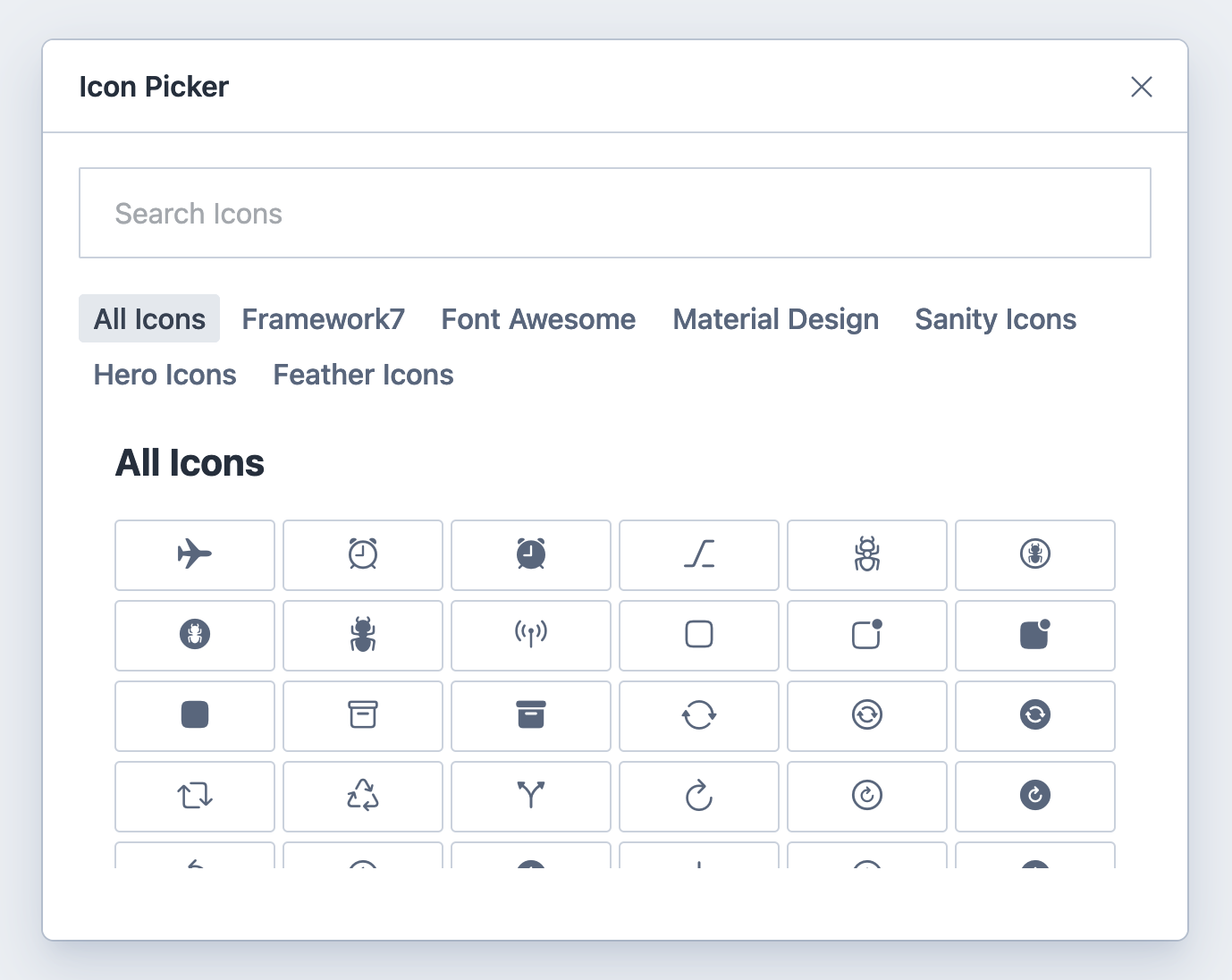
Icon picker for Sanity which let you select icons from a set of icon providers.
Installation
npm install sanity-plugin-icon-pickerUsage
Add it as a plugin in sanity.config.ts (or .js):
import { defineConfig } from 'sanity';
import { iconPicker } from 'sanity-plugin-icon-picker';

export default defineConfig({
  //...
  plugins: [iconPicker()],
});
Use the type in your schemas.
{
    title: "Icon",
    name: "icon",
    type: "iconPicker"
}
Options
Providers
Define which icon providers you want to use by providing their provider id in the providers array. If not defined, the Icon Picker defaults to display all providers and icons.
{
    title: "Icon",
    name: "icon",
    type: "iconPicker",
    options: {
        providers: ["f7", "fa", "mdi", "sa", "hi", "fi", "si"]
    }
}
Output Format
Format the output data in accordance with your front-end project. If you're using React you can set the outputFormat to react. If you ommit this option, the output format will be in accordance with every single provider's icon naming convention.
{
    title: "Icon",
    name: "icon",
    type: "iconPicker",
    options: {
        outputFormat: 'react',
    }
}
Filter
Filter out a subset of icons to be used by specifying a filter. A filter can be either an exact match of a string (case insensitive) or a regular expression. Supports both the react naming convention of an icon name as well as default naming conventions for each icon provider. This means that defining for instance the Font Awesome icon arrow-circle-up is equal to defining the react version FaArrowCircleUp.
{
    title: "Icon",
    name: "icon",
    type: "iconPicker",
    options: {
        filter: ['FaBeer', 'FaDocker', /^arrow/i],
    }
}
Store SVG
If you don't want to dynamically generate the icons in your front-end as described in this example, you can opt in to storing the selected SVG icon as a string in your data (usage example here).
{
    title: "Icon",
    name: "icon",
    type: "iconPicker",
    options: {
        storeSvg: true
    }
}
Configurations
Extend the built in provider configurations by adding your own. Note that if you want to mix built-in provider configurations with your own, you need to specify them manually since all will not be used automatically if a configuration is available.
| Key | Type | Description |
|---|---|---|
title |
String | The title of the icon set which will be displayed in the UI. |
provider |
String | Stored as icon picker data upon selection. |
icons |
Function | A function that returns an array of Icon Object. |
| Icon Object | ||
name |
String | Stored as icon picker data upon selection. |
component |
Function | A function that returns a React component. This function, when called, renders the icon in the UI. |
tags |
Array of Strings | An array containing the tags for the icon. This can be used for filtering. |
import React from 'react'
import * as CarbonIcons from '@carbon/icons-react'
...
...
{
  title: 'Icon',
  name: 'icon',
  type: 'iconPicker',
  options: {
    configurations: [
      {
        title: 'Carbon Icons',
        provider: 'ci',
        icons: (options) =>
          Object.entries(CarbonIcons).map(([name, Component]) => ({
            name,
            component: () => <Component width="1.5em" height="1em" />,
            tags: [name],
          })),
      },
    ],
  },
},
Supported Icon Providers
| Provider | Prefix | Homepage |
|---|---|---|
Framework7 |
f7 |
https://framework7.io/icons/ |
Font Awesome |
fa |
https://fontawesome.com/ |
Material Design Icons |
mdi |
http://google.github.io/material-design-icons/ |
Sanity Icons |
sa |
https://www.sanity.io/ |
Hero Icons |
hi |
https://github.com/tailwindlabs/heroicons |
Feather Icons |
fi |
https://feathericons.com/ |
Simple Icons |
si |
https://simpleicons.org/ |
Helper functions
Preview
In order to render the icon component as preview media, we can import a helper method.
import { preview } from 'sanity-plugin-icon-picker';We can then render the icon by passing the selected name and provider to this method which will return an icon component.
{
...
    preview: {
        select: {
          provider: "icon.provider",
          name: "icon.name",
        },
        prepare(icon) {
          return {
            title: icon.provider,
            subtitle: icon.name,
            media: preview(icon),
          };
        },
      }
}
Preview with configurations
If you're using your own configurations you need to pass the options object to the preview parameters. Here's an example:
import React from 'react';
import { preview } from 'sanity-plugin-icon-picker';
import * as CarbonIcons from '@carbon/icons-react';

const options = {
  configurations: [
    {
      title: 'Carbon Icons',
      provider: 'ci',
      icons: (options) =>
        Object.entries(CarbonIcons).map(([name, Component]) => ({
          name,
          component: () => <Component width="1.5em" height="1em" />,
          tags: [name],
        })),
    },
  ],
};

export const schemaTypes = [
  {
    title: 'Icons',
    name: 'icons',
    type: 'document',
    fields: [
      {
        title: 'Icon',
        name: 'icon',
        type: 'iconPicker',
        options,
      },
    ],
    preview: {
      select: {
        provider: 'icon.provider',
        name: 'icon.name',
      },
      prepare(icon) {
        return {
          title: icon.provider,
          subtitle: icon.name,
          media: preview({ ...icon, options }),
        };
      },
    },
  },
];
Migrations
import { migrateIconName } from 'sanity-plugin-icon-picker';We can use this function to migrate the name to a new outputFormat. This can be useful if you added icons in your studio and later decide that you want to use another outputFormat. Pass the third parameter react if you want to convert the name to options.outputFormat: 'react' naming convention. If you want to convert from react to default simply leave out the third parameter. Here's an example of a migration script where this function might come in handy.
migrateIconName('alert-circle', 'fi', 'react');FAQ
Can I use this plugin for Sanity Studio v2?
Yes you can! Simply install the older version of this plugin
npm install sanity-plugin-icon-picker@2.1.0Then refer to the old documentation and follow everything except the install step.
How can I consume the data returned from Sanity Studio in my React app?
Example 1: Dynamically generating icon
Here's a really simple example of how you could consume the data to render a Font Awesome icon from it. Note that in this example I'm using the option outputFormat: 'react' for the icon picker in the studio as mentioned here.
import * as Icons from 'react-icons/fa';

// Sanity data mock
const data = {
  _type: 'iconPicker',
  name: 'FaBeer',
  provider: 'fa',
  _updatedAt: '2021-07-25T02:30:43.141Z',
};

const DynamicFontAwesomeIcon = ({ name }) => Icons[name];

export default function App() {
  const Icon = DynamicFontAwesomeIcon(data);
  return (
    <div className="App">
      <Icon />
    </div>
  );
}
Example 2: Stored SVG
If you've opted in to store SVGs in your data (options.storeSvg), you could present them in various ways:
// Sanity data mock
const data = {
  _type: 'iconPicker',
  name: 'alert-circle',
  provider: 'fi',
  svg: '<svg stroke="currentColor" fill="none" stroke-width="2" viewBox="0 0 24 24" stroke-linecap="round" stroke-linejoin="round" height="1em" width="1em" xmlns="http://www.w3.org/2000/svg" style="width: 1.5em; height: 1em;"><circle cx="12" cy="12" r="10"></circle><line x1="12" y1="8" x2="12" y2="12"></line><line x1="12" y1="16" x2="12.01" y2="16"></line></svg>',
};

export default function App() {
  const encodedSvg = encodeURIComponent(data.svg);
  const imgSrc = `data:image/svg+xml,${encodedSvg}`;

  return (
    <div className="App">
      <img src={imgSrc} />
    </div>
  );
}
import SVG from 'react-inlinesvg';
// Sanity data mock
const data = {
_type: 'iconPicker',
name: 'alert-circle',
provider: 'fi',
svg: '<svg fill="none" height="1em" stroke="currentColor" stroke-linecap="round" stroke-linejoin="round" stroke-width="2" viewBox="0 0 24 24" width="1em" xmlns="http://www.w3.org/2000/svg"><circle cx="12" cy="12" r="10" /><line x1="12" x2="12" y1="8" y2="12" /><line x1="12" x2="12.01" y1="16" y2="16" /></svg>',
};
export default function App() {
return (
<div className="App">
<SVG src={data.svg} />
</div>
);
}Changing output format doesn't change the data
If you start adding icons to your data with for instance no options.outputFormat (default) set and then later decide that you want to use options.outputFormat: true, your data will not automagically update. You will either have to re-select each icon in your Studio or run a migration script to update all the icons to the correct output format. Here's an example of such a migration script.
Deploying NextJS embedded studio breaks studio
It's been reported several times that in some cases when deploying a studio that uses this plugin breaks the studio. The quick fix for that is to use swcMinify: false in your NextJS config.
License
MIT © Christopher Af Bjur
Develop & test
This plugin uses @sanity/plugin-kit with default configuration for build & watch scripts.
See Testing a plugin in Sanity Studio on how to run this plugin with hotreload in the studio.


