stacked_bar_chart
A Flutter package for creating different types of charts.This package gives developer the flexibility to customize their graph as well.

Features
-
Plot graphs
- Stacked Rounded Rectangle Graph
- Stacked Rectangele Graph
- Net Line Graph
- Net Point Graph
-
Customize your graph
- Select if you want to display the net line
- change core color,line color as well as line width of the net line
-
Scrollable
- The graphs plotted are scrollable
-
Provide data in json format
- You can use the toMap() and forMap() methods to provide your data in json format
-
Style your Labels
- You can style both you X-axis and Y-axis Labels.
-
Callback on bar tap
- A callback is provided on tap of each bar. Developer can use this feature as per their need.
Installation
In the dependencies: section of your pubspec.yaml, add the following line:
stacked_bar_chart:Then import it as :
import 'package:stacked_bar_chart/stacked_bar_chart.dart';Graph Types
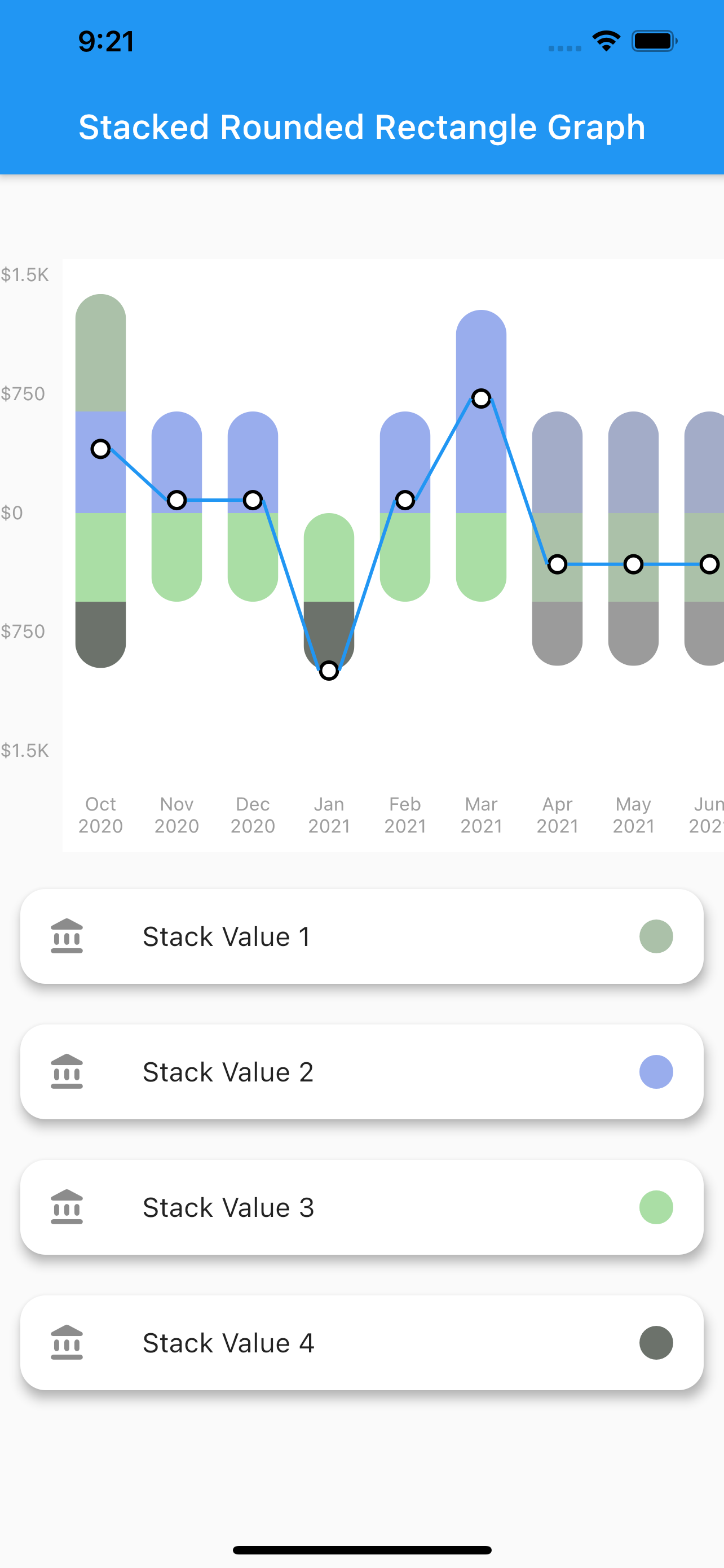
1. Stacked Rounded Rectangle Graph
- A simple stacked bar graph with rounded borders.
- To plot this graph pass the
GraphType.StackedRoundedingraphType. as shown below
graphType: GraphType.StackedRoundedYou can also change the styling of the line and point plotted.The color,width etc. can be changed using the netLine parameter as :
netLine: NetLine(
                showPointOnly: false,
                showLine: true,
                lineColor: Colors.blue,
                pointBorderColor: Colors.black,
                coreColor: Colors.white,
              ),

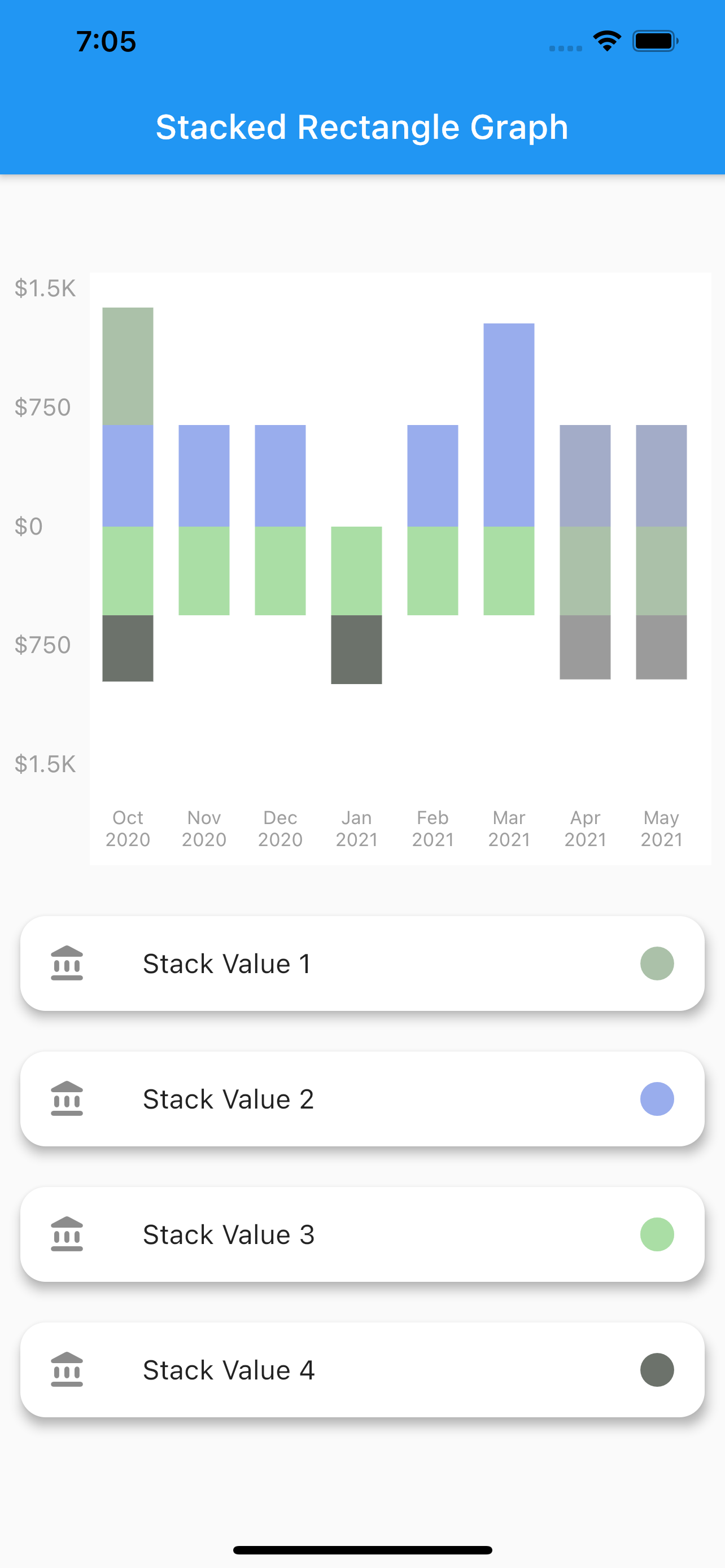
2. Stacked Rectangle Graph
-
A simple stacked bar graph with no rounded borders. You can customize it in the same way as the stacked rounded rectangle graph.
-
To plot this graph pass the
GraphType.StackedRectingraphType. as shown below
graphType: GraphType.StackedRect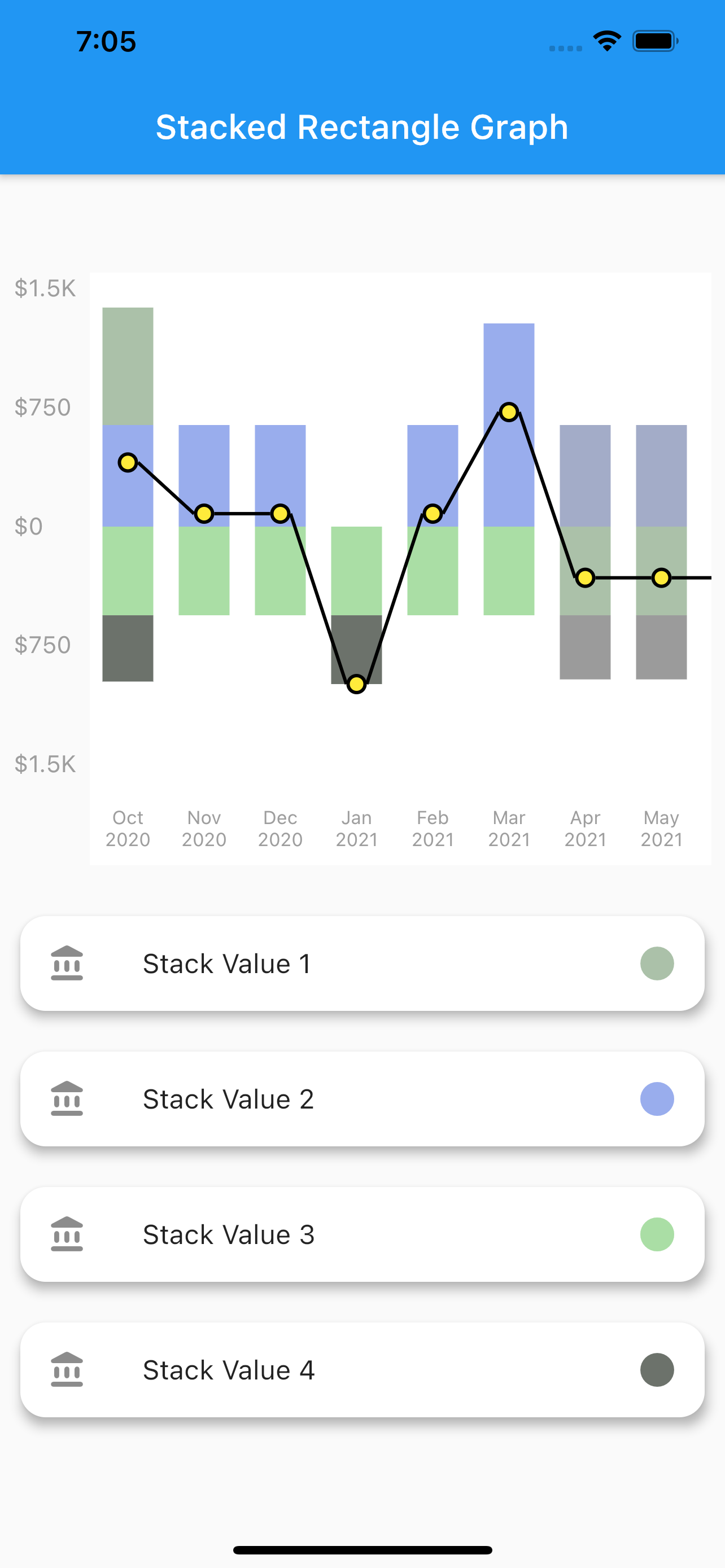

3. Net Line Graph
-
A simple line graph plotted with the net values of the data provided. The net values of a particular data is calculated and plotted.It can also be customized in the same way as stacked rounded rectangle graph.
-
To plot this graph pass the
GraphType.StackedRectingraphType. as shown below
graphType: GraphType.LineGraph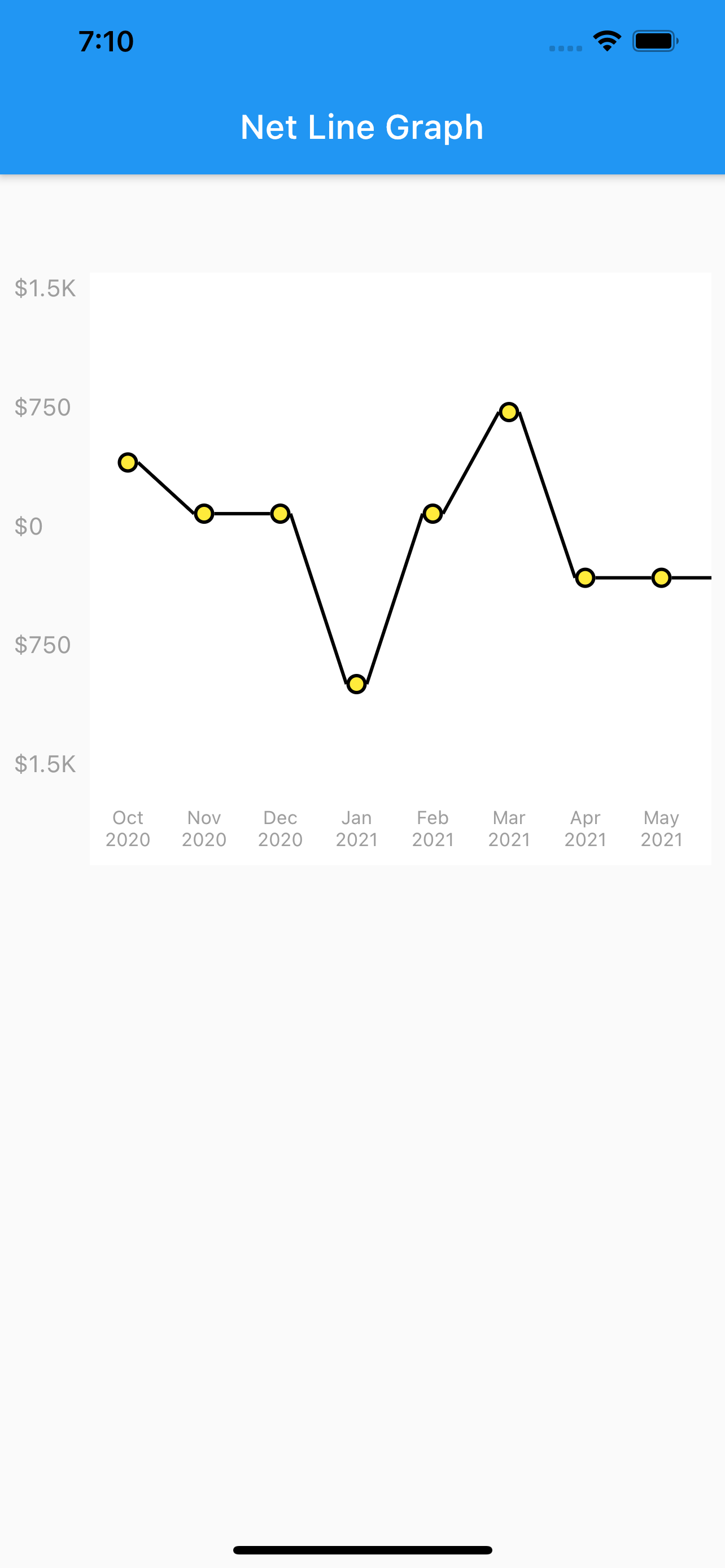
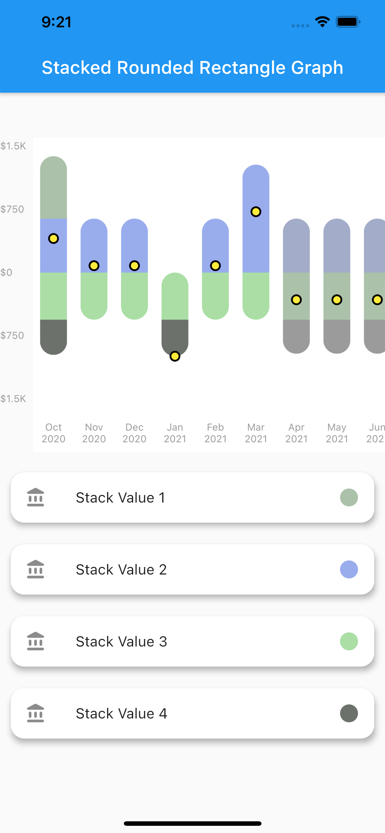
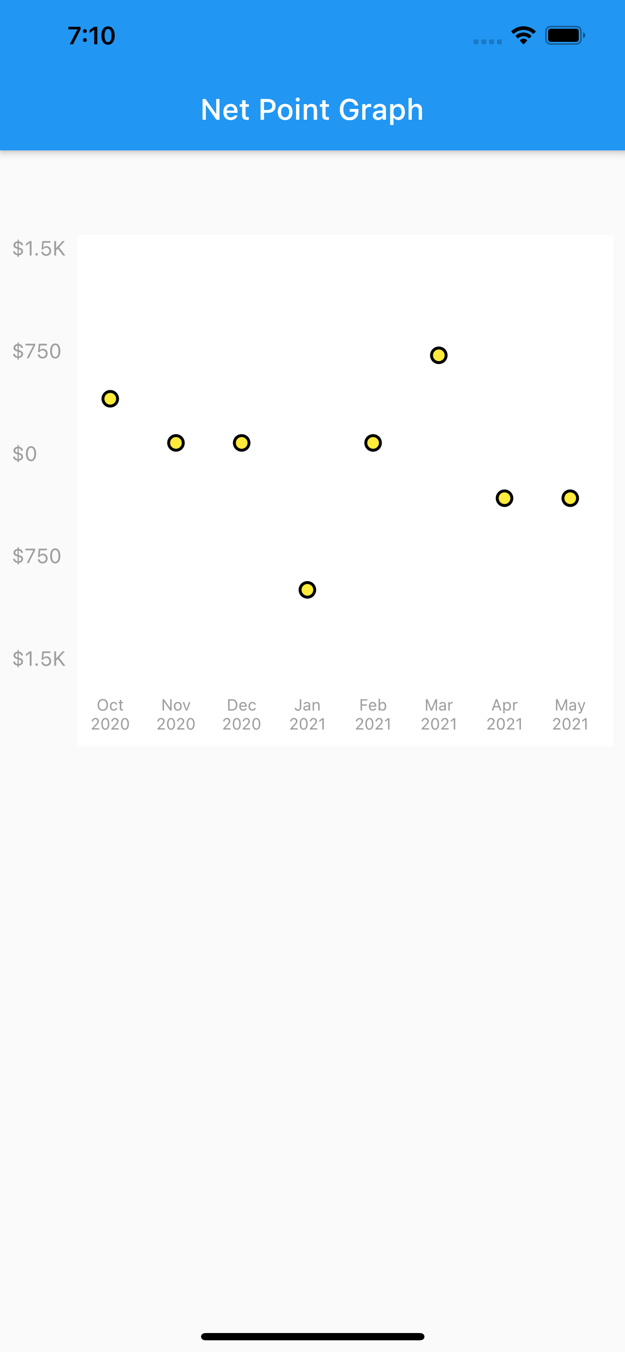
4. Net Point Graph
-
A simple plot of the net values of the data.You can customize the point core and it's outer border using the
netPointparameter. -
To plot this graph pass the
GraphType.StackedRectingraphType. and then pass parameters innetLineto remove the line as shown below
graphType: GraphType.LineGraphnetLine: NetLine(
showPointOnly: true,
showLine: false,
lineColor: Colors.blue,
pointBorderColor: Colors.black,
coreColor: Colors.white,
),
USAGE
class StackedBarGraph extends StatefulWidget {
  StackedBarGraph({Key key}) : super(key: key);

  @override
  _StackedBarGraphState createState() => _StackedBarGraphState();
}

class _StackedBarGraphState extends State<StackedBarGraph> {
  @override
  Widget build(BuildContext context) {
    return Scaffold(
      appBar: AppBar(
        title: Text("Stacked Rounded Rectangle Graph"),
      ),
      body: Column(
        children: [
          SizedBox(
            height: 50,
          ),
          Graph(
            yLabelConfiguration: YLabelConfiguration(
              yLabelStyle: TextStyle(
                color: Colors.grey,
                fontSize: 11,
              ),
              interval: 500,
              labelCount: 5,
              yLabelMapper: (num value) {
                return NumberFormat.compactCurrency(
                        locale: "en", decimalDigits: 0, symbol: "\$")
                    .format(value);
              },
            ),
            xLabelConfiguration: XLabelConfiguration(
              xLabelStyle: TextStyle(
                color: Colors.grey,
                fontSize: 11,
              ),
              xLabelMapper: (DateTime date) {
                return DateFormat("MMM yyyy").format(date);
              },
            ),
            netLine: NetLine(
              showLine: true,
              lineColor: Colors.black,
              pointBorderColor: Colors.black,
              coreColor: Colors.yellow,
            ),
            graphType: GraphType.StackedRounded,
            data: GraphData(
              backgroundColor: Colors.white,
              name: "ThePension",
              bars: [
                GraphBar(
                  month: DateTime(2020, 01),
                  sections: [
                    GraphBarSection(value: 200, color: Colors.pink),
                    GraphBarSection(value: 900, color: Colors.blue),
                    GraphBarSection(value: -200, color: Colors.amber),
                    GraphBarSection(value: -700, color: Colors.purple),
                  ],
                ),
                GraphBar(
                  month: DateTime(2020, 2),
                  sections: [
                    GraphBarSection(value: 300, color: Colors.pink),
                    GraphBarSection(value: 700, color: Colors.blue),
                    GraphBarSection(value: -400, color: Colors.amber),
                    GraphBarSection(value: -600, color: Colors.purple),
                  ],
                ),
                GraphBar(
                  month: DateTime(2020, 3),
                  sections: [
                    GraphBarSection(value: 400, color: Colors.pink),
                    GraphBarSection(value: 700, color: Colors.blue),
                    GraphBarSection(value: -100, color: Colors.amber),
                    GraphBarSection(value: -900, color: Colors.purple),
                  ],
                ),
                GraphBar(
                  month: DateTime(2020, 4),
                  sections: [
                    GraphBarSection(value: 400, color: Colors.pink),
                    GraphBarSection(value: 0, color: Colors.blue),
                    GraphBarSection(value: -800, color: Colors.amber),
                    GraphBarSection(value: -400, color: Colors.purple),
                  ],
                ),
                GraphBar(
                  month: DateTime(2020, 5),
                  sections: [
                    GraphBarSection(value: 700, color: Colors.pink),
                    GraphBarSection(value: 900, color: Colors.blue),
                    GraphBarSection(value: -200, color: Colors.amber),
                    GraphBarSection(value: -100, color: Colors.purple),
                  ],
                ),
                GraphBar(
                  month: DateTime(2020, 6),
                  sections: [
                    GraphBarSection(value: 900, color: Colors.pink),
                    GraphBarSection(value: 900, color: Colors.blue),
                    GraphBarSection(value: -200, color: Colors.amber),
                    GraphBarSection(value: -100, color: Colors.purple),
                  ],
                ),
                GraphBar(
                  month: DateTime(2020, 7),
                  sections: [
                    GraphBarSection(value: 300, color: Colors.pink),
                    GraphBarSection(value: 800, color: Colors.blue),
                    GraphBarSection(value: -200, color: Colors.amber),
                    GraphBarSection(value: -1100, color: Colors.purple),
                  ],
                ),
                GraphBar(
                  month: DateTime(2020, 8),
                  sections: [
                    GraphBarSection(value: 250, color: Colors.pink),
                    GraphBarSection(value: 980, color: Colors.blue),
                    GraphBarSection(value: -210, color: Colors.amber),
                    GraphBarSection(value: -720, color: Colors.purple),
                  ],
                ),
                GraphBar(
                  month: DateTime(2020, 9),
                  sections: [
                    GraphBarSection(value: 300, color: Colors.pink),
                    GraphBarSection(value: 200, color: Colors.blue),
                    GraphBarSection(value: -200, color: Colors.amber),
                    GraphBarSection(value: -400, color: Colors.purple),
                  ],
                ),
                GraphBar(
                  month: DateTime(2020, 10),
                  sections: [
                    GraphBarSection(value: 200, color: Colors.pink),
                    GraphBarSection(value: 900, color: Colors.blue),
                    GraphBarSection(value: -200, color: Colors.amber),
                    GraphBarSection(value: -700, color: Colors.purple),
                  ],
                ),
              ],
            ),
            onBarTapped: (GraphBar bar) {
              print(bar.month);
            },
          ),
        ],
      ),
    );
  }
}