
ChoroPie
version number: 0.0.2 author: Vincent Nikolayev
Overview
A Basemap/Matplotlib toolkit which allows the simplified creation of choropleth maps with colorbars using shapefiles, and the combined plotting of pie charts within the centroid coordinates of the shapefile's polygons.
Requires
- numpy
- pandas
- matplotlib
- basemap
Features:
- Easy choropleth mapping.
- Easy colorbar insertion.
- Plot pie charts at each shp file polygon centroid.
- Visualize extra features using the size of the pie charts, or even size of each pie slice (ie. the length of its radius).
- Limit main axes limits to specific areas (zoom to areas).
- Translate polygons and pie charts with the geographic coordinate system.
- Use offsets on polygons to make slight translations.
- Basemap class inheritance.
- Access matplotlib objects.
Example:
Without size_data:

With size_data:

With size_data and size_ratios:
Installation
To install use pip (not yet):
$ pip install choropie
Or clone the repo:
$ git clone https://github.com/vinceniko/choropie.git
$ python setup.py install
Basic Usage
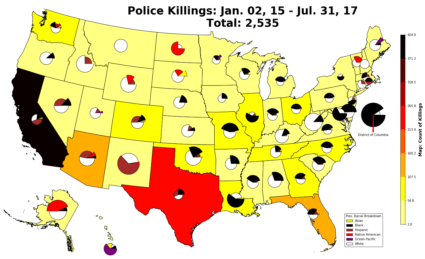
This example uses data taken from https://www.kaggle.com/the-guardian/the-counted and US census data including: population per state, the populations of each race in each state.
*Disclaimer: The colors used to present the racially focused data is not reflective of any kind of idealogy. I realize that some may find the use of these colors to be offensive, but no offense was implied or intended. The chosen colors are merely used to better explain the concepts being introduced in the explanation below.
Code:
from choropie import ChoroPie as cp

# convenience functions for determining which shp attrtibute to use to match with area_name index
shp_file = 'Data/cb_2016_us_state_500k/cb_2016_us_state_500k'  # file path to shp_file sans extension
shp_lst = cp.get_shp_attributes(shp_file)  # extracts shp attrbiutes (same as basemap."area"_info)
shp_key = cp.find_shp_key(df_state['counts'].index, shp_lst)  # determines which shp attribute matches the index of area_names that will be used for the plotting

basemap = dict(
    basemap_kwargs=dict(
        llcrnrlon=-119, llcrnrlat=22, urcrnrlon=-64, urcrnrlat=49, projection='lcc', lat_1=33, lat_2=45, lon_0=-95
    ),
    shp_file='Data/cb_2016_us_state_500k/cb_2016_us_state_500k',
    shp_key='NAME',
    figsize=(22, 12),
    )

choro = dict(
    num_colors=8,
    cmap='hot_r',
    color_data=df_state['counts'],
    )

pie = dict(
    size_data=df_state['per_capita'],
    size_ratios=df_race['per capita'],
    pie_data=df_race['percs'],
    pie_dict={'Asian': 'yellow', 'Black': 'black', 'Hispanic': 'brown',
              'Native American': 'red', 'Ocean Pacific': 'purple', 'White': 'white'},
    scale_factor_size=1,
    scale_factor_ratios=1/2
    )

test = cp.ChoroPie(**basemap)

test.choro_plot(**choro)
test.pie_plot(**pie)

test.insert_colorbar(colorbar_title='Map: Count of Killings', colorbar_loc_kwargs=dict(location='right'))
test.insert_pie_legend(legend_loc='lower right', pie_legend_kwargs=dict(title='Pies: Racial Breakdown'))
Arguments Explained:
Where color_data and size data are Pandas single-index series with the area_names used in the shp file as the index.
Ie.
| area_name | per capita rate |
|---|---|
| alabama | .000010 |
| alaska | .000020 |
| arizona | .000017 |
Where pie_data and size_ratios are Pandas multi-index series with the area_names used in the shp file as the first index, and the pie chart slices (the ones passed into the pie_dict parameter), as the second index. Ie.
| area_name | race | per-race rate |
|---|---|---|
| alabama | black | 0.000919 |
| alabama | white | 0.000188 |
| alaska | black | 0.000338 |
| alaska | native american | 0.001135 |
| alaska | white | 0.000105 |
Notes-
- The ChoroPie class inherits directly from Basemap.
- Pie plotting is optional. If pies are plotted, both size_data and size_ratios are optional. Not all pies have to be plotted as well (if it gets too cluttered...though in that case you can call the zoom_to_area method).
- Choropleth plotting is optional.
- The pie_dict parameter selects the colors for each pie slice.
Results:
By examining these results we can see that:
- California has had the most police killings.
- California has not had the highest per capita rate of police killings, with states such as New Mexico edging out ahead.
- In most states, the race with the most deaths were whites.
- Despite that, in states such as Oklahoma and Missiori, more blacks were killed proportionally when adjusted for the population differences of each race.
Explanation of Other features:


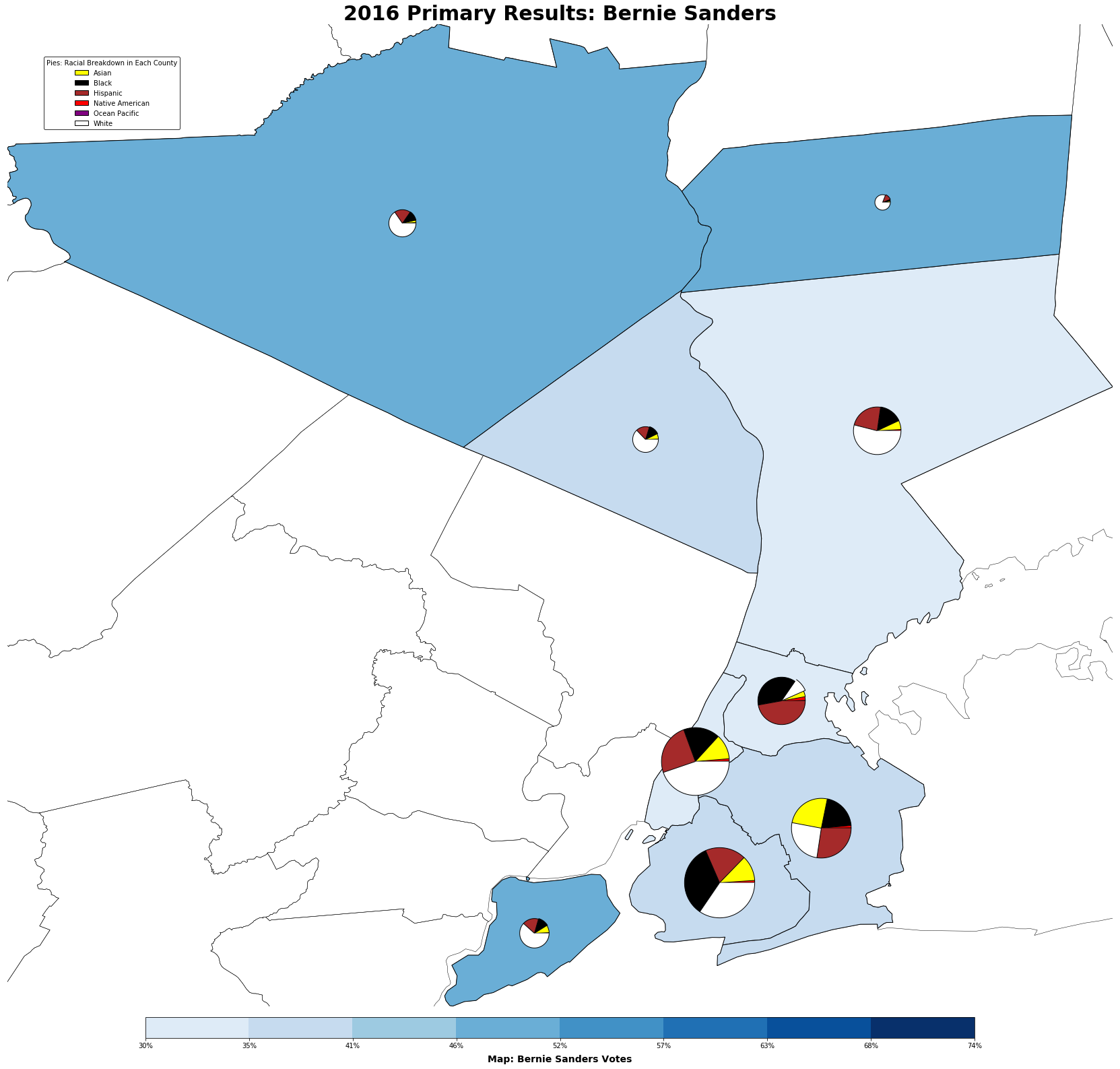
df_state = df_primary[df_primary['state'] == 'New York']
queery = df_state.set_index('county').loc[['Queens', 'Bronx', 'Brooklyn', 'Manhattan', 'Staten Island', 'Rockland', 'Westchester', 'Orange', 'Putnam']]['fips'].unique().astype(int)

test.zoom_to_area([str(num) for num in queery])
- Pass a list of area_names to zoom_to_area to constrain the main axis to the difference between min and max coordinates of those areas (in this case, this method allows us to uncluster the piecharts in the primary results image towards the top of the page). Thereafter, call zoom_home to reset axis limits.
- There are various methods available for translating both polygons and pie charts easily and effectively. (Example. refer to how Hawaii and Alaska are plotted in an aformentioned image).
