@RogerioPradoJ paretochart - rogeriopradoj-paretochart - Fork from @tintrinh
Pareto chart for python 3 (similar to Matlab, but much more flexible) - Fork from @tintrinh.
Features
- Data labels for the chart x-axis.
-
Fully customizable with unique
argandkwarginputs:-
Bar chart: follows the inputs of the matplotlib.pyplot.bar function (use
bar_args=(...)andbar_kw={...}). -
Cumulative line: follows the inputs of the matplotlib.pyplot.plot function (use
line_args=(...)andline_kw={...}). -
Limit line: follows the inputs of the matplotlib.axes.Axes.axhline function (use
limit_kw={...}).
-
Bar chart: follows the inputs of the matplotlib.pyplot.bar function (use
- Put the chart on arbitrary axes.
Examples
First, a simple import::
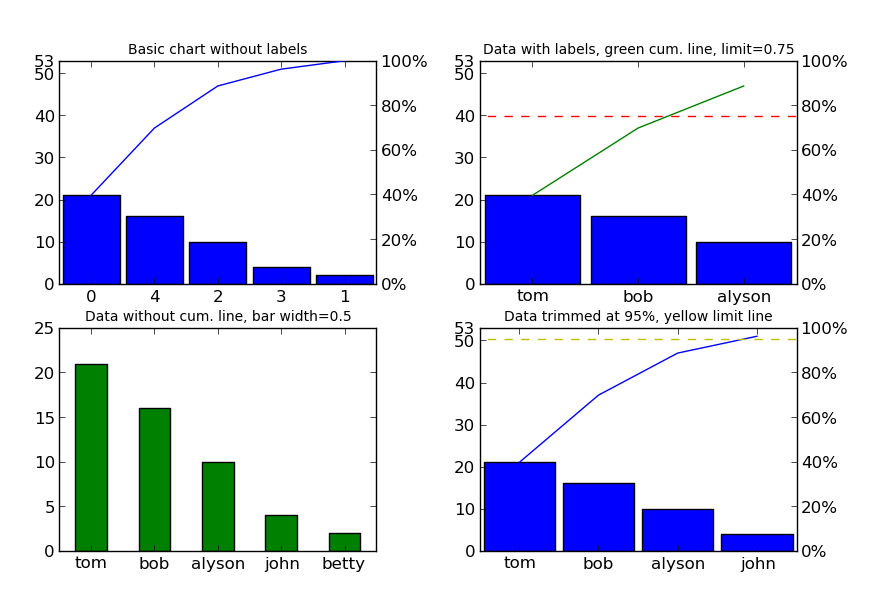
from paretochart.paretochart import paretoNow, let's create the numeric data (no pre-sorting necessary)::
data = [21, 2, 10, 4, 16]We can even assign x-axis labels (in the same order as the data)::
labels = ['tom', 'betty', 'alyson', 'john', 'bob']For this example, we'll create 4 plots that show the customization capabilities::
import matplotlib.pyplot as plt

# create a grid of subplots
fig, axes = plt.subplots(2, 2)
The first plot will be the simplest usage, with just the data::
pareto(data, axes=axes[0, 0])
plt.title('Basic chart without labels', fontsize=10)
In the second plot, we'll add labels, put a cumulative limit at 0.75 (or 75%) and turn the cumulative line green::
pareto(data, labels, axes=axes[0, 1], limit=0.75, line_args=('g',))
plt.title('Data with labels, green cum. line, limit=0.75', fontsize=10)
In the third plot, we'll remove the cumulative line and limit line, make the bars green and resize them to a width of 0.5::
pareto(data, labels, cumplot=False, axes=axes[1, 0], data_kw={'width': 0.5,
    'color': 'g'})
plt.title('Data without cum. line, green bar width=0.5', fontsize=10)
In the fourth plot, let's put the cumulative limit at 95% and make that line yellow::
pareto(data, labels, limit=0.95, axes=axes[1, 1], limit_kw={'color': 'y'})
plt.title('Data trimmed at 95%, yellow limit line', fontsize=10)
And last, but not least, let's show the image::
fig.canvas.set_window_title('Pareto Plot Test Figure')
plt.show()
This should result in the following image (click here if the image doesn't show up):
Installation
Since this is really a single python file, you can simply go to the
GitHub_ page, simply download paretochart.py and put it in
a directory that python can find it.
Alternatively, the file can be installed using::
pip install --upgrade rogeriopradoj-paretochartIf you are using Python2, you can use original @tintrinh's project::
pip install --upgrade paretochartDevelopment and Publishing New Versions
Using knowledge from https://medium.com/@joel.barmettler/how-to-upload-your-python-package-to-pypi-65edc5fe9c56.
- define next version number (try to follow semver 2
- make the changes in codebase
- update
setup.py:- version
- download_url
- update
README.md:- pareto_plot_test_figure url
- commit, tag, and push to git central repo
- create a source distribution, and validate it:
python setup.py sdisttwine check dist/*
- upload the source to PyPi:
twine upload dist/*