RailsBootstrapForm

rails_bootstrap_form is a Rails form builder that makes it super easy to integrate Bootstrap 5 forms into your Rails application.
rails_bootstrap_form's form helpers generate the form field and its label along with all the Bootstrap mark-up required for proper Bootstrap display.
Minimum Requirements
- Ruby 3.2.2+ (https://www.ruby-lang.org/en/downloads/branches/)
- Rails 7.0+ (https://guides.rubyonrails.org/maintenance_policy.html)
- Bootstrap 5.0+ (https://getbootstrap.com/docs/versions/)
Installation
Install Bootstrap 5. There are many ways to do this, depending on the asset pipeline you're using in your Rails application.
One way is to use the gem that works with Sprockets. To do so, in a brand new Rails 7.0 application created without the
--webpacker option, add the bootstrap gem to your Gemfile:
gem "bootstrap", "~> 5.0"And follow the remaining instructions in the official bootstrap installation guide
for setting up application.scss and application.js.
Add the rails_bootstrap_form gem to your Gemfile:
gem "rails_bootstrap_form", "~> 0.9.8"Then:
bundle install
Depending on which CSS pre-processor you are using, adding the bootstrap form styles differs slightly.
If you use Rails in the default mode without any pre-processor, you'll have to add the following line to your application.css file:
*= require rails_bootstrap_formIf you followed the official bootstrap installation guide,
you'll probably have switched to SCSS. In this case add the following line to your application.scss:
@import "rails_bootstrap_form";Configuration
rails_bootstrap_form can be used without any configuration. However, rails_bootstrap_form does have an optional configuration file at config/initializers/rails_bootstrap_form.rb for setting options that affect all generated forms in an application. This configuration file is created using the generator
by running the command:
$ rails generate rails_bootstrap_form:install
Example:
# config/initializers/rails_bootstrap_form.rb
RailsBootstrapForm.configure do |config|
  # to make forms non-compliant with W3C.
  config.default_form_attributes = {novalidate: true}
end
The current configuration options are:
| Option | Default value | Description |
|---|---|---|
default_form_attributes |
Set this option to {novalidate: true} to instruct rails_bootstrap_form to skip all HTML 5 validation. |
Usage
bootstrap_form_for
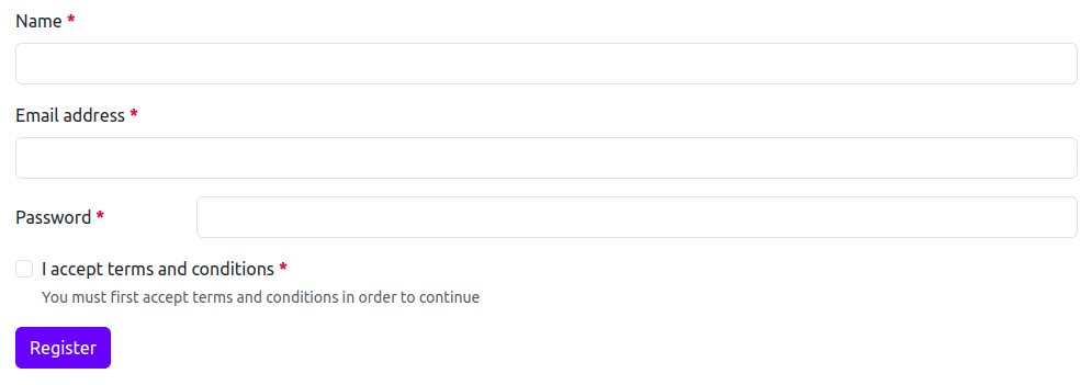
To get started, use the bootstrap_form_for helper in place of the Rails form_for helper. Here's an example:

<%= bootstrap_form_for(@user) do |f| %>
  <%= f.email_field :email %>
  <%= f.password_field :password %>
  <%= f.check_box :remember_me %>
  <%= f.primary "Log In" %>
<% end %>
This generates the following HTML:
<form novalidate="novalidate" class="new_user" id="new_user" action="/users" accept-charset="UTF-8" method="post">
  <div class="mb-3">
    <label class="form-label required" for="user_email">Email address</label>
    <input class="form-control" aria-required="true" required="required" type="email" name="user[email]" id="user_email">
  </div>
  <div class="mb-3">
    <label class="form-label required" for="user_password">Password</label>
    <input class="form-control" aria-required="true" required="required" type="password" name="user[password]" id="user_password">
  </div>
  <div class="mb-3">
    <div class="form-check">
      <input class="form-check-input" type="checkbox" value="1" name="user[terms]" id="user_terms">
      <label class="form-check-label" for="user_terms">I accept terms and conditions</label>
      <div class="form-text text-muted">You must first accept terms and conditions in order to continue</div>
    </div>
  </div>
  <input type="submit" name="commit" value="Log In" class="btn btn-primary" data-disable-with="Log In">
</form>
bootstrap_form_with
To get started, use the bootstrap_form_with helper in place of the Rails form_with helper. Here's an example:

<%= bootstrap_form_with(model: @user) do |f| %>
  <%= f.email_field :email %>
  <%= f.password_field :password %>
  <%= f.check_box :remember_me %>
  <%= f.primary "Log In" %>
<% end %>
This generates the following HTML:
<form novalidate="novalidate" class="new_user" id="new_user" action="/users" accept-charset="UTF-8" method="post">
  <div class="mb-3">
    <label class="form-label required" for="user_email">Email address</label>
    <input class="form-control" aria-required="true" required="required" type="email" name="user[email]" id="user_email">
  </div>
  <div class="mb-3">
    <label class="form-label required" for="user_password">Password</label>
    <input class="form-control" aria-required="true" required="required" type="password" name="user[password]" id="user_password">
  </div>
  <div class="mb-3">
    <div class="form-check">
      <input class="form-check-input" type="checkbox" value="1" name="user[terms]" id="user_terms">
      <label class="form-check-label" for="user_terms">I accept terms and conditions</label>
      <div class="form-text text-muted">You must first accept terms and conditions in order to continue</div>
    </div>
  </div>
  <input type="submit" name="commit" value="Log In" class="btn btn-primary" data-disable-with="Log In">
</form>
Bootstrap Configuration Options
Here's a list of all possible options you can pass via bootstrap option that can be attached to the bootstrap_form_for, bootstrap_form_with, fields_for, or any field helpers inside of it:
| Option | Description | Default value |
|---|---|---|
disabled |
An option to disable rails_bootstrap_form helpers. Default rails form builder element is rendered when set to true
|
false |
layout |
Controls layout of form and field helpers. It can be vertical horizontal, or inline. |
vertical |
field_class |
A CSS class that will be applied to all form fields. | nil |
help_text |
Describes help text for the HTML field. Help text is automatically read from translation file. If you want to customize it, you can pass a string. You can also set it false if you do not want help text displayed. |
nil |
label_text |
An option to customize automatically generated label text. | nil |
skip_label |
An option to control whether the label is to be displayed or not. | false |
hide_label |
An option to control whether the label is only accessible to a screen readers. | false |
hide_class |
A CSS class that will be used when the label is only accessible to a screen readers. | visually-hidden |
label_class |
A CSS class that will be applied to all labels when layout is vertical. |
form-label |
additional_label_class |
An additional CSS class that will be added along with the existing label css classes. | nil |
prepend |
Raw or HTML content to be prepended to the field. | nil |
append |
Raw or HTML content to be appended to the field. | nil |
additional_input_group_class |
An additional CSS class that will be added to existing input group wrapper css classes. | nil |
floating |
An option to control whether the field should have a floating label. | false |
static_field_class |
A CSS class that will be applied to all static fields. | form-control-plaintext |
switch |
An option to control whether the check box should look like Bootstrap switches. | false |
wrapper |
An option to control the HTML attributes and options that will be added to a field wrapper. You can set it false if you don't the field to be rendered in a wrapper. | {} |
size |
An option to control the size of input groups, buttons, labels, and fields. It can be sm or lg. |
nil |
inline |
An option to group checkboxes and radio buttons on the same horizontal row. If form layout is inline, this option doesn't get considered. |
false |
label_col_class |
A CSS class that will be applied to all labels when layout is horizontal. |
col-form-label |
label_col_wrapper_class |
A CSS class for label column when layout is horizontal. |
col-sm-2 |
field_col_wrapper_class |
A CSS class for field column when layout is horizontal. |
col-sm-10 |
render_as_button |
An option to render submit button using <button type="submit"> instead of <input type="submit">. |
false |
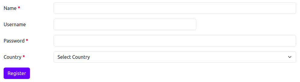
Options defined on the form level will apply to all field helpers. Options defined on field helpers takes precedence over form-level options. Here's an example of a form where one field uses different layout:
<%= bootstrap_form_for @user do |form| %>
  <%= form.text_field :name %>
  <%= form.email_field :email %>
  <%= form.password_field :password, bootstrap: {layout: :horizontal} %>
  <%= form.check_box :terms %>
  <%= form.primary "Register" %>
<% end %>
This generates the following HTML:
<form novalidate="novalidate" class="new_user" id="new_user" action="/users" accept-charset="UTF-8" method="post">
  <div class="mb-3">
    <label class="form-label required" for="user_name">Name</label>
    <input class="form-control" aria-required="true" required="required" type="text" name="user[name]" id="user_name">
  </div>
  <div class="mb-3">
    <label class="form-label required" for="user_email">Email address</label>
    <input class="form-control" aria-required="true" required="required" type="email" name="user[email]" id="user_email">
  </div>
  <div class="row mb-3">
    <label class="col-form-label col-sm-2 required" for="user_password">Password</label>
    <div class="col-sm-10">
      <input class="form-control" aria-required="true" required="required" type="password" name="user[password]" id="user_password">
    </div>
  </div>
  <div class="mb-3">
    <div class="form-check">
      <input class="form-check-input" type="checkbox" value="1" name="user[terms]" id="user_terms">
      <label class="form-check-label" for="user_terms">I accept terms and conditions</label>
      <div class="form-text text-muted">You must first accept terms and conditions in order to continue</div>
    </div>
  </div>
  <input type="submit" name="commit" value="Register" class="btn btn-primary" data-disable-with="Register">
</form>
Disabling Bootstrap
You can completely disable bootstrap and use default form builder by passing disabled: true option. For example:
<%= form.text_field :username, bootstrap: {disabled: true} %>This generates the following HTML:
<input type="text" name="user[username]" id="user_username">Disabling wrapper
In some cases, you may need to disable the default wrapper. You can do this by passing wrapper: false option:

<%= form.text_field :name, bootstrap: {wrapper: false} %>This generates the following HTML:
<label class="form-label required" for="user_name">Name</label>
<input class="form-control" aria-required="true" required="required" type="text" name="user[name]" id="user_name">
Add additional CSS class
You can use additional_field_class option at form or field level to add extra CSS classes to the fields.
<%= form.text_field :name, autocomplete: "new-name", bootstrap: {additional_field_class: "custom-class"} %>This generates the following HTML:
<div class="mb-3">
  <label class="form-label required" for="user_name">Name</label>
  <input autocomplete="new-name" class="form-control custom-class" aria-required="true" required="required" type="text" name="user[name]" id="user_name">
</div>
You can also use HTML class attribute to add additional CSS class to the single field:
<%= form.text_field :name, autocomplete: "new-name", class: "custom-class" %>This generates the following HTML:
<div class="mb-3">
  <label class="form-label required" for="user_name">Name</label>
  <input autocomplete="new-name" class="form-control custom-class" aria-required="true" required="required" type="text" name="user[name]" id="user_name">
</div>
Here additional_field_class option takes precedance over HTML class attribute:
<%= form.text_field :name, autocomplete: "new-name", bootstrap: {additional_field_class: "custom-class"}, class: "html-class" %>This generates the following HTML:
<div class="mb-3">
  <label class="form-label required" for="user_name">Name</label>
  <input autocomplete="new-name" class="form-control custom-class" aria-required="true" required="required" type="text" name="user[name]" id="user_name">
</div>
Supported Form Helpers
This gem wraps most of the form field helpers. Here's the current list:
check_box                    collection_check_boxes       collection_radio_buttons
collection_select            color_field                  date_field
date_select                  datetime_field               datetime_local_field
datetime_select              email_field                  file_field
grouped_collection_select    hidden_field                 month_field
number_field                 password_field               phone_field
radio_button                 range_field                  rich_text_area
search_field                 select                       static_field
telephone_field              text_area                    text_field
time_field                   time_select                  time_zone_select
url_field                    week_field                   weekday_select
Supported Form Layouts
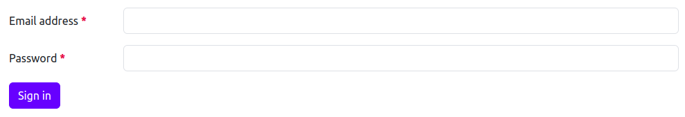
Vertical Layout
This layout is default layout for the form in which labels are above the fields. In this layout, labels and fields take 100% of the width.
Here's an example of how it looks like:

<%= bootstrap_form_for @user do |form| %>
  <%= form.email_field :email %>
  <%= form.password_field :password %>
  <%= form.primary "Sign in" %>
<% end %>
This generates the following HTML:
<form novalidate="novalidate" class="new_user" id="new_user" action="/users" accept-charset="UTF-8" method="post">
  <div class="mb-3">
    <label class="form-label required" for="user_email">Email address</label>
    <input class="form-control" aria-required="true" required="required" type="email" name="user[email]" id="user_email">
  </div>
  <div class="mb-3">
    <label class="form-label required" for="user_password">Password</label>
    <input class="form-control" aria-required="true" required="required" type="password" name="user[password]" id="user_password">
  </div>
  <input type="submit" name="commit" value="Sign in" class="btn btn-primary" data-disable-with="Sign in">
</form>
Horizontal Layout
If you want to align label and field side by side, you can use horizontal layout for the form.
You can optionally override label_col_wrapper_class and field_col_wrapper_class (they default to col-sm-2 and col-sm-10) at either form level
or field level if want to customize space between label and field.
Here's an example of how it looks like by default:
<%= bootstrap_form_for @user, bootstrap: {layout: :horizontal} do |form| %>
  <%= form.email_field :email %>
  <%= form.password_field :password %>
  <%= form.primary "Sign in" %>
<% end %>
This generates the following HTML:
<form novalidate="novalidate" class="new_user" id="new_user" action="/users" accept-charset="UTF-8" method="post">
  <div class="row mb-3">
    <label class="col-form-label col-sm-2 required" for="user_email">Email address</label>
    <div class="col-sm-10">
      <input class="form-control" aria-required="true" required="required" type="email" name="user[email]" id="user_email">
    </div>
  </div>
  <div class="row mb-3">
    <label class="col-form-label col-sm-2 required" for="user_password">Password</label>
    <div class="col-sm-10">
      <input class="form-control" aria-required="true" required="required" type="password" name="user[password]" id="user_password">
    </div>
  </div>
  <input type="submit" name="commit" value="Sign in" class="btn btn-primary" data-disable-with="Sign in">
</form>
The label_col_wrapper_class and field_col_wrapper_class css classes can also be customized per control:
<%= bootstrap_form_for @user, bootstrap: {layout: :horizontal} do |form| %>
  <%= form.text_field :name %>
  <%= form.email_field :username, bootstrap: {label_col_wrapper_class: "col-sm-2", field_col_wrapper_class: "col-sm-6"} %>
  <%= form.password_field :password %>
  <%= form.fields_for :address, include_id: false do |address_form| %>
    <%= address_form.select :country_id, options_for_select(::Country.pluck(:name, :id), address_form.object.country_id),
        {include_blank: "Select Country"} %>
  <% end %>
  <%= form.primary "Register" %>
<% end %>
This generates the following HTML:
<form novalidate="novalidate" class="new_user" id="new_user" action="/users" accept-charset="UTF-8" method="post">
  <div class="row mb-3">
    <label class="col-form-label col-sm-2 required" for="user_name">Name</label>
    <div class="col-sm-10">
      <input class="form-control" aria-required="true" required="required" type="text" name="user[name]" id="user_name">
    </div>
  </div>
  <div class="row mb-3">
    <label class="col-form-label col-sm-2" for="user_username">Username</label>
    <div class="col-sm-6">
      <input class="form-control" type="email" name="user[username]" id="user_username">
    </div>
  </div>
  <div class="row mb-3">
    <label class="col-form-label col-sm-2 required" for="user_password">Password</label>
    <div class="col-sm-10">
      <input class="form-control" aria-required="true" required="required" type="password" name="user[password]" id="user_password">
    </div>
  </div>
  <div class="row mb-3">
    <label class="col-form-label col-sm-2 required" for="user_address_attributes_country_id">Country</label>
    <div class="col-sm-10">
      <select class="form-select" aria-required="true" required="required" name="user[address_attributes][country_id]" id="user_address_attributes_country_id">
        <option value="">Select Country</option>
        <option value="1">India</option>
        <option value="2">Ireland</option>
        <option value="3">United States</option>
        <option value="4">United Kingdom</option>
      </select>
    </div>
  </div>
  <input type="submit" name="commit" value="Register" class="btn btn-primary" data-disable-with="Register">
</form>
Inline Layout
You may choose to render form elements in one line. Please note that this layout won't render all form elements perfectly. Things like errors messages and help text won't show up right.
Here's an example of how it looks like:

<%= bootstrap_form_for @user, bootstrap: {layout: :inline} do |form| %>
  <%= form.email_field :email %>
  <%= form.password_field :password %>
  <%= form.primary "Sign in" %>
<% end %>
This generates the following HTML:
<form novalidate="novalidate" class="new_user row row-cols-lg-auto g-3 align-items-center" id="new_user" action="/users" accept-charset="UTF-8" method="post">
  <div class="col-12">
    <label class="form-label visually-hidden required" for="user_email">Email address</label>
    <input class="form-control" aria-required="true" required="required" placeholder="Email address" type="email" name="user[email]" id="user_email">
  </div>
  <div class="col-12">
    <label class="form-label visually-hidden required" for="user_password">Password</label>
    <input class="form-control" aria-required="true" required="required" placeholder="Password" type="password" name="user[password]" id="user_password">
  </div>
  <div class="col-12">
    <input type="submit" name="commit" value="Sign in" class="btn btn-primary" data-disable-with="Sign in">
  </div>
</form>
Components
rails_bootstrap_form internally supports below components which act as helpers to build fields and their wrappers.
Labels
By default, Rails takes label text from locale file. You can use label_text option to change label text
generated by the Rails.

<%= form.password_field :password, bootstrap: {label_text: "New password"} %>This generates the following HTML:
<div class="mb-3">
  <label class="form-label required" for="user_password">New password</label>
  <input class="form-control" aria-required="true" required="required" type="password" name="user[password]" id="user_password">
</div>
To hide a label, you can set hide_label: true option. This adds the visually-hidden class, which keeps your labels accessible
to those using screen readers.

<%= form.password_field :password, bootstrap: {hide_label: true} %>This generates the following HTML:
<div class="mb-3">
  <label class="form-label visually-hidden required" for="user_password">Password</label>
  <input class="form-control" aria-required="true" required="required" type="password" name="user[password]" id="user_password">
</div>
To skip a label, you can set skip_label: true option. This will not render label in a field wrapper.

<%= form.password_field :password, bootstrap: {skip_label: true} %>This generates the following HTML:
<div class="mb-3">
  <input class="form-control" aria-required="true" required="required" type="password" name="user[password]" id="user_password">
</div>
To add additional CSS class to the label, you can use additional_label_class option.

<%= form.password_field :password, bootstrap: {additional_label_class: "text-danger"} %>This generates the following HTML:
<div class="mb-3">
  <label class="form-label text-danger required" for="user_password">Password</label>
  <input class="form-control" aria-required="true" required="required" type="password" name="user[password]" id="user_password">
</div>
Help Text
The help text is useful when you want to provide helpful information about a field. By default, rails_bootstrap_form takes help text from locale file.
If you want to show information regarding any field, you need to add it in locale file of your application. You can also use HTML content for help text.
en:
  activerecord:
    help_texts:
      user:
        password: "A strong password should be at least twelve characters long with combination of uppercase letters, lowercase letters, numbers, and symbols"
<%= form.password_field :password %>This generates the following HTML:
<div class="mb-3">
  <label class="form-label required" for="user_password">Password</label>
  <input class="form-control" aria-required="true" required="required" type="password" name="user[password]" id="user_password">
  <div class="form-text text-muted">A strong password should be at least twelve characters long with combination of uppercase letters, lowercase letters, numbers, and symbols</div>
</div>
You can customize the help text using help_text option:

<%= form.password_field :password, bootstrap: {help_text: "Password should not be disclosed to anyone."} %>This generates the following HTML:
<div class="mb-3">
  <label class="form-label required" for="user_password">Password</label>
  <input class="form-control" aria-required="true" required="required" type="password" name="user[password]" id="user_password">
  <div class="form-text text-muted">Password should not be disclosed to anyone.</div>
</div>
You can also disable help text by setting help_text: false option:

<%= form.password_field :password, help_text: false %>This generates the following HTML:
<div class="mb-3">
  <label class="form-label required" for="user_password">Password</label>
  <input class="form-control" aria-required="true" required="required" type="password" name="user[password]" id="user_password">
</div>
Input Groups
Input groups allow prepending and appending arbitrary html or text to the field.
You can use prepend and/or append options to attach addons to input fields:

<%= form.number_field :expected_ctc, bootstrap: {prepend: "₹", append: ".00"} %>This generates the following HTML:
<div class="mb-3">
  <label class="form-label" for="user_expected_ctc">Expected CTC</label>
  <div class="input-group">
    <span class="input-group-text">₹</span>
    <input class="form-control" type="number" name="user[expected_ctc]" id="user_expected_ctc">
    <span class="input-group-text">.00</span>
  </div>
</div>
If you want to attach multiple addons to the input, pass them as an array:

<%= form.number_field :expected_ctc, bootstrap: {prepend: ["Gross", "₹"], append: [".00", "per annum"]} %>This generates the following HTML:
<div class="mb-3">
  <label class="form-label" for="user_expected_ctc">Expected CTC</label>
  <div class="input-group">
    <span class="input-group-text">Gross</span>
    <span class="input-group-text">₹</span>
    <input class="form-control" type="number" name="user[expected_ctc]" id="user_expected_ctc">
    <span class="input-group-text">.00</span>
    <span class="input-group-text">per annum</span>
  </div>
</div>
You can also prepend and append buttons. Note that these buttons must contain the btn class to generate the correct markup.

<%= form.text_field :search, bootstrap: {append: form.secondary("Search")} %>This generates the following HTML:
<div class="mb-3">
  <label class="form-label" for="user_search">Search</label>
  <div class="input-group">
    <input class="form-control" type="text" name="user[search]" id="user_search">
    <input type="submit" name="commit" value="Search" class="btn btn-secondary" data-disable-with="Search">
  </div>
</div>
To add additional CSS class to the input group wrapper, you can use additional_input_group_class option.

<%= form.number_field :expected_ctc, bootstrap: {prepend: "₹", append: ".00", additional_input_group_class: "custom-class"} %>This generates the following HTML:
<div class="mb-3">
  <label class="form-label" for="user_expected_ctc">Expected CTC</label>
  <div class="input-group custom-class">
    <span class="input-group-text">₹</span>
    <input class="form-control" type="number" name="user[expected_ctc]" id="user_expected_ctc">
    <span class="input-group-text">.00</span>
  </div>
</div>
You can customize size of the input group using size option. Input group supports sm and lg values.

<%= form.number_field :expected_ctc, bootstrap: {prepend: "₹", append: ".00", size: :sm} %>This generates the following HTML:
<div class="mb-3">
  <label class="form-label" for="user_expected_ctc">Expected CTC</label>
  <div class="input-group input-group-sm">
    <span class="input-group-text">₹</span>
    <input class="form-control form-control-sm" type="number" name="user[expected_ctc]" id="user_expected_ctc">
    <span class="input-group-text">.00</span>
  </div>
</div>
Form Helpers
Our form helpers accept the same arguments as the default Rails form helpers.
In order to apply addition options of rails_bootstrap_form, bootstrap object is passed in options argument of the helper.
Here's an example of how you pass the arguments for each form helper:
check_box
Our check_box helper accepts the same arguments as the default Rails helper.
except it don't accept a block as an argument and renders check box and label for you.

<%= form.check_box :remember_me %>This generates the following HTML:
<div class="mb-3">
  <div class="form-check">
    <input class="form-check-input" type="checkbox" value="1" name="user[remember_me]" id="user_remember_me">
    <label class="form-check-label" for="user_remember_me">Keep me signed in</label>
  </div>
</div>
You can set switch: true option if you want check box to look like switches.

<%= form.check_box :remember_me, bootstrap: {switch: true} %>This generates the following HTML:
<div class="mb-3">
  <div class="form-check form-switch">
    <input class="form-check-input" type="checkbox" value="1" name="user[remember_me]" id="user_remember_me">
    <label class="form-check-label" for="user_remember_me">Keep me signed in</label>
  </div>
</div>
This helper also renders help text if help_text option is set or information of the field is added to the locale file:

<%= form.check_box :terms, required: true %>This generates the following HTML:
<div class="mb-3">
  <div class="form-check">
    <input required="required" class="form-check-input" type="checkbox" value="1" name="user[terms]" id="user_terms">
    <label class="form-check-label required" for="user_terms">I accept terms and conditions</label>
    <div class="form-text text-muted">You must first accept terms and conditions in order to continue</div>
  </div>
</div>
color_field
Our color_field helper accepts the same arguments as the default Rails helper.

<%= form.color_field :favorite_color %>This generates the following HTML:
<div class="mb-3">
  <label class="form-label required" for="user_favorite_color">Favorite color</label>
  <input class="form-control form-control-color" aria-required="true" required="required" value="#000000" type="color" name="user[favorite_color]" id="user_favorite_color">
</div>
date_field
Our date_field helper accepts the same arguments as the default Rails helper.

<%= form.date_field :interview_date %>This generates the following HTML:
<div class="mb-3">
  <label class="form-label" for="user_interview_date">Interview date</label>
  <input class="form-control" value="2023-05-08" type="date" name="user[interview_date]" id="user_interview_date">
</div>
datetime_field
Our datetime_field helper accepts the same arguments as the default Rails helper.

<%= form.datetime_field :interview_datetime %>This generates the following HTML:
<div class="mb-3">
<label class="form-label" for="user_interview_datetime">Interview date & time</label>
<input class="form-control" type="datetime-local" name="user[interview_datetime]" id="user_interview_datetime">
</div>datetime_local_field
Our datetime_local_field helper accepts the same arguments as the default Rails helper.

<%= form.datetime_local_field :interview_datetime %>This generates the following HTML:
<div class="mb-3">
<label class="form-label" for="user_interview_datetime">Interview date & time</label>
<input class="form-control" type="datetime-local" name="user[interview_datetime]" id="user_interview_datetime">
</div>email_field
Our email_field helper accepts the same arguments as the default Rails helper.

<%= form.email_field :email %>This generates the following HTML:
<div class="mb-3">
  <label class="form-label required" for="user_email">Email address</label>
  <input class="form-control" aria-required="true" required="required" type="email" name="user[email]" id="user_email">
</div>
fields_for
Our fields_for helper accepts the same arguments as the default Rails helper.
rails_bootstrap_form allows us to set bootstrap option just like bootstrap_form_for and bootstrap_form_with. By setting this option on fields_for, it applies to all the fields defined for that nested form:
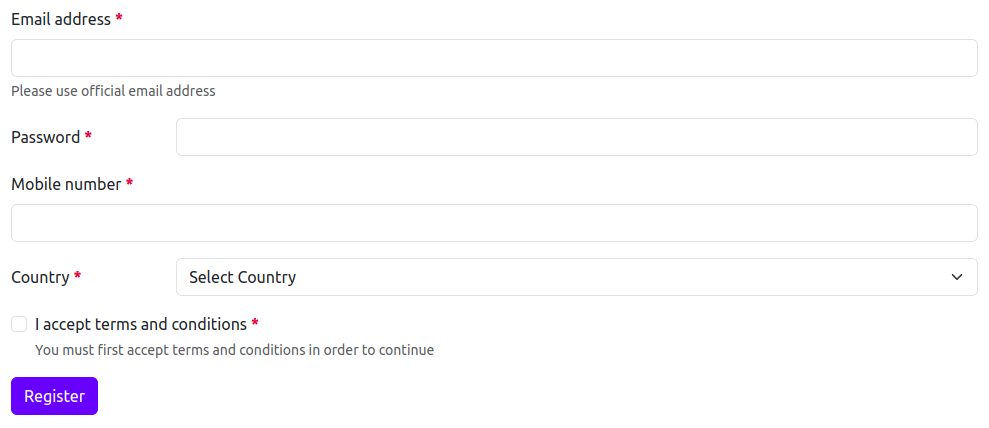
<%= bootstrap_form_for @user do |form| %>
  <%= form.email_field :email, autocomplete: "new-email" %>
  <%= form.password_field :password, autocomplete: "new-password", bootstrap: {layout: :horizontal} %>
  <%= form.phone_field :mobile_number %>
  <%= form.fields_for :address, include_id: false, bootstrap: {layout: :horizontal} do |address_form| %>
    <%= address_form.select :country_id, options_for_select(::Country.pluck(:name, :id), address_form.object.country_id),
        {include_blank: "Select Country"} %>
  <% end %>
  <%= form.check_box :terms, required: true %>
  <%= form.primary "Register" %>
<% end %>
This generates the following HTML:
<form novalidate="novalidate" class="new_user" id="new_user" action="/users" accept-charset="UTF-8" method="post">
  <div class="mb-3">
    <label class="form-label required" for="user_email">Email address</label>
    <input autocomplete="new-email" class="form-control" aria-required="true" required="required" type="email" name="user[email]" id="user_email">
    <div class="form-text text-muted">Please use official email address</div>
  </div>
  <div class="row mb-3">
    <label class="col-form-label col-sm-2 required" for="user_password">Password</label>
    <div class="col-sm-10">
      <input autocomplete="new-password" class="form-control" aria-required="true" required="required" type="password" name="user[password]" id="user_password">
    </div>
  </div>
  <div class="mb-3">
    <label class="form-label required" for="user_mobile_number">Mobile number</label>
    <input class="form-control" aria-required="true" required="required" type="tel" name="user[mobile_number]" id="user_mobile_number">
  </div>
  <div class="row mb-3">
    <label class="col-form-label col-sm-2 required" for="user_address_attributes_country_id">Country</label>
    <div class="col-sm-10">
      <select class="form-select" aria-required="true" required="required" name="user[address_attributes][country_id]" id="user_address_attributes_country_id">
        <option value="">Select Country</option>
        <option value="1">India</option>
        <option value="2">Ireland</option>
        <option value="3">United States</option>
        <option value="4">United Kingdom</option>
        <option value="5">Spain</option>
        <option value="6">France</option>
        <option value="7">Canada</option>
      </select>
    </div>
  </div>
  <div class="mb-3">
    <div class="form-check">
      <input required="required" class="form-check-input" type="checkbox" value="1" name="user[terms]" id="user_terms">
      <label class="form-check-label required" for="user_terms">I accept terms and conditions</label>
      <div class="form-text text-muted">You must first accept terms and conditions in order to continue</div>
    </div>
  </div>
  <input type="submit" name="commit" value="Register" class="btn btn-primary" data-disable-with="Register">
</form>
By setting bootstrap option on bootstrap_form_for or bootstrap_form_with, this option also applies to all the fields defined in fields_for block:

<%= bootstrap_form_for @user, bootstrap: {layout: :horizontal} do |form| %>
  <%= form.email_field :email, autocomplete: "new-email" %>
  <%= form.password_field :password, autocomplete: "new-password" %>
  <%= form.phone_field :mobile_number %>
  <%= form.fields_for :address, include_id: false do |address_form| %>
    <%= address_form.select :country_id, options_for_select(::Country.pluck(:name, :id), address_form.object.country_id),
        {include_blank: "Select Country"} %>
  <% end %>
  <%= form.check_box :terms, required: true %>
  <%= form.primary "Register" %>
<% end %>
This generates the following HTML:
<form novalidate="novalidate" class="new_user" id="new_user" action="/users" accept-charset="UTF-8" method="post">
  <div class="row mb-3">
    <label class="col-form-label col-sm-2 required" for="user_email">Email address</label>
    <div class="col-sm-10">
      <input autocomplete="new-email" class="form-control" aria-required="true" required="required" type="email" name="user[email]" id="user_email">
      <div class="form-text text-muted">Please use official email address</div>
    </div>
  </div>
  <div class="row mb-3">
    <label class="col-form-label col-sm-2 required" for="user_password">Password</label>
    <div class="col-sm-10">
      <input autocomplete="new-password" class="form-control" aria-required="true" required="required" type="password" name="user[password]" id="user_password">
    </div>
  </div>
  <div class="row mb-3">
    <label class="col-form-label col-sm-2 required" for="user_mobile_number">Mobile number</label>
    <div class="col-sm-10">
      <input class="form-control" aria-required="true" required="required" type="tel" name="user[mobile_number]" id="user_mobile_number">
    </div>
  </div>
  <div class="row mb-3">
    <label class="col-form-label col-sm-2 required" for="user_address_attributes_country_id">Country</label>
    <div class="col-sm-10">
      <select class="form-select" aria-required="true" required="required" name="user[address_attributes][country_id]" id="user_address_attributes_country_id">
        <option value="">Select Country</option>
        <option value="1">India</option>
        <option value="2">Ireland</option>
        <option value="3">United States</option>
        <option value="4">United Kingdom</option>
        <option value="5">Spain</option>
        <option value="6">France</option>
        <option value="7">Canada</option>
      </select>
    </div>
  </div>
  <div class="row mb-3">
    <div class="col-sm-10 offset-sm-2">
      <div class="form-check">
        <input name="user[terms]" type="hidden" value="0" autocomplete="off">
        <input required="required" class="form-check-input" type="checkbox" value="1" name="user[terms]" id="user_terms">
        <label class="form-check-label required" for="user_terms">I accept terms and conditions</label>
        <div class="form-text text-muted">You must first accept terms and conditions in order to continue</div>
      </div>
    </div>
  </div>
  <input type="submit" name="commit" value="Register" class="btn btn-primary" data-disable-with="Register">
</form>
Options specified at the field level take precedence over those specified at the fields_for level, which take precedence over those specified at the form level.
file_field
Our file_field helper accepts the same arguments as the default Rails helper.

<%= form.file_field :avatar %>This generates the following HTML:
<div class="mb-3">
  <label class="form-label" for="user_avatar">Avatar</label>
  <input class="form-control" type="file" name="user[avatar]" id="user_avatar">
</div>
hidden_field
The hidden_field helper in rails_bootstrap_form calls the default Rails helper directly, and does no additional mark-up.
month_field
Our month_field helper accepts the same arguments as the default Rails helper.

<%= form.month_field :birth_month %>This generates the following HTML:
<div class="mb-3">
  <label class="form-label" for="user_birth_month">Birth month</label>
  <input class="form-control" type="month" name="user[birth_month]" id="user_birth_month">
</div>
number_field
Our number_field helper accepts the same arguments as the default Rails helper.

<%= form.number_field :expected_ctc %>This generates the following HTML:
<div class="mb-3">
  <label class="form-label" for="user_expected_ctc">Expected CTC</label>
  <input class="form-control" type="number" name="user[expected_ctc]" id="user_expected_ctc">
</div>
password_field
Our password_field helper accepts the same arguments as the default Rails helper.

<%= form.password_field :password %>This generates the following HTML:
<div class="mb-3">
  <label class="form-label required" for="user_password">Password</label>
  <input class="form-control" aria-required="true" required="required" type="password" name="user[password]" id="user_password">
</div>
phone_field
Our phone_field helper accepts the same arguments as the default Rails helper.

<%= form.phone_field :mobile_number %>This generates the following HTML:
<div class="mb-3">
  <label class="form-label required" for="user_mobile_number">Mobile number</label>
  <input class="form-control" aria-required="true" required="required" type="tel" name="user[mobile_number]" id="user_mobile_number">
</div>
radio_button
Our radio_button helper accepts the same arguments as the default Rails helper.
This helper will render check box and label for you.

<%= form.radio_button :gender, :male, bootstrap: {label_text: "Male"} %>This generates the following HTML:
<div class="mb-3">
  <div class="form-check">
    <input class="form-check-input" type="radio" value="male" name="user[gender]" id="user_gender_male">
    <label class="form-check-label" for="user_gender_male">Male</label>
  </div>
</div>
This helper also renders help text if help_text option is set or information of the field is added to the locale file:

<%= form.radio_button :gender, :male, bootstrap: {label_text: "Male", help_text: "Please select your gender"} %>This generates the following HTML:
<div class="mb-3">
  <div class="form-check">
    <input class="form-check-input" type="radio" value="male" name="user[gender]" id="user_gender_male">
    <label class="form-check-label" for="user_gender_male">Male</label>
    <div class="form-text text-muted">Please select your gender</div>
  </div>
</div>
range_field
Our range_field helper accepts the same arguments as the default Rails helper.

<%= form.range_field :excellence %>This generates the following HTML:
<div class="mb-3">
  <label class="form-label" for="user_excellence">Excellence</label>
  <input class="form-range" type="range" name="user[excellence]" id="user_excellence">
</div>
rich_text_area
Our rich_text_area helper accepts the same arguments as the default Rails helper. This editor is also known as Trix Editor.
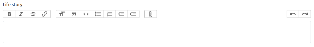
<%= form.rich_text_area :life_story %>This generates the following HTML:
<div class="mb-3">
  <label class="form-label" for="user_life_story">Life story</label>
  <input type="hidden" name="user[life_story]" id="user_life_story_trix_input_user" autocomplete="off">
  <trix-toolbar id="trix-toolbar-1">
    <div class="trix-button-row">
      <span class="trix-button-group trix-button-group--text-tools" data-trix-button-group="text-tools">
        <button type="button" class="trix-button trix-button--icon trix-button--icon-bold" data-trix-attribute="bold" data-trix-key="b" title="Bold" tabindex="-1">Bold</button>
        <button type="button" class="trix-button trix-button--icon trix-button--icon-italic" data-trix-attribute="italic" data-trix-key="i" title="Italic" tabindex="-1">Italic</button>
        <button type="button" class="trix-button trix-button--icon trix-button--icon-strike" data-trix-attribute="strike" title="Strikethrough" tabindex="-1">Strikethrough</button>
        <button type="button" class="trix-button trix-button--icon trix-button--icon-link" data-trix-attribute="href" data-trix-action="link" data-trix-key="k" title="Link" tabindex="-1">Link</button>
      </span>
      <span class="trix-button-group trix-button-group--block-tools" data-trix-button-group="block-tools">
        <button type="button" class="trix-button trix-button--icon trix-button--icon-heading-1" data-trix-attribute="heading1" title="Heading" tabindex="-1">Heading</button>
        <button type="button" class="trix-button trix-button--icon trix-button--icon-quote" data-trix-attribute="quote" title="Quote" tabindex="-1">Quote</button>
        <button type="button" class="trix-button trix-button--icon trix-button--icon-code" data-trix-attribute="code" title="Code" tabindex="-1">Code</button>
        <button type="button" class="trix-button trix-button--icon trix-button--icon-bullet-list" data-trix-attribute="bullet" title="Bullets" tabindex="-1">Bullets</button>
        <button type="button" class="trix-button trix-button--icon trix-button--icon-number-list" data-trix-attribute="number" title="Numbers" tabindex="-1">Numbers</button>
        <button type="button" class="trix-button trix-button--icon trix-button--icon-decrease-nesting-level" data-trix-action="decreaseNestingLevel" title="Decrease Level" tabindex="-1">Decrease Level</button>
        <button type="button" class="trix-button trix-button--icon trix-button--icon-increase-nesting-level" data-trix-action="increaseNestingLevel" title="Increase Level" tabindex="-1">Increase Level</button>
      </span>
      <span class="trix-button-group trix-button-group--file-tools" data-trix-button-group="file-tools">
        <button type="button" class="trix-button trix-button--icon trix-button--icon-attach" data-trix-action="attachFiles" title="Attach Files" tabindex="-1">Attach Files</button>
      </span>
      <span class="trix-button-group-spacer"></span>
      <span class="trix-button-group trix-button-group--history-tools" data-trix-button-group="history-tools">
        <button type="button" class="trix-button trix-button--icon trix-button--icon-undo" data-trix-action="undo" data-trix-key="z" title="Undo" tabindex="-1">Undo</button>
        <button type="button" class="trix-button trix-button--icon trix-button--icon-redo" data-trix-action="redo" data-trix-key="shift+z" title="Redo" tabindex="-1">Redo</button>
      </span>
    </div>
    <div class="trix-dialogs" data-trix-dialogs="">
      <div class="trix-dialog trix-dialog--link" data-trix-dialog="href" data-trix-dialog-attribute="href">
        <div class="trix-dialog__link-fields">
          <input type="url" name="href" class="trix-input trix-input--dialog" placeholder="Enter a URL…" aria-label="URL" required="" data-trix-input="" disabled="disabled">
          <div class="trix-button-group">
            <input type="button" class="trix-button trix-button--dialog" value="Link" data-trix-method="setAttribute">
            <input type="button" class="trix-button trix-button--dialog" value="Unlink" data-trix-method="removeAttribute">
          </div>
        </div>
      </div>
    </div>
  </trix-toolbar>
  <trix-editor class="trix-content form-control" id="user_life_story" input="user_life_story_trix_input_user" data-direct-upload-url="http://test.host/rails/active_storage/direct_uploads" data-blob-url-template="http://test.host/rails/active_storage/blobs/redirect/:signed_id/:filename" contenteditable="" role="textbox" aria-label="Life story Life story" trix-id="1" toolbar="trix-toolbar-1"></trix-editor>
</div>
search_field
Our search_field helper accepts the same arguments as the default Rails helper.

<%= form.search_field :search %>This generates the following HTML:
<div class="mb-3">
  <label class="form-label" for="user_search">Search</label>
  <input class="form-control" type="search" name="user[search]" id="user_search">
</div>
telephone_field
Our telephone_field helper accepts the same arguments as the default Rails helper.

<%= form.telephone_field :mobile_number %>This generates the following HTML:
<div class="mb-3">
  <label class="form-label required" for="user_mobile_number">Mobile number</label>
  <input class="form-control" aria-required="true" required="required" type="tel" name="user[mobile_number]" id="user_mobile_number">
</div>
text_field
Our text_field helper accepts the same arguments as the default Rails helper.

<%= form.text_field :name %>This generates the following HTML:
<div class="mb-3">
  <label class="form-label required" for="user_name">Name</label>
  <input class="form-control" aria-required="true" required="required" type="text" name="user[name]" id="user_name">
</div>
text_area
Our text_area helper accepts the same arguments as the default Rails helper.
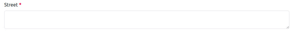
<%= form.text_area :street %>This generates the following HTML:
<div class="mb-3">
  <label class="form-label required" for="user_street">Street</label>
  <textarea class="form-control" aria-required="true" required="required" name="user[street]" id="user_street"></textarea>
</div>
time_field
Our time_field helper accepts the same arguments as the default Rails helper.

<%= form.time_field :interview_time %>This generates the following HTML:
<div class="mb-3">
  <label class="form-label" for="user_interview_time">Interview time</label>
  <input class="form-control" type="time" name="user[interview_time]" id="user_interview_time">
</div>
url_field
Our url_field helper accepts the same arguments as the default Rails helper.

<%= form.url_field :blog_url %>This generates the following HTML:
<div class="mb-3">
  <label class="form-label" for="user_blog_url">Blog URL</label>
  <input class="form-control" type="url" name="user[blog_url]" id="user_blog_url">
</div>
week_field
Our week_field helper accepts the same arguments as the default Rails helper.

<%= form.week_field :winter_holiday_week %>This generates the following HTML:
<div class="mb-3">
  <label class="form-label" for="user_winter_holiday_week">Winter holiday week</label>
  <input class="form-control" type="week" name="user[winter_holiday_week]" id="user_winter_holiday_week">
</div>
Form Options Helpers
Our form options helpers accept the same arguments as the default Rails form options helpers.
In order to apply addition options of rails_bootstrap_form, bootstrap object is passed in options argument of the helper.
Here's an example of how you pass the arguments for each form option helper:
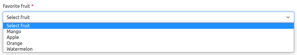
select
Our select helper accepts the same arguments as the default Rails helper.
Here's an example of how you pass both options and html_options hashes:

<%= form.select :fruit_id, options_for_select(::Fruit.pluck(:name, :id), form.object.fruit_id), {include_blank: "Select fruit", bootstrap: {size: :sm, help_text: false}}, {onchange: "this.form.submit();"} %>This generates the following HTML:
<div class="mb-3">
  <label class="form-label required" for="user_fruit_id">Favorite fruit</label>
  <select onchange="this.form.submit();" class="form-select" aria-required="true" required="required" name="user[fruit_id]" id="user_fruit_id">
    <option value="">Select fruit</option>
    <option value="1">Mango</option>
    <option value="2">Apple</option>
    <option value="3">Orange</option>
    <option value="4">Watermelon</option>
  </select>
</div>
collection_select
Our collection_select helper accepts the same arguments as the default Rails helper.
Here's an example of how you pass both options and html_options hashes:
<%= form.collection_select :fruit_id, ::Fruit.all, :id, :name, {include_blank: "Select fruit", bootstrap: {help_text: false}}, {selected: form.object.fruit_id, onchange: "this.form.submit();"} %>This generates the following HTML:
<div class="mb-3">
  <label class="form-label required" for="user_fruit_id">Favorite fruit</label>
  <select onchange="this.form.submit();" class="form-select" aria-required="true" required="required" name="user[fruit_id]" id="user_fruit_id">
    <option value="">Select fruit</option>
    <option value="1">Mango</option>
    <option value="2">Apple</option>
    <option value="3">Orange</option>
    <option value="4">Watermelon</option>
  </select>
</div>
grouped_collection_select
Our grouped_collection_select helper accepts the same arguments as the default Rails helper.
Here's an example of how you pass both options and html_options hashes:

<%= form.grouped_collection_select :city, ::Country.includes(:cities), :cities, :name, :id, :name, {include_blank: "Select city", bootstrap: {floating: true}}, {onchange: "this.form.submit();"} %>This generates the following HTML:
<div class="mb-3">
  <div class="form-floating">
    <select onchange="this.form.submit();" class="form-select" aria-required="true" required="required" placeholder="City" name="user[city]" id="user_city">
      <option value="">Select city</option>
      <optgroup label="India">
        <option value="1">Mumbai</option>
        <option value="2">New Delhi</option>
        <option value="3">Kolkata</option>
        <option value="4">Chennai</option>
      </optgroup>
      <optgroup label="Ireland">
        <option value="5">Dublin</option>
        <option value="6">Galway</option>
        <option value="7">Cork</option>
        <option value="8">Belfast</option>
      </optgroup>
      <optgroup label="United States">
        <option value="9">New York</option>
        <option value="10">Los Angeles</option>
        <option value="11">San Francisco</option>
        <option value="12">Chicago</option>
      </optgroup>
      ...
      ...
    </select>
    <label class="form-label required" for="user_city">City</label>
  </div>
</div>
time_zone_select
Our time_zone_select helper accepts the same arguments as the default Rails helper.
Here's an example of how you pass both options and html_options hashes:

<%= form.time_zone_select :timezone, ::ActiveSupport::TimeZone.all, {include_blank: "Select time zone", bootstrap: {label_text: "Preferred time zone"}}, {onchange: "this.form.submit();"} %>This generates the following HTML:
<div class="mb-3">
<label class="form-label" for="user_timezone">Preferred time zone</label>
<select onchange="this.form.submit();" class="form-select" name="user[timezone]" id="user_timezone">
<option value="">Select time zone</option>
<option value="International Date Line West">(GMT-12:00) International Date Line West</option>
<option value="American Samoa">(GMT-11:00) American Samoa</option>
<option value="Midway Island">(GMT-11:00) Midway Island</option>
<option value="Hawaii">(GMT-10:00) Hawaii</option>
<option value="Alaska">(GMT-09:00) Alaska</option>
<option value="Pacific Time (US & Canada)">(GMT-08:00) Pacific Time (US & Canada)</option>
<option value="Tijuana">(GMT-08:00) Tijuana</option>
<option value="Arizona">(GMT-07:00) Arizona</option>
...
...
</select>
</div>weekday_select
Our weekday_select helper accepts the same arguments as the default Rails helper.
Here's an example of how you pass both options and html_options hashes:

<%= form.weekday_select :weekly_off, {selected: "Monday", bootstrap: {label_text: "Week off"}}, {onchange: "this.form.submit();"} %>This generates the following HTML:
<div class="mb-3">
  <label class="form-label" for="user_weekly_off">Week off</label>
  <select onchange="this.form.submit();" class="form-select" name="user[weekly_off]" id="user_weekly_off">
    <option selected="selected" value="Monday">Monday</option>
    <option value="Tuesday">Tuesday</option>
    <option value="Wednesday">Wednesday</option>
    <option value="Thursday">Thursday</option>
    <option value="Friday">Friday</option>
    <option value="Saturday">Saturday</option>
    <option value="Sunday">Sunday</option>
  </select>
</div>
collection_check_boxes
This helper provides a way to create collection of check boxes. This helper accepts same arguments as default Rails helper except it don't accept a block as
an argument and takes care of rendering labels, check boxes, and wrapper for you. collection_check_boxes are rendered by default for multiple option selections, but you can turn them into single selections by passing options[:multiple] = false.

<%= form.collection_check_boxes :skill_ids, ::Skill.all, :id, :name, {bootstrap: {layout: :horizontal, inline: true}, onchange: "this.form.submit();"}, {} %>This generates the following HTML:
<div class="row mb-3">
  <label class="col-form-label col-sm-2 required" for="user_skill_ids">Skills</label>
  <div class="col-sm-10">
    <div class="rails-bootstrap-forms-collection-check-boxes">
      <input value="" multiple="multiple" autocomplete="off" type="hidden" name="user[skill_ids][]" id="user_skill_ids">
      <div class="form-check form-check-inline">
        <input onchange="this.form.submit();" class="form-check-input" type="checkbox" value="1" name="user[skill_ids][]" id="user_skill_ids_1">
        <label class="form-check-label" for="user_skill_ids_1">Communication</label>
      </div>
      <div class="form-check form-check-inline">
        <input onchange="this.form.submit();" class="form-check-input" type="checkbox" value="2" name="user[skill_ids][]" id="user_skill_ids_2">
        <label class="form-check-label" for="user_skill_ids_2">Problem Solving</label>
      </div>
      <div class="form-check form-check-inline">
        <input onchange="this.form.submit();" class="form-check-input" type="checkbox" value="3" name="user[skill_ids][]" id="user_skill_ids_3">
        <label class="form-check-label" for="user_skill_ids_3">Leadership</label>
      </div>
      <div class="form-check form-check-inline">
        <input onchange="this.form.submit();" class="form-check-input" type="checkbox" value="4" name="user[skill_ids][]" id="user_skill_ids_4">
        <label class="form-check-label" for="user_skill_ids_4">Writing</label>
      </div>
      <div class="form-check form-check-inline">
        <input onchange="this.form.submit();" class="form-check-input" type="checkbox" value="5" name="user[skill_ids][]" id="user_skill_ids_5">
        <label class="form-check-label" for="user_skill_ids_5">Creativity</label>
      </div>
      <div class="form-check form-check-inline">
        <input onchange="this.form.submit();" class="form-check-input" type="checkbox" value="6" name="user[skill_ids][]" id="user_skill_ids_6">
        <label class="form-check-label" for="user_skill_ids_6">Time Management</label>
      </div>
      <div class="form-check form-check-inline">
        <input onchange="this.form.submit();" class="form-check-input" type="checkbox" value="7" name="user[skill_ids][]" id="user_skill_ids_7">
        <label class="form-check-label" for="user_skill_ids_7">Team Work</label>
      </div>
      <div class="form-check form-check-inline">
        <input onchange="this.form.submit();" class="form-check-input" type="checkbox" value="8" name="user[skill_ids][]" id="user_skill_ids_8">
        <label class="form-check-label" for="user_skill_ids_8">Negotiation</label>
      </div>
      <div class="form-check form-check-inline">
        <input onchange="this.form.submit();" class="form-check-input" type="checkbox" value="9" name="user[skill_ids][]" id="user_skill_ids_9">
        <label class="form-check-label" for="user_skill_ids_9">Decision Making</label>
      </div>
      <div class="form-check form-check-inline">
        <input onchange="this.form.submit();" class="form-check-input" type="checkbox" value="10" name="user[skill_ids][]" id="user_skill_ids_10">
        <label class="form-check-label" for="user_skill_ids_10">Management</label>
      </div>
    </div>
    <div class="form-text text-muted">Select your strong skills</div>
  </div>
</div>
If form layout is inline, collection_check_boxes always render inline check boxes.
collection_radio_buttons
This helper provides a way to create collection of radio buttons. This helper accepts same arguments as default Rails helper except it don't accept a block as
an argument and takes care of rendering labels, radio button, and wrapper for you.

<%= form.collection_radio_buttons :fruit_id, ::Fruit.all, :id, :name, {checked: form.object.fruit_id, bootstrap: {layout: :horizontal, inline: true}}, {} %>This generates the following HTML:
<div class="row mb-3">
  <label class="col-form-label col-sm-2 required" for="user_fruit_id">Favorite fruit</label>
  <div class="col-sm-10">
    <div class="rails-bootstrap-forms-collection-radio-buttons">
      <div class="form-check form-check-inline">
        <input class="form-check-input" type="radio" value="1" name="user[fruit_id]" id="user_fruit_id_1">
        <label class="form-check-label" for="user_fruit_id_1">Mango</label>
      </div>
      <div class="form-check form-check-inline">
        <input class="form-check-input" type="radio" value="2" name="user[fruit_id]" id="user_fruit_id_2">
        <label class="form-check-label" for="user_fruit_id_2">Apple</label>
      </div>
      <div class="form-check form-check-inline">
        <input class="form-check-input" type="radio" value="3" name="user[fruit_id]" id="user_fruit_id_3">
        <label class="form-check-label" for="user_fruit_id_3">Orange</label>
      </div>
      <div class="form-check form-check-inline">
        <input class="form-check-input" type="radio" value="4" name="user[fruit_id]" id="user_fruit_id_4">
        <label class="form-check-label" for="user_fruit_id_4">Watermelon</label>
      </div>
    </div>
    <div class="form-text text-muted">Select your favorite fruit</div>
  </div>
</div>
If form layout is inline, collection_check_boxes always render inline check boxes.
Date Helpers
The multiple selects that the date and time helpers (date_select, time_select, datetime_select) generate are wrapped inside a fieldset.rails-bootstrap-forms-[date|time|datetime]-select tag.
This is because Bootstrap automatically styles our controls as blocks. This wrapper fixes this defining these selects as inline-block and a width of auto.
In order to apply addition options of rails_bootstrap_form, bootstrap object is passed in options argument of the helper.
date_select
Our date_select helper accepts the same arguments as the default Rails helper.
Here's an example of how you pass both options and html_options hashes:

<%= form.date_select :interview_date, {selected: form.object.interview_date, bootstrap: {label_text: "Choose interview date"}}, {onchange: "this.form.submit();"} %>This generates the following HTML:
<div class="mb-3">
  <label class="form-label" for="user_interview_date">Choose interview date</label>
  <fieldset class="rails-bootstrap-forms-date-select">
    <select id="user_interview_date_1i" name="user[interview_date(1i)]" onchange="this.form.submit();" class="form-select">
      <option value="2018">2018</option>
      <option value="2019">2019</option>
      <option value="2020">2020</option>
      <option value="2021">2021</option>
      <option value="2022">2022</option>
      <option value="2023" selected="selected">2023</option>
      ...
      ...
    </select>
    <select id="user_interview_date_2i" name="user[interview_date(2i)]" onchange="this.form.submit();" class="form-select">
      <option value="1">January</option>
      <option value="2">February</option>
      <option value="3">March</option>
      <option value="4">April</option>
      <option value="5" selected="selected">May</option>
      ...
      ...
    </select>
    <select id="user_interview_date_3i" name="user[interview_date(3i)]" onchange="this.form.submit();" class="form-select">
      <option value="1">1</option>
      <option value="2">2</option>
      <option value="3">3</option>
      <option value="4">4</option>
      <option value="5">5</option>
      <option value="6">6</option>
      <option value="7">7</option>
      <option value="8" selected="selected">8</option>
      ...
      ...
    </select>
  </fieldset>
</div>
time_select
Our time_select helper accepts the same arguments as the default Rails helper.
Here's an example of how you pass both options and html_options hashes:

<%= form.time_select :interview_time, {selected: form.object.interview_time, bootstrap: {label_text: "Choose interview time"}}, {onchange: "this.form.submit();"} %>This generates the following HTML:
<div class="mb-3">
  <label class="form-label" for="user_interview_time">Choose interview time</label>
  <fieldset class="rails-bootstrap-forms-time-select">
    <input type="hidden" id="user_interview_time_1i" name="user[interview_time(1i)]" value="1" autocomplete="off">
    <input type="hidden" id="user_interview_time_2i" name="user[interview_time(2i)]" value="1" autocomplete="off">
    <input type="hidden" id="user_interview_time_3i" name="user[interview_time(3i)]" value="1" autocomplete="off">
    <select id="user_interview_time_4i" name="user[interview_time(4i)]" onchange="this.form.submit();" class="form-select">
      <option value="00">00</option>
      <option value="01">01</option>
      <option value="02">02</option>
      <option value="03">03</option>
      <option value="04">04</option>
      ...
      ...
    </select>
    :
    <select id="user_interview_time_5i" name="user[interview_time(5i)]" onchange="this.form.submit();" class="form-select">
      <option value="00">00</option>
      <option value="01">01</option>
      <option value="02">02</option>
      <option value="03">03</option>
      <option value="04">04</option>
      <option value="05">05</option>
      ...
      ...
    </select>
  </fieldset>
</div>
datetime_select
Our datetime_select helper accepts the same arguments as the default Rails helper.
Here's an example of how you pass both options and html_options hashes:

<%= form.datetime_select :interview_datetime, {selected: form.object.interview_datetime, bootstrap: {label_text: "Choose interview date & time"}}, {onchange: "this.form.submit();"} %>This generates the following HTML:
<div class="mb-3">
<label class="form-label" for="user_interview_datetime">Choose interview date & time</label>
<fieldset class="rails-bootstrap-forms-datetime-select">
<select id="user_interview_datetime_1i" name="user[interview_datetime(1i)]" onchange="this.form.submit();" class="form-select">
<option value="2018">2018</option>
<option value="2019">2019</option>
<option value="2020">2020</option>
<option value="2021">2021</option>
...
...
</select>
<select id="user_interview_datetime_2i" name="user[interview_datetime(2i)]" onchange="this.form.submit();" class="form-select">
<option value="1">January</option>
<option value="2">February</option>
<option value="3">March</option>
<option value="4">April</option>
...
...
</select>
<select id="user_interview_datetime_3i" name="user[interview_datetime(3i)]" onchange="this.form.submit();" class="form-select">
<option value="1">1</option>
<option value="2">2</option>
<option value="3">3</option>
<option value="4">4</option>
<option value="5">5</option>
<option value="6">6</option>
...
...
</select>
—
<select id="user_interview_datetime_4i" name="user[interview_datetime(4i)]" onchange="this.form.submit();" class="form-select">
<option value="00">00</option>
<option value="01">01</option>
<option value="02">02</option>
<option value="03">03</option>
<option value="04">04</option>
...
...
</select>
:
<select id="user_interview_datetime_5i" name="user[interview_datetime(5i)]" onchange="this.form.submit();" class="form-select">
<option value="00">00</option>
<option value="01">01</option>
<option value="02">02</option>
<option value="03">03</option>
<option value="04">04</option>
...
...
</select>
</fieldset>
</div>Submit Buttons
rails_bootstrap_form allows to easily create submit button for the form. rails_bootstrap_form supports three color variants for submit buttons: secondary, primary, and danger. Submit buttons are supported in vertical, horizontal, and inline layout.
Submit buttons in inline form are wrapped inside div.col-12 to properly align on small width devices.

<%= form.secondary "Search" %>
<%= form.primary "Register" %>
<%= form.danger "Delete" %>
This generates the following HTML:
<input type="submit" name="commit" value="Search" class="btn btn-secondary" data-disable-with="Search">
<input type="submit" name="commit" value="Register" class="btn btn-primary" data-disable-with="Register">
<input type="submit" name="commit" value="Delete" class="btn btn-danger" data-disable-with="Delete">
It is also possible to pass additional classes to the button helpers using HTML class attribute and that class will be
added along with default class of the submit helper.

<%= form.primary "Register", class: "register-button" %>This generates the following HTML:
<input type="submit" name="commit" value="Register" class="register-button btn btn-primary" data-disable-with="Register">To render submit helper as a button helper, you can set render_as_button: true option or pass a block.

<%= form.primary "Register", bootstrap: {render_as_button: true} %>
<%= form.secondary do %>
  Sign in
<% end %>
This generates the following HTML:
<button name="button" type="submit" class="btn btn-primary">Register</button>
<button name="button" type="submit" class="btn btn-secondary">
  Sign in
</button>
Static controls
rails_bootstrap_form provides form helper static_field to render static controls which internally uses text_field form helper.
It sets readonly and disabled attributes on the text field. By default, static_field applies form-control-plaintext
CSS class to the control but you can change it by using option static_field_class.
You can create a static controls like this:

<%= form.static_field :email %>This generates the following HTML:
<div class="mb-3">
  <label class="form-label required" for="user_email">Email address</label>
  <input readonly="readonly" disabled="disabled" value="test@example.com" class="form-control-plaintext" aria-required="true" required="required" type="text" name="user[email]" id="user_email">
</div>
static_field supports all the bootstrap options which are supported by text_field.
Floating Labels
The floating option can be used to enable Bootstrap floating labels. This option is supported on text fields, text areas and dropdowns. Here's an example:

<%= bootstrap_form_for @user, bootstrap: {floating: true} do |form| %>
  <%= form.text_field :name %>
  <%= form.email_field :username %>
  <%= form.password_field :password %>
  <%= form.fields_for :address, include_id: false do |address_form| %>
    <%= address_form.text_area :street %>
    <%= address_form.select :country_id, options_for_select(::Country.pluck(:name, :id), address_form.object.country_id),
        {include_blank: "Select Country"} %>
  <% end %>
  <%= form.primary "Register" %>
<% end %>
This generates the following HTML:
<form novalidate="novalidate" class="new_user" id="new_user" action="/users" accept-charset="UTF-8" method="post">
  <div class="mb-3">
    <div class="form-floating">
      <input class="form-control" aria-required="true" required="required" placeholder="Name" type="text" name="user[name]" id="user_name">
      <label class="form-label required" for="user_name">Name</label>
    </div>
  </div>
  <div class="mb-3">
    <div class="form-floating">
      <input class="form-control" placeholder="Username" type="email" name="user[username]" id="user_username">
      <label class="form-label" for="user_username">Username</label>
    </div>
  </div>
  <div class="mb-3">
    <div class="form-floating">
      <input class="form-control" aria-required="true" required="required" placeholder="Password" type="password" name="user[password]" id="user_password">
      <label class="form-label required" for="user_password">Password</label>
    </div>
  </div>
  <div class="mb-3">
    <div class="form-floating">
      <textarea class="form-control" aria-required="true" required="required" placeholder="Street" name="user[address_attributes][street]" id="user_address_attributes_street"></textarea>
      <label class="form-label required" for="user_address_attributes_street">Street</label>
    </div>
  </div>
  <div class="mb-3">
    <div class="form-floating">
      <select class="form-select" aria-required="true" required="required" placeholder="Country" name="user[address_attributes][country_id]" id="user_address_attributes_country_id">
        <option value="">Select Country</option>
        <option value="1">India</option>
        <option value="2">Ireland</option>
        <option value="3">United States</option>
        <option value="4">United Kingdom</option>
      </select>
      <label class="form-label required" for="user_address_attributes_country_id">Country</label>
    </div>
  </div>
  <input type="submit" name="commit" value="Register" class="btn btn-primary" data-disable-with="Register">
</form>
rails_bootstrap_form automatically disables floating labels for unsupported helpers.
Validation and Errors
By default, rails_bootstrap_form generations in-line errors which appear below the field.
Inline Errors
By default, fields that have validation errors will be outlined in red and the error will be displayed below the field. Here's an example:

<%= bootstrap_form_for @user do |form| %>
  <%= form.email_field :email %>
  <%= form.password_field :password %>
  <%= form.primary "Register" %>
<% end %>
This generates the following HTML:
<form novalidate="novalidate" class="new_user" id="new_user" action="/users" accept-charset="UTF-8" method="post">
  <div class="mb-3">
    <label class="form-label required is-invalid" for="user_email">Email address</label>
    <input class="form-control is-invalid" aria-required="true" required="required" type="email" name="user[email]" id="user_email">
    <div class="invalid-feedback">can't be blank</div>
    <div class="form-text text-muted">Please use official email address</div>
  </div>
  <div class="mb-3">
    <label class="form-label required is-invalid" for="user_password">Password</label>
    <input class="form-control is-invalid" aria-required="true" required="required" type="password" name="user[password]" id="user_password">
    <div class="invalid-feedback">can't be blank</div>
  </div>
  <input type="submit" name="commit" value="Register" class="btn btn-primary" data-disable-with="Register">
</form>
Inline errors are also supported if the field is wrapped inside of input group and has floating label:

<%= form.text_field :expected_ctc, bootstrap: {floating: true, prepend: "$", append: "0.0"} %>This generates the following HTML:
<div class="mb-3">
  <div class="input-group has-validation">
    <span class="input-group-text">$</span>
    <div class="form-floating is-invalid">
      <input class="form-control is-invalid" aria-required="true" required="required" placeholder="Expected CTC" type="text" value="" name="user[expected_ctc]" id="user_expected_ctc">
      <label class="form-label required is-invalid" for="user_expected_ctc">Expected CTC</label>
    </div>
    <span class="input-group-text">0.0</span>
    <div class="invalid-feedback">can't be blank</div>
  </div>
</div>
The has-validation CSS class is added to an input group when the field has errors.
The is-invalid CSS class is added to floating label container when field with floating label has errors.
Required Fields
A label that is associated with a mandatory field is automatically annotated with a required CSS class. rails_bootstrap_form provides styling for required fields.
You're also free to add any appropriate CSS to style required fields as desired.
The label required class is determined based on the definition of a presence validator with the associated model attribute. Presently this is one of: ActiveRecord::Validations::PresenceValidator or ActiveModel::Validations::PresenceValidator.
In cases where this behaviour is undesirable, use the required option to force the class to be present or absent:

<%= form.date_field :birth_date, required: false %>
<%= form.url_field :blog_url, required: true %>
This generates the following HTML:
<div class="mb-3">
  <label class="form-label" for="user_birth_date">Birth date</label>
  <input class="form-control" type="date" name="user[birth_date]" id="user_birth_date">
</div>
<div class="mb-3">
  <label class="form-label required" for="user_blog_url">Blog URL</label>
  <input required="required" class="form-control" aria-required="true" type="url" name="user[blog_url]" id="user_blog_url">
</div>
Required belongs_to associations
Adding a form control for a belongs_to associated field will automatically pick up the associated presence validator.

<%= form.collection_radio_buttons :fruit_id, ::Fruit.all, :id, :name, {checked: form.object.fruit_id} %>This generates the following HTML:
<div class="mb-3">
  <label class="form-label required" for="user_fruit_id">Favorite fruit</label>
  <div class="rails-bootstrap-forms-collection-radio-buttons">
    <div class="form-check form-check-inline">
      <input class="form-check-input" type="radio" value="1" name="user[fruit_id]" id="user_fruit_id_1">
      <label class="form-check-label" for="user_fruit_id_1">Mango</label>
    </div>
    <div class="form-check form-check-inline">
      <input class="form-check-input" type="radio" value="2" name="user[fruit_id]" id="user_fruit_id_2">
      <label class="form-check-label" for="user_fruit_id_2">Apple</label>
    </div>
    <div class="form-check form-check-inline">
      <input class="form-check-input" type="radio" value="3" name="user[fruit_id]" id="user_fruit_id_3">
      <label class="form-check-label" for="user_fruit_id_3">Orange</label>
    </div>
    <div class="form-check form-check-inline">
      <input class="form-check-input" type="radio" value="4" name="user[fruit_id]" id="user_fruit_id_4">
      <label class="form-check-label" for="user_fruit_id_4">Watermelon</label>
    </div>
  </div>
  <div class="form-text text-muted">Select your favorite fruit</div>
</div>
Internationalization
rails_bootstrap_form follows standard rails conventions so it's i18n-ready. See more here
Other Tips
Empty But Visible Labels
Some third party plug-ins require an empty but visible label on an input control. The hide_label option generates a label that won't appear on the screen, but it's considered invisible and therefore doesn't work with such a plug-in. An empty label (e.g. "") causes the underlying Rails helpers to generate a label based on the field's attribute's name.
The solution is to use a zero-width character for the label, or some other "empty" HTML. For example:
bootstrap: {label_text: "​".html_safe}or
bootstrap: {label_text: "<span></span>".html_safe}Contributing
I welcome contributions. If you wish to contribute in rails_bootstrap_form, please review the Contributing document first.
License
Copyright 2023 Harshal V. LADHE, Released under the MIT License

