gameofthrones 
This package provides a round of palettes inspired by the Game of Thrones TV show.
At its first version, it simply contains the palettes of some of the houses of Westeros. They have been chosen manually, taking into account its consistency with all the existing branding of the franchise, but its suitability for data visualisation.
Information visualization is just a language with everything to be discovered.
A colour palette should not only be beautiful, but suitable for portraying and highlighting data. The colours of this palette has been chose trying to to find this balance between suitability for plotting and relatability to the world of A Song of Ice and Fire.
Installation
Just copy and execute this bunch of code and you’ll have the last version of the package installed:
devtools::install_github("aljrico/gameofthrones")Or just use the more stable version on the CRAN:
install.packages("gameofthrones")And you can now use it:
library(gameofthrones)
Usage
The default colour scale of the package is the one of the house Targaryen. If you prefer to choose another one, you’ll need to specify which house you want the palette from.
Let’s say that you want a palette made from the house Targaryen.
pal <- got(250, option = "Targaryen")
image(volcano, col = pal)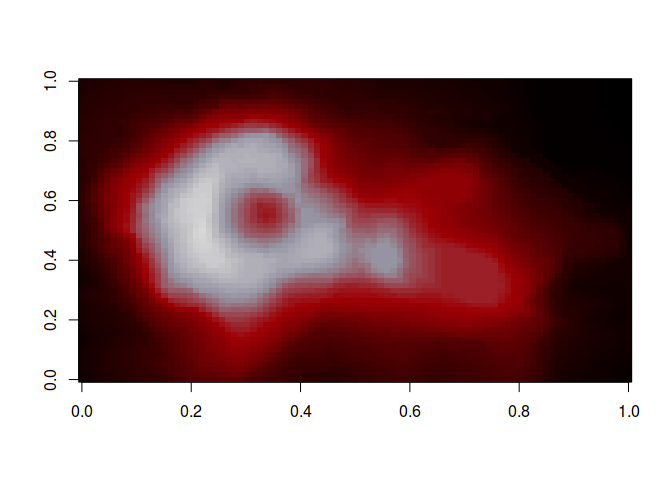
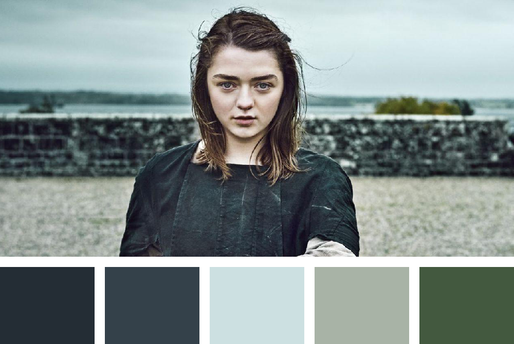
Or that you want burn some plots down using wildfire.
pal <- got(250, option = "Wildfire")
image(volcano, col = pal)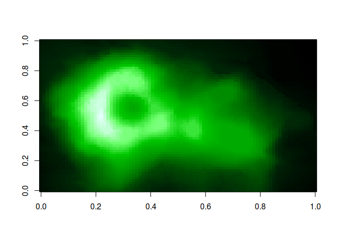
ggplot2
Of course, this package has specific functions to behave seamlessly with
the best data visiualisation library available. The package contains
colour scale functions for ggplot2 plots: scale_color_got() and
scale_fill_got().
Here is a made up example using the colours from the house of Martell,
library(ggplot2)
ggplot(data.frame(x = rnorm(1e4), y = rnorm(1e4)), aes(x = x, y = y)) +
  geom_hex() +
    coord_fixed() +
  scale_fill_got(option = "Martell") +
    theme_bw()
and Baratheon
ggplot(data.frame(x = rnorm(1e4), y = rnorm(1e4)), aes(x = x, y = y)) +
  geom_hex() +
    coord_fixed() +
  scale_fill_got(option = "Baratheon") +
    theme_bw()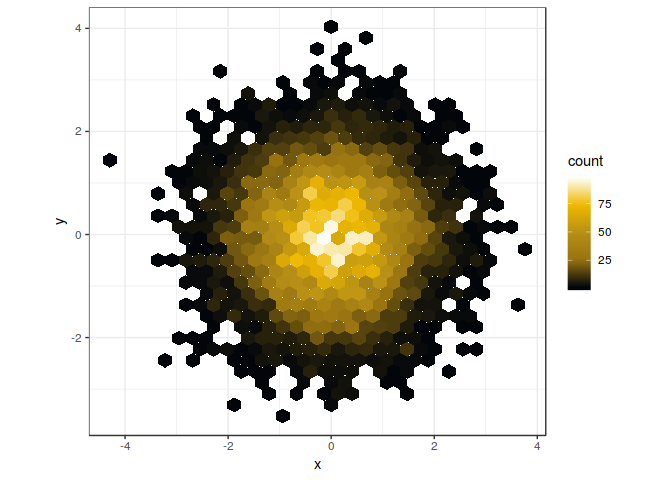
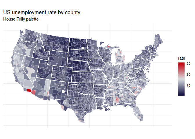
You can also use it to create this cloropeth of the U.S Unemployment:
But what if you want discrete scales? These functions also can be used
for discrete scales with the argument discrete = TRUE. This argument,
when TRUE, sets a finite number of sufficiently spaced colours within
the selected palette to plot your data. You can also bypass it by calling the function with a _d() at the end. So scale_fill_got(discrete = TRUE) becomes scale_fill_got_d(). Much easier, isn't it?
library(gridExtra)

gg1 <- ggplot(diamonds, aes(factor(color), fill=factor(cut))) +
    geom_bar(colour = "black") +
  scale_fill_got(discrete = TRUE, option = "Margaery") +
    ggtitle("Lady Margaery") +
    theme_minimal()

gg2 <- ggplot(diamonds, aes(factor(color), fill=factor(cut))) +
    geom_bar(colour = "black") +
  scale_fill_got_d(option = "Daenerys", direction = - 1) +
    ggtitle("Daenerys Stormborn") +
    theme_minimal()

grid.arrange(gg1,gg2)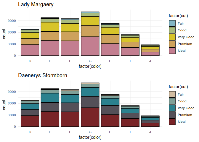
Note that you can also play with the direction of the colour map. Either
the default direction = 1 or the opposite direction = -1.
See how diferently you can highlight the density distribution of restaurans in southern France.
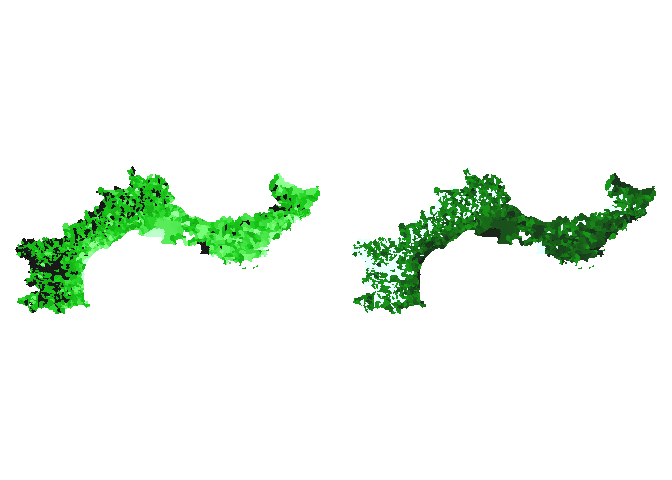
Just make sure you try all the options.
gg1 <- ggplot(diamonds, aes(carat, fill = cut)) +
  geom_density(position = "stack") +
    scale_fill_got(discrete = TRUE, option = "Stark2")

gg2 <- ggplot(mpg, aes(class)) +
    geom_bar(aes(fill = drv), position = position_stack(reverse = TRUE), colour = "black") +
 coord_flip() +
    scale_fill_got(discrete = TRUE, option = "Daenerys") +
 theme(legend.position = "top") +
    ylab("") +
    xlab("Class")

grid.arrange(gg1,gg2)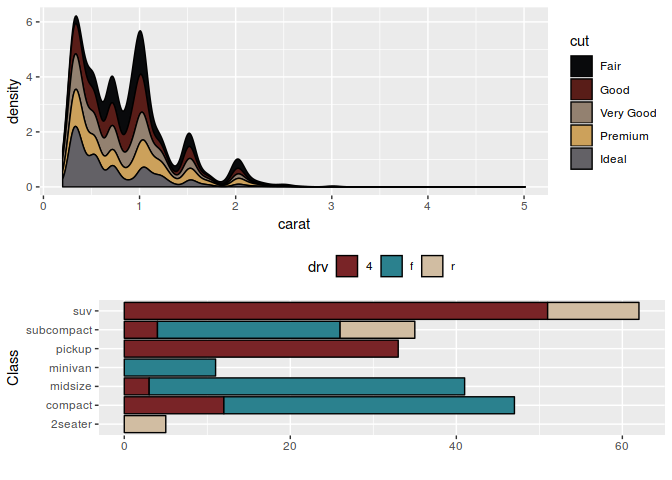
Palettes
option = "Arya"