cordova-plugin-splitview
Native iOS Split View
iOS Split View
An iOS split view is a container that manages two or three child columns. The plugin creates a split view and the child views, supplying each with a WebView. Child WebViews can manage the split view and communicate with each other.
What’s New
2.4.1
- Update for Cordova iOS 7.0
2.4
- New inset options
- Hide-Navigation-Bar option
- New TabBar options
2.3
- Collection View List (replaces classic-view TableView option)
- Bug fixes
2.2
- Large Navigation Bar Titles in Primary View
- Navigation Bar for Compact Tab View
- Tab Bar Appearance options
- Scrollbar options
- iOS 15 Appearance updates
2.1
- Navigation Bar buttons and context menus.
- Additional tab bar options, updated interface
2.0
- Supports either iOS14 and later column-style layouts with two or three columns, or the classic split view.
- Supports separate compact-view tab bar.
- Set properties via json.
- Similar behavior for embedding and non-embedding cases.
Except for the classic split view, this version no longer supports the TableView option. Newer versions use a CollectionView. Classic split view will be supported as long as it is supported by Apple but all future plug-in development will target the iOS14+ version .
What’s Ahead
- Additional and revised documentation
- Additional layout options
- Additional Compact View options
- Update and expand event handling
- Remove 6 tab limit and support “more” in TabView
- Multiple WebViews in TabView
Installation
cordova plugin add cordova-plugin-splitviewConfiguration
Auto hiding of splash screen needs to be disabled in config.xml
<preference name="AutoHideSplashScreen" value="false" />
The plugin as shipped enables the minimum supported version of Swift. Unless it is necessary to use this version (4.0) it is strongly recommended to build with Swift 5.
Getting Started
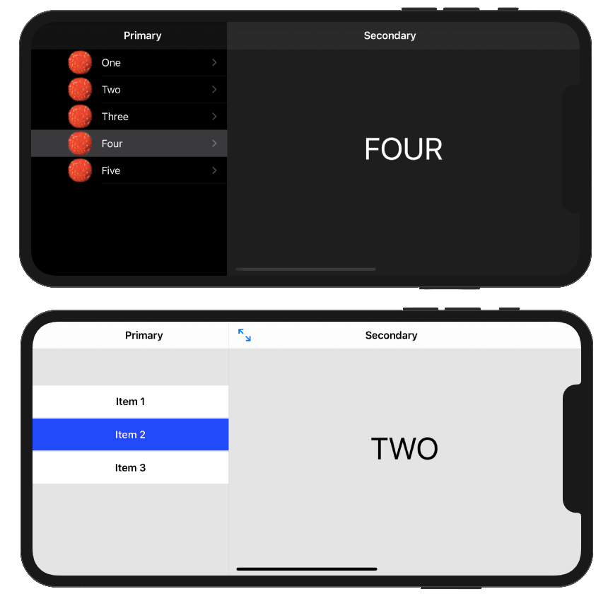
The best way is to build the Demo App. The demo shows both new and classic view options: two column, three column, and tab-bar compact. Buttons and menus too.
See Apple’s UISplitViewController documentation for a more detailed explanation of the split view.
See Classic Split View to support pre-iOS14 devices.
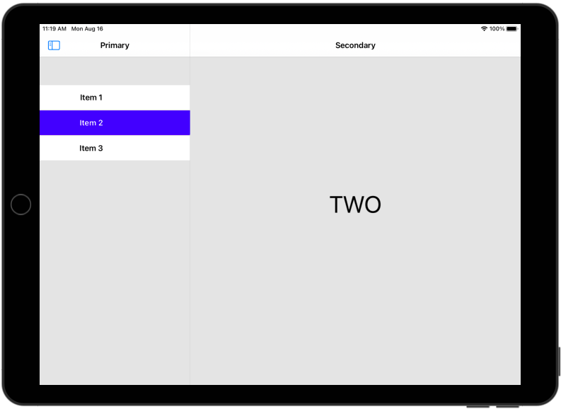
To present a Split View (post-iOS14), first create view properties.
For example:
viewPropJSON =
'{
  "fullscreen":true,
  "primaryTitle": "Primary",
  "primaryURL": "doublePrimary.html",
  "secondaryTitle": "Secondary",
  "secondaryURL": "doubleSecondary.html",
  "style": "doubleColumn",
  "topColumnForCollapsingToProposedTopColumn": "primary",
  "preferredSplitBehavior": "automatic",
  "preferredDisplayMode": "twoBesideSecondary",
  "primaryEdge": "leading",
  "backgroundColor": [
    228,
    228,
    228,
    1
  ]
}'
Many properties, but in most cases the defaults work just fine. After creating the properties, show the Split View:
cordova.plugins.SplitView.showView(viewPropJSON,viewPropPrimary,viewPropSecondary,viewPropSup,viewPropCompact,null,null);The child views have to initilize message and event handling.
For example:
function onDeviceReady() {
    navigator.splashscreen.hide();
    cordova.plugins.SplitView.message = recievedMessage;
    cordova.plugins.SplitView.action = handleEvents;
}

function recievedMessage(item) {
    selectItem(item);
}

function handleEvents(event,data) {
    if((event === cordova.plugins.SplitView.viewEvents.buttonEvent) && (data === "rightTap")) {
        //do something
    }
}

The plugin sets the version of Swift to 4.0, the minimum needed.  Bumping the version to Swift 5 will produce smaller/faster code.
Quirks
The plug-in hides quirky behavior as much as possible but there are issues that resist being hidden.
Large titles, insets, and Scroll Edge behavior are trouble spots.
In this version, large-title navigation bars are mostly limited to the primary view or compact-view tabs.
Compact Tab Bar views need to set the initial bar appearance after which the plug-in manages appearance.
Horizontal Scroll Bars and scrolling
In some cases, despite what CSS seems to dictate, horizontal scrolling is enabled and horizontal scroll bars may appear (the content will snap back in to place, but the process is visually unappealing). There are two attributes that prevent this behavior: “horizScrollBarInvisible” and “preventHorizScroll”. One makes the bar invisible, the other prevents horizontal scrolling.
CSS html vs body
Side effects of styling choices can cause navigation bar and scroll bar appearance issues that don’t happen in a normal full-view app (which doesn’t have navigation bars). See the Demo App for examples.
Compact View Tabs
The compact view is a single webView that is moved between tabs. WebView Content is updated on tab selection. When switching between tabs that have Large Titles, scroll-to-top is sometimes necessary after a transition from a scrolling to a non-scrolling view. Future versions of the plugin will support multiple tab webviews which will make tab transitions easier to manage. See the Demo App for an example.
Launch Image
If launch images are missing, some configurations will initially display incorrectly.
Large Titles, Insets, and Scrolling
With a small-title view, everything pretty much just works. Large-title views open a Pandora's Box of edge conditions, special cases and strange behavior.
Large Titles
Large Titles can be used in any tab of a compact tab view. They can also be used in all split views (Primary, Secondary, and Supplimentary) if a TabView is used for the compact case. If an app doesn't have a separate compact view then Large Titles are limited to the primary view unless all titles are large and never change (by scrolling, for example.)
Insets
The plugin partially handles inset behavior which roughly speaking is the process of shrinking content to accomodate safe areas, large navigation bar titles, and the like. There are, however, inset management choices that affect webview behavior. There are three ways we deal with insets: the contentInsetAdjustmentBehavior property, the viewport-fit=cover property of the "viewport" meta tag, and the set of "safe-area-inset-" css environment variables.
What we're concerned with is the way in which insets affect our webviews and their containers. Small-title navigation bars or views with hidden title bars are easier to handle. The case to pay special attention to is a notched phone in landscape orientation.
How the webview handles height and width properties is impacted by inset-handling options.
contentInsetAdjustmentBehavior:
There are two options: "never" and "always". "never" does not adjust insets. "always" takes safe area insets into account.
If contentInsetAdjustmentBehavior = "never", fixed-position elements remain fixed, otherwise the elements will move when insets change (scrolling a large-title view will cause this.)
Transition to a large title while scrolling is smoother when contentInsetAdjustmentBehavior = "always" is used.
Width/height and padding will differ depending on option. For example, using vh/vw or %, and padding choices will depend on the inset option. See the Demo App for examples.
viewport-fit=cover property:
The viewport-fit=cover property of the "viewport" meta tag sets contentInsetAdjustmentBehavior to "never." There are subtle differences between using this property and setting just "contentInsetAdjustmentBehavior". "viewport-fit=cover" doesn't take effect until content is loaded. This can affect initial conditions like title size. contentInsetAdjustmentBehavior = "never" is set before content is loaded. The two options should be used together. Since contentInsetAdjustmentBehavior = "never" is the default, setting viewport-fit=cover alone is sufficient.
safe-area-inset:
These environment variables can be used to inset content. For example:
padding: env(safe-area-inset-top, 0px) env(safe-area-inset-left, 0px) env(safe-area-inset-bottom, 0px) env(safe-area-inset-left, 0px);See the Demo App for examples.
Scrolling
Large-title views:
Transition to a large title while scrolling is smoother when contentInsetAdjustmentBehavior = "always" is used. The Demo App shows both the "always" and "never" cases.
Small-title views:
Works with all inset options.
Depending on inset options, on some devices and orientations, an unwanted horizontal scroll bar will appear. Preventing the scroll bar appearing via css isn't always straightforward (there is an example in the Demo App). The properties “horizScrollBarInvisible” and “preventHorizScroll” will unconditionally prevent horizontal scrolling/scrollbar appearance.
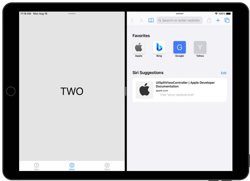
Tab View
Compact Size Class and TabView
There are two size classes: Regular and Compact, which apply to width and height and depend on device size and orientation. Horizontally Regular you would find on a large device such as an iPad or a large iPhone in landscape, and Horizontally Compact you would find on a smaller device in portrait or landscape, or an iPad running multiple apps in a split screen.
The plug-in has the option of using a TabView for the Compact Size. The view will dynamically switch to/from a split view as the Size Class changes. For example, when a large iPhone is rotated from portrait to landscape or when a second app shares the screen on an iPad.
Regular size
Compact size
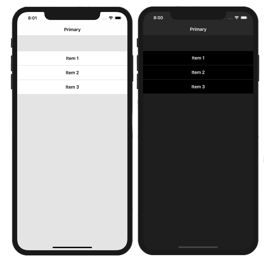
Collection View List
Provides a scrollable list of selectable items organized as collapsable sections.
This version only supports a list with "sidebar" style in the primary view. The Collection View List replaces the TableView used by Classic Split View for apps targeting iOS14 and above.
On item selection, the view fires a "collectionEvent" which sends a "selectedListItem" to property-specified views. An item can be selected programmatically via the "setCollectionProperty" viewAction. Since a "collectionEvent" is not fired if an item is selected programmatically, a "fireCollectionEvent" viewAction can be used to notify other views that a selection has occured.
Navigation Bar Buttons
Left and right buttons on the Navigation Bar are supported. Both buttons support text and systemItems (system-supplied images), images, SF Symbols, and context menus. The left button can be relocated to avoid conflict.
Navigation Bar Appearance
Large Titles can be used in any tab of a compact tab view. They can also be used in all split views (Primary, Secondary, and Supplimentary) if a TabView is used for the compact case. If an app doesn't have a separate compact view then Large Titles are limited to the primary view unless all titles are large and never change (by scrolling, for example.)
There is an option to hide the bar (the "hideNavigationBar" property).
iOS 14 and later Methods
showView
cordova.plugins.SplitView.showView (splitViewProps, primaryProps, secondaryProps, supProps, compactProps, success, error)Show split view.
| Param | Type | Description |
|---|---|---|
| splitViewProps | String | split view properties |
| primaryProps | String | properties for primary view |
| secondaryProps | String | properties for secondary view |
| supProps | String | properties for supplementary view |
| compactProps | String | properties for compact view |
| onSuccess | Function | Success callback function |
| error | Function | Error callback |
Default is a modal split view. Optionally the split view can be made the root view. If the split view is made root, the original view (from which showView was called) is lost. Using the “fullscreen” option preserves the original view but with the same appearance of split view as root. The split view is still modal and can be dismissed thus returning to the original view. The original view can serve as a welcome page or simply display the startup background color and go unnoticed.
display
cordova.plugins.SplitView.display (show_hide, view, success, error)Present or dismiss view.
| Param | Type | Description |
|---|---|---|
| show_hide | Bool | show or hide |
| view | String | view to show/hide: "primary", "secondary”, "supplementary", "compact"] |
| success | Function | Success callback function |
| error | Function | Error callback |
See Apple UISplitViewController show/hide documentation for additional details.
setSplitViewProperties
cordova.plugins.SplitView.setSplitViewProperties (properties, success, error)Set properties on Split View. Some properties can only be set on creation (showView)
| Param | Type | Description |
|---|---|---|
| properties | String | Container view properties |
| success | Function | Success callback function |
| error | Function | Error callback |
setProperties
cordova.plugins.SplitView.setProperties (properties, success, error)Set properties on Split View child view. Some properties can only be set on creation (showView)
| Param | Type | Description |
|---|---|---|
| properties | String | Split View child properties |
| success | Function | Success callback function |
| error | Function | Error callback |
let viewProps ='{ "barButtonRight": {"type":"system","identifier": "rightTap","title":"'+testButtonOptions[testButtonIndex]+'"} }';
cordova.plugins.SplitView.setProperties(viewProps,null,null);
initChild
cordova.plugins.SplitView.initChild ()Initialize Split View child.
Call for all views. Typically called immediately after "device ready”.
Call when ready to receive messages.
selectTab
cordova.plugins.SplitView.selectTab ( tab, success, error)Select tab on bar
| Param | Type | Description |
|---|---|---|
| tab | Number | selected tab |
| success | Function | Success callback function |
| error | Function | Error callback |
viewAction
cordova.plugins.SplitView.viewAction(action,targets,data,success, error)perform Split View Action
Performs actions such as dismissing views and triggering events.
| Param | Type | Description | Default |
|---|---|---|---|
| action | String | action to perform | |
| targets | [String] | action targets | [self] |
| data | [String] | action data | [""] |
| success | Function | Success callback function | null |
| error | Function | Error callback | null |
actions:
dismiss
Dismiss Split View
This action will do nothing if the split view is the root view, otherwise return to root view.
cordova.plugins.SplitView.viewAction("dismiss");setCollectionProperty
Sets Collection View properties
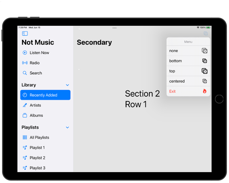
Selects an item Section and Row and optionally scrolls to selected position.
The Collection View is currently limited to the primary view: the only valid target is "primary"
data: JSON
| Select | Type | Description | Default |
|---|---|---|---|
| section | Int | Select Section | |
| row | Int | Select Row | |
| scrollPosition | String | Scroll to Position | none |
| scrollPosition | Description |
|---|---|
| none | don't scroll |
| top | position item at top |
| bottom | position item at bottom |
| centeredVertically | center item vertically |
// Select section one, row two and center vertically
let section = 1;
let row = 2;
let scrollPosition = "centeredVertically"
let msgJSON = '{"id": "selectListItem", "select": { "section": '+ section +' , "row": '+ row +' ,"scrollPosition": "' + scrollPosition + '" }}';
cordova.plugins.SplitView.viewAction("setCollectionProperty", ["primary"],[msgJSON]);
fireCollectionEvent
Fires a colloctionView event
Supported events:
- collectionEvents.selectedListItem
Fires a list-item-selected event, identical to the event generated when a user makes a selection. This is useful when an item is programmatically selected in which case the collectionView does not fire a "selected" event.
data: JSON
| Event Data | Type | Description |
|---|---|---|
| id | Int | event ID |
| select | Select | Selection Data |
| Select | Type | Description |
|---|---|---|
| section | Int | Selected Section |
| row | Int | Selected Row |
let section = 1;
let row = 2;
let msg1JSON = '{"id": "' + cordova.plugins.SplitView.collectionEvents.selectedListItem + '", "select": { "section": '+ section +' , "row": '+ row +' }}';
cordova.plugins.SplitView.viewAction("fireCollectionEvent", ["secondary"],[msg1JSON]);
scrollBar
Hides or shows scrollbar. This is faster and more reliable than than using web methods.
data:
| option | Description |
|---|---|
| hideVert | hide vertical scroll bar |
| showVert | show vertical scroll bar |
| hideHoriz | hide horizontal scroll bar |
| showHoriz | show horizontal scroll bar |
cordova.plugins.SplitView.viewAction("fireCollectionEvent", ["scrollBar"],["self"],["hideVert"]);Event Handling
Events are generated by button taps, menu item selection, etc. A single event handler handles all events. Handler is initilized—usually in onDeviceReady—before use.
Supported events:
- viewEvents.buttonEvent
- viewEvents.tabBarEvent
- viewEvents.collectionEvent
Event Handler
function(event,data)
| Param | Type | Description |
|---|---|---|
| event | viewEvents | event type |
| data | String | event-specific data |
buttonEvent
Event target is WebView associated with button.
Values
viewEvents.buttonEvent
Event generated by button tap or button context menu item selection.
data:
“identifier” value set on item creation
tabBarEvent
Event target is WebView associated with tabBar.
viewEvents.tabBarEvent
Event generated on tab bar item selection.
data:
“tag” item set on tab creation represented as a string.
collectionEvent
viewEvents.collectionEvent
Events generated by a Collection View.
Currently there is one Collection View event:
- collectionEvents.selectedListItem
This event is generated when the user selects a List item.
View properties determine event-target views.
A view can construct and send this event to a other views.
This is necessary because this event is not fired if an item is selected programmatically
data:
JSON
| Event Data | Type | Description |
|---|---|---|
| id | Int | event ID |
| select | Select | Selection Data |
| Select | Type | Description |
|---|---|---|
| section | Int | Selected Section |
| row | Int | Selected Row |
if (event === cordova.plugins.SplitView.viewEvents.collectionEvent) {
    const jsonMsg = JSON.parse(data);
    if(jsonMsg.id ===  cordova.plugins.SplitView.collectionEvents.selectedListItem)
        displaySelection( jsonMsg.select.row,jsonMsg.select.section);
}
initialization
cordova.plugins.SplitView.action = [the Event Handler];
function onDeviceReady() {
    cordova.plugins.SplitView.action = handleEvents;
}


function handleEvents(event,data) {
    if((event === cordova.plugins.SplitView.viewEvents.tabBarEvent)) {
	//do something
    }
}
Plugin events are independent of Javascript Events. To link the two, Javascript Events can be created:
const theEvent= new Event("theEvent");  //or new CustomEvent
document.addEventListener("theEvent",e => {
//do something
})
The event is syncronously fired by the following:
document.dispatchEvent(theEvent);Inter-view Messaging
Send message string between views. A message handler in the target view has to be set up—usually in onDeviceReady—before use.
sendMessage
cordova.plugins.SplitView.sendMessage (destination, message, success, error)Send message to view.
| Param | Type | Description |
|---|---|---|
| destination | String | message destination view: [“primary", "secondary”, "supplementary", "compact"] |
| message | String | message content |
| success | Function | Success callback function |
| error | Function | Error callback |
JSON can be useful here.
Message Handler
function ( messageString)
| Param | Type | Description |
|---|---|---|
| messageString | String | received message |
messageString
Received message sent by SendMessage.
initialization
cordova.plugins.SplitView.message = [the Message Handler];
function onDeviceReady() {
 cordova.plugins.SplitView.message = receivedMessage;;
}

var receivedMessage = function ( messageString) {
    //do something
}
Properties
Properties are set via a JSON string.
Example:
let redBackground = 228;
let greenBackground = 228;
let blueBackground = 228;

viewPropJSON = '{"primaryTitle":"Primary", "secondaryTitle":"Secondary","fullscreen":true, "Style":"doubleColumn","backgroundColor":[' + redBackground+','+ greenBackground+ ',' + blueBackground+ ',' + '1]}';| Property | Type | Description | Default |
|---|---|---|---|
| primaryURL | String | URL of Primary View | primary.html |
| secondaryURL | String | URL of Secondary View | secondary.html |
| supplementaryURL | String | URL of Supplementary View | supplementary.html |
| compactURL | String | URL of Compact View | compact.html |
| viewConfig | ViewConfig | View Configuration | |
| primaryTitle | String | Primary view NavigationBar title | |
| secondaryTitle | String | Secondary view NavigationBar title | |
| supplementaryTitle | String | Supplementary view NavigationBar title | |
| usesCompact | Bool | uses compactURL/TabView for Compact View | false |
| fullscreen | Bool | if SplitView is presented modally, make full screen | false |
| makeRoot | Bool | Makes SplitView the root view | false |
| style | String | The number of SplitView columns | doubleColumn |
| preferredDisplayMode | String | Sets display mode if constraints allow | automatic |
| presentsWithGesture | Bool | Hidden view controller presented/dismissed via swipe gesture | true |
| showsSecondaryOnlyButton | Bool | Secondary view controller—tripleColumn only—shows a secondary-only display-mode toggle button | false |
| preferredSplitBehavior | String | Child views relation to each other | automatic |
| primaryColumnWidthFraction | Number | Preferred relative width of the primary view. Number between 0.0 and 1.0 | automaticDimension |
| preferredPrimaryColumnWidth | Number | Preferred width, in points, of the primary view | automaticDimension |
| minimumPrimaryColumnWidth | Number | Sets min width, in points, of the primary view | automaticDimension |
| maximumPrimaryColumnWidth | Number | Sets max width, in points, of the primary view | automaticDimension |
| supplementaryColumnWidthFraction | Number | Preferred relative width of the supplementary view. Number between 0.0 and 1.0 | automaticDimension |
| supplementaryColumnWidth | Number | Preferred width, in points, of the supplementary view | automaticDimension |
| maximumSupplementaryColumnWidth | Number | Sets max width, in points, of the supplementary view | automaticDimension |
| minimumSupplementaryColumnWidth | Number | Sets min width, in points, of the supplementary view | automaticDimension |
| primaryEdge | String | Side of primary view | leading |
| backgroundColor | Array | Sets primary view background color that is displayed during WebView load, overrides light/dark | |
| backgroundColorLight | Array | Sets primary view background color that is displayed during WebView load, in light mode | |
| backgroundColorDark | Array | Sets primary view background color that is displayed during WebView load, in dark mode | |
| tintColor | Array | Sets Navigation Bar tint color (bar text etc.) | |
| barTintColor | Array | Sets Navigation Bar bar tint color (bar background) | |
| topColumnForCollapsingTo ProposedTopColumn | String | Provides the column to display after the split view interface collapses | |
| displayModeForExpandingTo ProposedDisplayMode | String | Provides the display mode to use after the split view interface expands | |
| horizScrollBarInvisible | Bool | makes horizontal scroll bar invisible without disabling scrolling | |
| vertScrollBarInvisible | Bool | makes vertical scroll bar invisible without disabling scrolling | |
| preventHorizScroll | String | Prevents horizontal scrolling , scrollbar remains | |
| contentInsetAdjustmentBehavior | String | Sets Inset Options | never |
| hideNavigationBar | Bool | Hides Navigation Bar | false |
primaryURL
URL of Primary View content.
Type: String
The default is “primary.html”
viewPropJSON = '{"primaryURL":"triplePrimary.html" }';secondaryURL
URL of Secondary View content.
Type: String
The default is “secondary.html”
viewPropJSON = '{"secondaryURL":"tripleSecondary.html" }';supplementaryURL
URL of Supplementary View content.
Type: String
The default is “supplementary.html”
viewPropJSON = '{"supplementaryURL":"tripleSupplementary.html" }';compactURL
URL of Compact View content.
Type: String
The default is “compact.html”
viewPropJSON = '{"compactURL”:”tabs.html" }';ViewConfig
Configuration of views.
The default is to use webViews for all views. Currently, ViewConfig's only supported use is to specify a collectionList as the primary view, otherwise this property can be omitted.
| Property | Type | Description | Default |
|---|---|---|---|
| primary | String | Primary view type | webView |
| secondary | String | Secondary view type | webView |
| supplementary | String | Supplementary view type | webView |
viewPropJSON = '{ "viewConfig": {"primary": "collectionList" }}';primaryTitle
Primary view NavigationBar title.
Type: String
The default is no title.
viewPropJSON = '{"primaryTitle":"Primary" }';secondaryTitle
Secondary view NavigationBar title.
Type: String
The default is no title.
viewPropJSON = '{"secondaryTitle":"Secondary" }';supplementaryTitle
Supplementary view NavigationBar title.
Type: String
The default is no title.
viewPropJSON = '{"supplementaryTitle":"Supplementary” }';usesCompact
uses compactURL/TabView for Compact View. If this option is selected, a compactURL must be set and tabBarItems added
Type: Bool
The default is false.
viewPropJSON = '{"usesCompact":true }';fullscreen
If SplitView is presented modally—the default—make full screen.
This allows return to to the startup view programmatically but without the appearance of a modal view.
If “makeRoot” is “true”, “fullscreen” has no effect.
Type: Bool
The default is false.
viewPropJSON = '{"fullscreen":true }';makeRoot
Makes SplitView the root view. The startup view is lost.
Type: Bool
The default is false.
viewPropJSON = '{"makeRoot":true }';style
The number of SplitView columns.
Type: String
The default is “doubleColumn”.
| style | Description |
|---|---|
| doubleColumn | two column display |
| tripleColumn | three column display |
viewPropJSON = '{"style":"tripleColumn” }';See Apple UISplitViewController Documentation for additional info.
preferredDisplayMode
The number of SplitView columns.
Type: String
The default is “automatic”.
| preferredDisplayMode | Description |
|---|---|
| automatic | Split view controller automatically decides which display mode to use |
| secondaryOnly | Only secondary view shown |
| oneBesideSecondary | Sidebar appears beside secondary view |
| oneOverSecondary | Sidebar on top of the secondary view, secondary view partially visible |
| twoBesideSecondary | Two sidebars beside secondary view |
| twoOverSecondary | Two sidebars on top of the secondary view, secondary view partially visible |
| twoDisplaceSecondary | Two sidebars displace secondary view, moving it partially offscreen |
viewPropJSON = '{"preferredDisplayMode":"twoBesideSecondary” }';See Apple UISplitViewController Documentation for additional info.
presentsWithGesture
Hidden view controller presented and dismissed via swipe gesture.
Type: Bool
The default is true.
viewPropJSON = '{"presentsWithGesture”:false }';See Apple UISplitViewController Documentation for additional info.
showsSecondaryOnlyButton
This only applies to tripleColumn display. Secondary view shows a secondary-only display-mode toggle button
Type: Bool
The default is false.
viewPropJSON = '{"showsSecondaryOnlyButton”:true }';See Apple UISplitViewController Documentation for additional info.
preferredSplitBehavior
Child views relation to each other.
Type: String
The default is “automatic”.
| preferredSplitBehavior | Description |
|---|---|
| automatic | Split view controller automatically selects split behavior |
| tile | Sidebars and secondary view tiled side-by-side |
| overlay | Sidebars overlay secondary view, secondary view partially visible |
| displace | Sidebars displace the secondary view, moving it partially offscreen |
viewPropJSON = '{"preferredSplitBehavior":"tile” }';See Apple UISplitViewController Documentation for additional info.
primaryColumnWidthFraction
Preferred relative width of the primary view. Number between 0.0 and 1.0 Percentage of the overall width of the split view.
Type: Number
The default is automaticDimension.
viewPropJSON = '{"primaryColumnWidthFraction”:0.5 }';See Apple UISplitViewController Documentation for additional info.
preferredPrimaryColumnWidth
Preferred width, in points, of the primary view.
Type: Number
The default is automaticDimension.
viewPropJSON = '{"preferredPrimaryColumnWidth”:300 }';See Apple UISplitViewController Documentation for additional info.
minimumPrimaryColumnWidth
Sets min width, in points, of the primary view.
Type: Number
The default is automaticDimension.
viewPropJSON = '{"minimumPrimaryColumnWidth”:100 }';See Apple UISplitViewController Documentation for additional info.
maximumPrimaryColumnWidth
Sets max width, in points, of the primary view.
Type: Number
The default is automaticDimension.
viewPropJSON = '{"maximumPrimaryColumnWidth”:200 }';See Apple UISplitViewController Documentation for additional info.
supplementaryColumnWidthFraction
Preferred relative width of the supplementary view. Number between 0.0 and 1.0 Percentage of the overall width of the split view.
Type: Number
The default is automaticDimension.
viewPropJSON = '{"supplementaryColumnWidthFraction”:0.5 }';See Apple UISplitViewController Documentation for additional info.
supplementaryColumnWidth
Preferred width, in points, of the supplementary view.
Type: Number
The default is automaticDimension.
viewPropJSON = '{"supplementaryColumnWidth”:200 }';See Apple UISplitViewController Documentation for additional info.
minimumSupplementaryColumnWidth
Sets min width, in points, of the supplementary view.
Type: Number
The default is automaticDimension.
viewPropJSON = '{"minimumSupplementaryColumnWidth”:100 }';See Apple UISplitViewController Documentation for additional info.
maximumSupplementaryColumnWidth
Sets max width, in points, of the supplementary view.
Type: Number
The default is automaticDimension.
viewPropJSON = '{"maximumSupplementaryColumnWidth”:200 }';See Apple UISplitViewController Documentation for additional info.
primaryEdge
Side of primary view.
Type: String
The default is “leading”.
| primaryEdge | Description |
|---|---|
| leading | Primary view on leading edge |
| trailing | Primary view on trailing edge |
viewPropJSON = '{"primaryEdge”:”trailing” }';See Apple UISplitViewController Documentation for additional info.
backgroundColor
Sets primary view background color that is displayed during WebView load, overrides backgroundColorLight/backgroundColorDark. Determine light/dark mode and set appropriate color.
Type: Array
[Red,Green,Blue,Alpha]
Red,Green,Blue 0-255
Alpha transparency value 0-1
viewPropJSON = '{"backgroundColor":[1,255,3,1] }';backgroundColorLight
Sets primary view background color that is displayed during WebView load, if mode is light.
Type: Array
[Red,Green,Blue,Alpha]
Red,Green,Blue 0-255
Alpha transparency value 0-1
viewPropJSON = '{"backgroundColorLight”:[228,228,228,1] }';backgroundColorDark
Sets primary view background color that is displayed during WebView load, if mode is dark.
Type: Array
[Red,Green,Blue,Alpha]
Values
Red,Green,Blue 0-255
Alpha transparency value 0-1
viewPropJSON = '{"backgroundColorDark”:[30,30,30,1] }';tintColor
Sets Navigation Bar tint color (bar text etc.)
Type: Array
[Red,Green,Blue,Alpha]
Values
Red,Green,Blue 0-255
Alpha transparency value 0-1
viewPropJSON = '{"tintColor”:[30,30,30,1] }';See Apple UISplitViewController Documentation for additional info.
barTintColor
Sets Navigation Bar bar tint color (bar background)
Type: Array
[Red,Green,Blue,Alpha]
Values
Red,Green,Blue 0-255
Alpha transparency value 0-1
See Apple UISplitViewController Documentation for additional info.
viewPropJSON = '{"barTintColor”:[30,30,30,1] }';topColumnForCollapsingToProposedTopColumn
Provides the column to display after the split view interface collapses.
Type: String
The default is “default”.
| topColumnForCollapsingToProposedTopColumn | Description |
|---|---|
| default | Use “proposedTopColumn”, the column proposed by split view |
| primary | Use primary view |
| secondary | Use secondary view |
| supplementary | Use supplementary view |
| compact | Use compact view |
viewPropJSON = '{"topColumnForCollapsingToProposedTopColumn":"primary" }';See Apple UISplitViewControllerDelegate Documentation for additional details.
displayModeForExpandingToProposedDisplayMode
Provides the display mode to use after the split view interface expands.
Type: String
The default is “default”.
| displayModeForExpandingToProposedDisplayMode | Description |
|---|---|
| default | Use “proposedDisplayMode”, the column proposed by split view |
| secondaryOnly | Only secondary view shown |
| oneBesideSecondary | Sidebar appears beside secondary view |
| oneOverSecondary | Sidebar on top of the secondary view, secondary view partially visible |
| twoBesideSecondary | Two sidebars beside secondary view |
| twoOverSecondary | Two sidebars on top of the secondary view, secondary view partially visible |
| twoDisplaceSecondary | Two sidebars displace secondary view, moving it partially offscreen |
viewPropJSON = '{"displayModeForExpandingToProposedDisplayMode":"oneOverSecondary" }';See Apple UISplitViewControllerDelegate Documentation for additional details.
horizScrollBarInvisible
Makes horizontal scroll bar invisible without disabling scrolling
Type: Bool
The default is False.
viewPropJSON = '{"horizScrollBarInvisible":true }';vertScrollBarInvisible
Makes vertical scroll bar invisible without disabling scrolling
Type: Bool
The default is False.
viewPropJSON = '{"vertScrollBarInvisible":true }';preventHorizScroll
Prevents horizontal scrolling , scrollbar remains
Type: Bool
The default is False.
viewPropJSON = '{"preventHorizScroll":true }';contentInsetAdjustmentBehavior
The way in which safe area insets are added to the adjusted content inset. The importance of this property is how it affects a webview and its container.
Type: Bool
The default is "never".
| contentInsetAdjustmentBehavior | Description |
|---|---|
| never | Don't adjust insets |
| always | Always include safe area insets |
If "never" is selected, fixed position elements will remain fixed. If "always" is selected, fixed elements will change position when insets change such as when the Navigation Bar title changes size on scrolling.
See the "Large Titles, Insets, and Scrolling" section for additional details.
viewPropJSON = '{"contentInsetAdjustmentBehavior":"auto" }';hideNavigationBar
Hides the Navigation Bar
Type: Bool
The default is False.
viewPropJSON = '{"hideNavigationBar":true }';Native View (Collection View) Properties
Collection View List as a Primary View is the only option currently supported.
| Property | Type | Description |
|---|---|---|
| views | Views | Native View configuration data |
Views
Configuration info for views which don't contain a WebView
| Property | Type | Description |
|---|---|---|
| primaryCollection | Collection | Primary collectionView initilization |
Collection
Section data and configuration of Collection View
| Property | Type | Description |
|---|---|---|
| sections | [Section] | Section data |
| config | CollectionConfig | collectionView configuration |
Section
Section header and List Items of Collection View
| Property | Type | Description |
|---|---|---|
| header | String | Section header text |
| listItems | [ListItem] | Section items |
ListItem
Item text and images
| Property | Type | Description |
|---|---|---|
| listImage | Image | Item image |
| listText | String | Item text |
CollectionConfig
| Property | Type | Description | Default |
|---|---|---|---|
| type | String | type of collectionView | List View |
| initialSection | Int | Initial section selection | 0 |
| initialRow | Int | Initial row selection | 0 |
| clearsSelection | Bool | clears selection when view appears | false |
| messageTargets | [String] | Target views for events |
type
Currently ignored: the only type available is "List View"
initialSection
Initial selected section
initialRow
Initial selected row
clearsSelection
Clears selection when view appears
messageTargets
Target views for events. "primary" is not a valid target
Values:
secondary
supplementary
compact
viewPropJSON = '{
"views":{
   "primaryCollection":{
      "config":{
         "initialSection":0,
         "initialRow":0,
         "messageTargets":[
            "compact",
            "secondary"
         ]
      },
      "sections":[
         {
            "listItems":[
               {
                  "listImage":{
                     "type":"symbol",
                     "name":"play.circle"
                  },
                  "listText":"Listen Now"
               }
            ]
         ]
      }
   }}';
Compact View TabBar Properties
Tab Bars have been both simplified and extended for 2.1. 2.1 TabBars are not compatible with the 2.0 version. 2.2 TabBars are extended but compatible with 2.1.
| Property | Type | Description | Default |
|---|---|---|---|
| tabBar | TabBar | TabBar properties | |
| tabBarItems | TabBarItem | TabBar Item properties | |
| tabItemsAppend | Array | Modifies selected-item message | |
| selectedTabIndex | Number | Set tab index | 0 |
| shouldSelectTab | Bool | Select tab without interruption | true |
tabBar
TabBar properties
| Property | Type | Description | Default |
|---|---|---|---|
| tabBarAppearance | TabBarAppearance | Appearance options |
viewPropJSON = ''{ "tabBar": {"tabBarAppearance": {"background": "transparent", "lockBackground": true} }}';tabBarAppearance
Appearance options
| Property | Type | Description | Default |
|---|---|---|---|
| background | String | appearance properties | |
| lockBackground | Bool | lock appearance |
background
We are setting the transparency/opacity of the tab bar background. The plug-in or the OS manages this most of the time—depends on the scroll state—but we can set the initial state or lock the state permanently with “lockBackground”
Values:
transparent — transparent background opaque — current-theme-specific opaque colors default — default background
lockBackground
Locks the background selection regardless of scroll state. Normally, there is a scrollEdgeAppearance for fully scrolled content and a standardAppearance for partially scrolled content.
tabBarItem
| Property | Type | Description | Default |
|---|---|---|---|
| title | String | item title | |
| image | Image | item image | |
| systemItem | String | system item image | |
| tag | Integer | tab ID |
viewPropJSON = '{"tabBarItems":[{"title":"title1", "tag": 0, "image": {"type": "symbol","name": "1.circle"}}] }';title
Type: String
Item title.
viewPropJSON = '{"tabBarItems":[{"title":"title1", "tag": 0, "image": {"type": "symbol","name": "1.circle"}}] }';title
Type: String
systemItem
Type: String
System tab bar items.
| title | Description |
|---|---|
| bookmarks | bookmarks system item |
| contacts | contacts system item |
| downloads | downloads system item |
| favorites | favorites system item |
| featured | featured system item |
| history | history system item |
| more | more system item |
| mostRecent | most recent system item |
| mostViewed | most viewed system item |
| recents | recents system item |
| search | search system item |
| topRated | top rated system item |
tag
Type: Integer
tab identifier
When a menu item is selected, a view event (SplitView.viewEvents.tabBarEvent) is generated with a string representaion
of the tap number passed as “data”.
viewPropJSON = '{"tabBarItems":[{"title":"title1", "tag": 0, "image": {"type": "symbol","name": "1.circle"}}] }';function handleEvents(event,data) {
//
// The TabBar sends a string representaion of the tag number
//
if((event === cordova.plugins.SplitView.viewEvents.tabBarEvent)) {
if(data === “0”)
// do something
}
}selectedTabIndex
Set tab index
Type: Number
The default is 0.
viewPropJSON = '{"selectedTabIndex”:1 }';shouldSelectTab
Select tab without interruption if true. If false, a "barItemSelected" viewEvent is fired instead. The event handler needs to select the tab. This property can be used to prepare for transition or to prevent or delay item selection.
Type: Bool
The default is true.
viewPropJSON = '{"shouldSelectTab”:false }';Navigation Bar Button Properties
| Property | Type | Description |
|---|---|---|
| barButtonRight | BarButtonItem | Right button properties |
| barButtonLeft | BarButtonItem | Left button properties |
barButtonRight
Type: BarButtonItem
Right button properties
viewPropJSON = '{ "barButtonRight": {"type":"text","text":"Tap Me"} }';barButtonLeft
Type: BarButtonItem
Left button properties
viewPropJSON = '{ "barButtonLeft": {"type":"text","text":"Left"} }';BarButtonItem Properties
| Property | Type | Description | Default |
|---|---|---|---|
| type | String | Button type | |
| title | String | Button text or SystemItem | |
| image | Image | Button Image | |
| menuType | String | Button Image | none |
| leftItemsSupplementBackButton | Bool | Left button displayed in addition to Back Button | False |
| menuElements | menuElement | Context menu elements | |
| menuTitle | String | Context menu title | |
| identifier | String | Context menu title |
type
Type: String
Type of button.
| type | Description |
|---|---|
| text | button is a text button, the text specified by “title” property |
| system | button displays SystemItem specified by “title” property |
| image | button is an image button |
viewPropJSON = '{ "barButtonRight": {"type":"text”,”title”:”Tap Me"} }';
viewPropJSON = '{ "barButtonRight": {"type":"system”,”title:”done"} }';
viewPropJSON = '{ "barButtonRight": {
							"type": "image",
							"identifier": ".0",
							"image":  {
								"type": "symbol",
								"name": "dice"
							}
				}}’
title
Type: String
Button text or button SystemItem. For a “text” button this is the text, for a “system” button, the following system items are available:
| title | Description |
|---|---|
| done | localized system Done button |
| cancel | localized system Cancel button |
| edit | localized system Edit button |
| save | localized system Save button |
| add | system plus button, plus sign icon |
| compose | system compose button |
| reply | system reply button |
| action | system action button |
| organize | system organize button |
| bookmarks | system bookmarks button |
| search | system search button |
| stop | system stop button |
| camera | system camera button |
| trash | system trash button |
| play | system play button |
| pause | system pause button |
| rewind | system rewind button |
| fastForward | system fastForward button |
| undo | system undo button |
| redo | system redo button |
| close | system close button |
viewPropJSON = '{ "barButtonRight": {"type":"system”,”title”:”cancel"} }';The Demo App shows all SystemItem options.
Image
| Property | Type | Description | Default |
|---|---|---|---|
| type | String | Image type | |
| name | String | ||
| symbolConfig | Configuration |
type
Type: String
Type of Image. Either a user-supplied image or an Apple SF symbol.
Values
symbol Apple SF symbol. A collection of thousands of symbols. See Apple SF Symbol docs.
file Image file
name
Type: String
File name of image or symbol name
symbolConfig
Type: [Configuration]
Array of symbol attributes
viewPropJSON='{ {"type": "symbol","name": "dice","symbolConfig":[{"type":"scale","value":"large"}]}}';Configuration
Configuration options for Symbol Images See Apple docs for UIImage.SymbolConfiguration
| Property | Type | Description | Default |
|---|---|---|---|
| type | String | Configuration type | |
| value | String |
type
Type: String
Type of configuration. Currently support “scale” and “weight”.
| type | Description |
|---|---|
| scale | symbol scale |
| weight | symbol weight |
value
Type: String
scale
| value | Description |
|---|---|
| default | system default |
| unspecified | unspecified scale |
| small | small symbol image |
| medium | medium symbol image |
| large | large symbol image |
weight
| value | Description |
|---|---|
| unspecified | unspecified weight |
| ultraLight | ultraLight weight |
| thin | thin weight |
| light | light weight |
| regular | regular weight |
| medium | medium weight |
| semibold | semibold weight |
| bold | bold weight |
| heavy | heavy weight |
| black | ultra-heavy weight |
menuType
Type: String
Type of context menu. Default is no menu.
| menuType | Description |
|---|---|
| menu | Show menu defined by “menuElements” on button tap. “identifier” property not used: no tap event |
| menuLongPress | Show menu on Long Press. Tap event produced on short tap |
leftItemsSupplementBackButton
Type: Bool
A left bar button by default displaces a back button. Setting this item to “true” causes the button to be displayed to the right of the back button.
The default is false.
viewPropJSON='{ "barButtonLeft": {"type":"text”,”title”:”Left","leftItemsSupplementBackButton":true} }';menuElements
Type: MenuElement
An array of menu elements which comprise a context menu
viewPropJSON = '{"menuElements": [
						{
						"title":"Item 1",
						"identifier": ".1",
						"menuImage": {
							"type": "symbol",
							"name": "dice",
							"symbolConfig":[
								{
								"type":"scale",
								"value":"large"
								}
							]
						}
					}
				]}’;
menuTitle
Type: String
The title of the context menu.
viewPropJSON = '{ "barButtonRight": {"type":"text”,”title”:”Button”,"menuTitle": "The Menu" } }';identifier
Type: String
Identifier that uniquely identifies event “buttonEvent” produced on button tap. When a button is tapped, a view event (SplitView.viewEvents.buttonEvent) is generated with “identifier” passed as “data”.
viewPropJSON = '{ "barButtonRight": {"type":"text”,”title”:”Button”,“identifier”: “theID”} }';function handleEvents(event,data) {
if((event === cordova.plugins.SplitView.viewEvents.buttonEvent)) {
if(data === “theID”)
// do something
}
}MenuElement
Menu elements which comprise a context menu. See Apple docs for UIMenuElement
| Property | Type | Description | Default |
|---|---|---|---|
| title | String | Element title | |
| identifier | String | Element identifier | |
| menuImage | Image | Element Image | |
| attributes | String | Element attributes |
title
Type: String
Menu element text
viewPropJSON = '{"menuElements": [{"title":"Item 1"}]}';identifier
Type: String
Identifier that uniquely identifies event “buttonEvent” produced on menu item selection. When an item is selected, a view event (SplitView.viewEvents.buttonEvent) is generated with “identifier” passed as “data”.
viewPropJSON = '{"menuElements": [{"title":"Item 1","identifier": “m1”}]}’;function handleEvents(event,data) {
if((event === cordova.plugins.SplitView.viewEvents.buttonEvent)) {
if(data === “m1”)
// do something
}
}menuImage
Type: Image
Menu element image
viewPropJSON = '{"menuImage": {
							"type": "symbol",
							"name": "dice",
							"symbolConfig":[
								{
								"type":"scale",
								"value":"large"
								}
							]
						}
}';
attributes
Type: String array
Menu element attributes
| attributes | Description |
|---|---|
| destructive | more prominent style |
| disabled | element can’t be selected |
| hidden | element not displayed |
viewPropJSON = '{"attributes": ["destructive"]}';Embedding Option
Embeds plugin in a native app. Using the Embedding Option with the plugin creates a hybrid app and eliminates the startup delay of creating an extra web view.
The Embedding Option requires a native app into which Cordova is embedded. See the Embedding Demo for an example. See "Embedding Option — Classic Split View" to embed pre-iOS 14 classic views.
EmbedSplitColumn
Create and (if needed) retain a reference to EmbedSplitColumn.
EmbedSplitColumn * es = [[EmbedSplitColumn alloc] init];showView
func showView(_ appWindow: UIWindow)Summary
shows Split View Controller as root view controller of appWindow
Parameters
| Param | Description |
|---|---|
| appWindow | application window for split view |
Properties
splitViewJSON primaryViewJSON secondaryViewJSON supplementaryViewJSON compactViewJSON
splitViewJSON: String
primaryViewJSON: String
secondaryViewJSON: String
supplementaryViewJSON: String
compactViewJSON: String
Post-iOS 14 embedding sets properties via a JSON string. See Javascript Properties for details.
   EmbedSplitColumn.splitViewJson = @"{\"isEmbedded\":true,\"primaryTitle\":\"Primary\",\"primaryURL\":\"indexTriple.html\",\"topColumnForCollapsingToProposedTopColumn\":\"primary\", \"secondaryTitle\":\"Secondary\",\"secondaryURL\":\"indexTriple2.html\", \"Style\":\"tripleColumn\",\"backgroundColorLight\":[228,228,228,1],\"backgroundColorDark\":[30,30,30,1], \"showsSecondaryOnlyButton\":true,\"preferredDisplayMode\":\"twoBesideSecondary\",\"supplementaryTitle\":\"Supplementary\"}";
    [es showView:self.window ];
splitViewController
var splitViewController: RtViewController RtViewController is the root view controller which exposes subviews for modification above and beyond what the Javascript API offers.
By default, all orientations are supported. RtViewController accepts an optional UIInterfaceOrientationMask argument for other than default orientaion support.
To demo the embedded Split View, in the SplitDemo file AppDelegate.m comment out the current code and use the code that is currently commented out. Post-iOS 14 multi-column Demo for the new stuff, Classic for the old. A real app would be structured differently: the embedding demo was constructed to fit in a Cordova-generated app.
Here’s the demo code that launches the iOS 14 embedded split view:
//
// Post-iOS 14 multi-column Demo
//
#import "AppDelegate.h"
#import "MainViewController.h"
#import "SplitDemo-Swift.h"

@implementation AppDelegate

@synthesize window;

- (BOOL)application:(UIApplication*)application didFinishLaunchingWithOptions:(NSDictionary*)launchOptions
{
    CGRect screenBounds = [[UIScreen mainScreen] bounds];

    self.window = [[UIWindow alloc] initWithFrame:screenBounds];
    self.window.autoresizesSubviews = YES;

    EmbedSplitColumn * es = [[EmbedSplitColumn alloc] init];

    es.splitViewJson = @"{\"isEmbedded\":true,\"primaryTitle\":\"Primary\",\"primaryURL\":\"indexTriple.html\",\"topColumnForCollapsingToProposedTopColumn\":\"primary\", \"secondaryTitle\":\"Secondary\",\"secondaryURL\":\"indexTriple2.html\", \"Style\":\"tripleColumn\",\"backgroundColorLight\":[228,228,228,1],\"backgroundColorDark\":[30,30,30,1], \"showsSecondaryOnlyButton\":true,\"preferredDisplayMode\":\"twoBesideSecondary\",\"supplementaryTitle\":\"Supplementary\"}";
    [es showView:self.window ];

    return YES;
}

@end
Classic Split View
Shows two WebViews (or an optional primary table view) framed as an iOS split view.
A classic split view consists of two related views: a primary view and a secondary view. The views can be displayed as columns if screen real estate permits.
Classic split view is the only option for supporting pre-iOS14 devices.
The plugin can simulate a split view as the app window's root view or using the “embedding” option present the split view as a true root view.
The Demo App shows the available plugin options, as well as using the plugin "embedded" (Native app with a Cordova-enabled WebView component.)
Parent view methods
show
cordova.plugins.SplitView.show(primaryURL, secondaryURL, success, error)Show modal split view
Set attributes before calling.
| Param | Type | Description |
|---|---|---|
| primaryURL | String | URL for primary view. Default is index1.html |
| secondaryURL | String | URL for secondary view. Default is index1.html |
| onSuccess | Function | Success callback function |
| error | Function | Error callback |
initSplitView
cordova.plugins.SplitView.initSplitView()Initialize split view
Must be called at least once before “show”. Sets attributes to defaults.
Primary view methods
primaryItemSelected
cordova.plugins.SplitView.primaryItemSelected(itemString)Notifies Secondary View of action in Primary View
| Param | Type | Description |
|---|---|---|
| itemString | String | Notification data for secondary view |
Secondary view methods
initSecondary
cordova.plugins.SplitView.initSecondary(itemString)Typically called immediately after "device ready”. Call when ready to receive messages from Primary view.
sendResults
cordova.plugins.SplitView.sendResults(resultsString)Return results to Parent View
| Param | Type | Description |
|---|---|---|
| resultsString | String | Returned results |
Classic Split View Properties
| Property | Type | Default |
|---|---|---|
| primaryTitle | string | |
| secondaryTitle | string | |
| leftButtonTitle | string | |
| rightButtonTitle | string | |
| useTableView | bool | false |
| displayModeButtonItem | bool | true |
| fullscreen | bool | false |
| preferredPrimaryColumnWidthFraction | number | automaticDimension |
| minimumPrimaryColumnWidth | number | automaticDimension |
| maximumPrimaryColumnWidth | number | automaticDimension |
| closed | function | |
| selected | function |
primaryTitle
Set primary view NavigationBar title
cordova.plugins.SplitView.primaryTitle = "Primary";secondaryTitle
Set secondary view NavigationBar title
cordova.plugins.SplitView.secondaryTitle = "Secondary";leftButtonTitle
Sets primary view NavigationBar left button title. If a title is not provided, the button is not shown
cordova.plugins.SplitView.leftButtonTitle = “Left”;rightButtonTitle
Sets primary view NavigationBar right button title. If a title is not provided, the button is not shown
cordova.plugins.SplitView.rightButtonTitle = “Right”;useTableView
Use Table View as Primary view (true) or WebView (false) Default is WebView
cordova.plugins.SplitView.useTableView = true;displayModeButtonItem
Changes display mode. See Apple UISplitViewController Documentation for additional details.
cordova.plugins.SplitView.displayModeButtonItem= false;fullscreen
Changes presentation style of split view to full screen.
Set this to make the split view full screen. This is necessary to simulate a root view.
cordova.plugins.SplitView.fullscreen= true;The Width properties are handled automatically by iOS unless overridden by the following properties:
preferredPrimaryColumnWidthFraction
Preferred relative width of the primary view. Number between 0.0 and 1.0 Percentage of the overall width of the split view. See Apple UISplitViewController Documentation for additional details.
cordova.plugins.SplitView.preferredPrimaryColumnWidthFraction= 0.5;minimumPrimaryColumnWidth
Sets min width, in points, of the primary view. See Apple UISplitViewController Documentation for additional details.
cordova.plugins.SplitView.minimumPrimaryColumnWidth = 100.0maximumPrimaryColumnWidth
Sets max width, in points, of the primary view . See Apple Documentation for UISplitViewController.
cordova.plugins.SplitView.maximumPrimaryColumnWidth = 100.0barTintColor
cordova.plugins.SplitView.barTintColor(red,green,blue)Sets Navigation Bar bar tint color (bar background) See Apple Docs for additional details.
| Param | Type | Description |
|---|---|---|
| red | Number | red 0-255 |
| green | Number | green 0-255 |
| blue | Number | blue 0-255 |
tintColor
cordova.plugins.SplitView.tintColor(red,green,blue)Sets Navigation Bar tint color (bar text etc.) See Apple Docs for additional details.
| Param | Type | Description |
|---|---|---|
| red | Number | red 0-255 |
| green | Number | green 0-255 |
| blue | Number | blue 0-255 |
primaryBackgroundColor
cordova.plugins.SplitView.primaryBackgroundColor(red,green,blue)Sets primary view background color
| Param | Type | Description |
|---|---|---|
| red | Number | red 0-255 |
| green | Number | green 0-255 |
| blue | Number | blue 0-255 |
secondaryBackgroundColor
cordova.plugins.SplitView.secondaryBackgroundColor(red,green,blue)Sets secondary view background color
| Param | Type | Description |
|---|---|---|
| red | Number | red 0-255 |
| green | Number | green 0-255 |
| blue | Number | blue 0-255 |
Callbacks
closed
function ( results,status)
| Param | Type | Description |
|---|---|---|
| results | String | results returned on close |
| status | enum | results status |
results
String sent by “sendResults” in secondary view.
status
| Value | Status |
|---|---|
| SplitView.dismissType.swipe | Dismissed by swipe |
| SplitView.dismissType.left | Dismissed by left button |
| SplitView.dismissType.right | Dismissed by right button |
Only available in parent view.
var onViewClosed = function ( results,status) {
    if(status == cordova.plugins.SplitView.dismissType.left) {
        //do something
    }
}

cordova.plugins.SplitView.closed = onViewClosed;
selected
function ( itemString)
| Param | Type | Description |
|---|---|---|
| itemString | String | selection string |
itemString
String sent in primary view by “primaryItemSelected”. Typically reflects an item selection but could be any action.
Only available in secondary view.
var onSelected = function ( itemString) {
    //do something
}

cordova.plugins.SplitView.selected= onSelected;
Embedding Option — Classic Split View
Embed plugin in a native app. Using the Embedding Option with the plugin creates a hybrid app and eliminates the startup delay of creating an extra web view. Embedded split view classic only supports a two-webview split view. The tableview option is not supported.
The Embedding Option requires a native app into which Cordova is embedded. See the demo for an example.
show
func show(_ appWindow: UIWindow)Summary
shows Split View Controller as root view controller of appWindow
Parameters
| Param | Description |
|---|---|
| appWindow | application window for split view |
In the non-embedded version, the initial background colors of the primary and secondary views, the colors briefly displayed during WebView load, are set by the parent WebView/Media Query. Since the embedded case doesn’t have a parent WebView, the plugin determines light/dark mode and chooses the supplied light or dark color. Versions of iOS that don’t support dark mode will default to light.
setPrimaryBackgroundColor
func setPrimaryBackgroundColor(_ light: UIColor, _ dark: UIColor) Summary
sets primary view background color that is displayed during WebView load.
Parameters
| Param | Description |
|---|---|
| light | background color in light mode |
| dark | background color in dark mode |
setSecondaryBackgroundColor
func setSecondaryBackgroundColor(_ light: UIColor, _ dark: UIColor)Summary
sets secondary background color that is displayed during WebView load.
Parameters
| Param | Description |
|---|---|
| light | background color in light mode |
| dark | background color in dark mode |
Properties
primaryURL
URL of Primary View content.
var primaryURL: StringThe default is “index1.html”
    embedSplit.primaryURL = @"index1.html”;   //objective-c
    embedSplit.primaryURL= "index1.html"      // swift
secondaryURL
URL of Secondary View content.
var secondaryURL: StringThe default is “index2.html”
    embedSplit.secondaryURL = @"index2.html”;   //objective-c
    embedSplit.secondaryURL= "index2.html"      // swift
primaryTitle
Title of primary view.
var primaryTitle: String embedSplit.primaryTitle = @"Primary"; //objective-c
embedSplit.primaryTitle = "Primary" // swiftsecondaryTitle
Title of secondary view.
var secondaryTitle: String embedSplit.secondaryTitle = @"Secondary"; //objective-c
embedSplit.secondaryTitle = "Secondary" // swiftleftButtonTitle
Title of left button. If a title is not provided, the button is not shown.
var leftButtonTitle: String embedSplit.leftButtonTitle = @“Left”; //objective-c
embedSplit.leftButtonTitle = “Left” // swiftrightButtonTitle
Title of right button. If a title is not provided, the button is not shown.
var rightButtonTitle: String embedSplit.rightButtonTitle = @“Right”; //objective-c
embedSplit.rightButtonTitle = “Right” // swiftThe Width properties are handled automatically by iOS unless overridden by the following properties:
primaryColumnWidthfraction
var primaryColumnWidthfraction: CGFloat Preferred relative width of the primary view controller’s content See Apple’s docs for details
    embedSplit.primaryColumnWidthfraction = 0.5;   //objective-c
    embedSplit.primaryColumnWidthfraction = 0.5    // swift
minimumPrimaryColumnWidth
var minimumPrimaryColumnWidth: CGFloat In points, the minimum width for the primary view controller’s content See Apple’s docs for details
    embedSplit.minimumPrimaryColumnWidth = 200.0;   //objective-c
    embedSplit.minimumPrimaryColumnWidth = 200.0    // swift
maximumPrimaryColumnWidth
var maximumPrimaryColumnWidth: CGFloatIn points, the maximum width for the primary view controller’s content See Apple’s docs for details
    embedSplit.maximumPrimaryColumnWidth = 200.0;   //objective-c
    embedSplit.maximumPrimaryColumnWidth = 200.0    // swift
showDisplayModeButtonItem
var showDisplayModeButtonItem: BoolShow button that changes the split view controller display mode
Default is TRUE
    embedSplit.showDisplayModeButtonItem = false;   //objective-c
    embedSplit.showDisplayModeButtonItem = false        // swift
To demo the Split View, in the SplitView Demo file AppDelegate.m comment out the current code and use the classic-view code that is currently commented out. A real app would be structured differently: the embedding demo was constructed to fit in a Cordova-generated app.
Here’s the demo code that launches the classic embedded split view:
#import "AppDelegate.h"
#import "MainViewController.h"
#import "SplitDemo-Swift.h"

@implementation AppDelegate

@synthesize window;

- (BOOL)application:(UIApplication*)application didFinishLaunchingWithOptions:(NSDictionary*)launchOptions
{
    CGRect screenBounds = [[UIScreen mainScreen] bounds];

    self.window = [[UIWindow alloc] initWithFrame:screenBounds];
    self.window.autoresizesSubviews = YES;

    EmbedSplit * es = [[EmbedSplit alloc] init];
    UIColor *colorLight = [UIColor colorWithRed:0.894 green:0.894 blue:0.894 alpha:1];
    UIColor *colorDark = [UIColor colorWithRed:0.12 green:0.12 blue:0.12 alpha:1];
    [es setPrimaryBackgroundColor:colorLight :colorDark];
    [es setSecondaryBackgroundColor:colorLight :colorDark];
    es.primaryTitle = @"Primary";
    es.secondaryTitle = @"Secondary";
    [es show:self.window ];

    return YES;
}

@end
