Polythene
Material Design component library for Mithril and React.
Can be used as general-purpose component library that includes dialogs, cards, notifications, lists, buttons, form elements, and more.
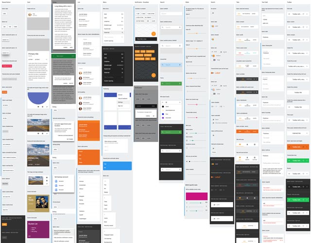
Kitchen sink - click to enlarge
Main features
- Allows creating dynamic and interactive interfaces with ease
- Closely follows the Material Design specification
- Versatile theming options to totally deviate from Material Design
- Supports touch, mouse and keyboard
- Extensive documentation with example code
Demos
Getting started
Setup examples / starter kits
Mithril
- polythene-mithril-setup
- polythene-mithril-typescript-setup
- polythene-mithril-material-components-web
- polythene-mithril-coffeescript-setup
React
Guides
- Documentation: components, examples, CSS, theming
- Extending other libraries
- Developing
- Change log
- Known issues
Compatibility
- Mithril 1.x, Mithril 2.x
- React 16.x
- Bundlers: Rollup, Webpack 3 and 4
- TypeScript
Browser support
- Chrome: 54+
- Edge: 13+
- Firefox: 49+
- Internet Explorer: 11 - see Known issues
- Mobile Safari: 9+
- Safari: 9+
