react-datum-datagrid
A datagrid built on react-virtualized that works with react-datum and Backbone.js

Live Demo & Examples
http://zulily.github.io/react-datum-datagrid/docs/examples/#basic
Installation
Install from NPM:
npm install react-datum-datagrid --save** Install from the web: **
Copy development (.js) or optimized (.min.js) distribution file from https://github.com/zulily/react-datum-datagrid/tree/master/dist in with your other vendor js and use a script tag or AMD to load it.
Usage
Suppose you have a Backbone Collection of puppy records such as http://zulily.github.io/react-datum-datagrid/test/lib/puppyData.js ...
let puppyCollection = new Backbone.Collection(PUPPY_DATA)To build an infinitely scrolling datagrid with locked left columns...
class BasicDatagridDisplay extends React.Component {
  static displayName = "BasicDatagridDisplay"

  render(){
    // ReactDatumDatagrid will fill what ever element it is placed in
    // Below we constrain it to 100% of the demo pane and a fixed width of 600px
    // You can also use Flex!  See TODO Flexy Demo
    return (
      <div style={{height: "100%", width: 600}}>
        <ReactDatumDatagrid.Datagrid
          collection={puppyCollection}
          columns={this.getColumns()}
          headerHeight={40}
          rowHeight={110}
          defaultColumnDef={{
            width: 150
          }}/>
      </div>
    )
  }

  getColumns(){
    return [{
      key: 'imageUrl',
      name: 'Image',
      width: 120,
      datum: ReactDatum.LazyPhoto,
      locked: true
    },{
      key: 'name',
    },{
      key: 'breed',
    },{
      key: 'size',
      width: 80,
    },{
      key: 'sex',
      width: 80,
    },{
      key: 'contactEmail',
      width: '200',
      datum: ReactDatum.Email,
      datumProps: {
        ellipsizeAt: false,
        reverseEllipsis: true,
      }
    }]
  }
}

window.Demo = BasicDatagridDisplay
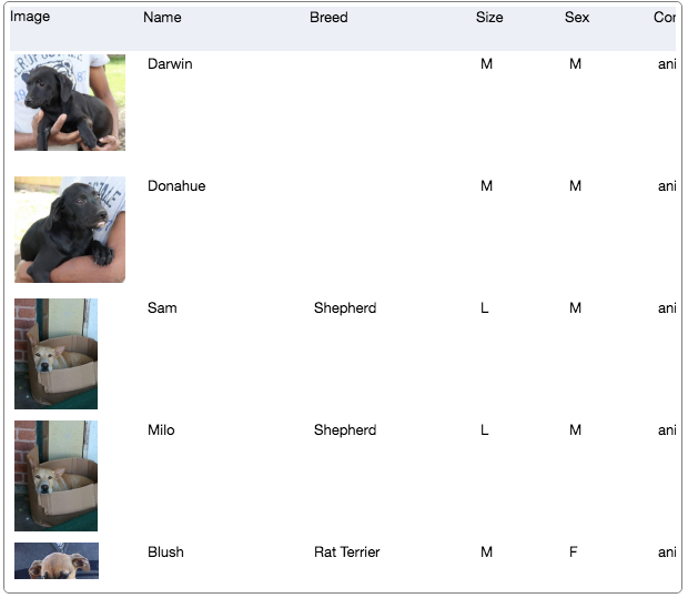
And violà...
screenshot - click to view demo:
Column definition objects
Currently supported column feature attributes:
-
key- this is the only required attribute for all columns. It is the attribute name in the model to display and update. -
name- the label to display in the header. May be a React Component. default: columnkeyhumanized and title cased. -
width- the width of the column (when orientation datagrid prop is landscape) -
height- the height of the columns (when orientation datagrid prop is portrait) -
datum- a datum component to use for display and input. default: ReactDatum.Text -
datumProps- props to pass datum component above -
sortable- bool; show sort icon in column header -
sortAttr- string attribute name to sort by if different then key -
exportable- bool; if false, don't export this column in in csv export -
exportAs- string to use as header in csv export. default name -
exportAttribute- string name of attribute to export if diff than column.key -
csvExportAttribute- string name of attribute to export to csv. defaults to exportAttr -
exportFunction- a callback function Called with (model, columnDef, datagrid, options). If specified, has precedence over exportAttr and csvExportAttr. It should return a text or numeric value to export for the given model and column definition. Called with (model, columnDefinition, datagrid, options) where options can beforCsv: true if being exported for Csv . -
validations- An array of methods to call with (model, columnDef, value). Each method specified must return true or the model value will not be set. Failing validations should return a string error message suitable for user comprehension. -
cellStyle- inline styles to apply to the cell. -
cellComponent- Component to display in cells. alias:defaultFormatter. default: ReactDatumDatagrid.Cell -
headerComponent- Component to display in header cells. alias:header. default: ReactDatumDatagrid.HeaderCell
API Docs
The object oriented API of react-datum-datagrid is documented in our API Docs.
Enough reading, check out the demos!