react-native-draggable


UPDATE DEC 2019 (v3.0.0) - This repo has just been completely refreshed and contains very different functionality, please see the new props and usage below
Draggable item for react-native!
npm install react-native-draggable
import Draggable from 'react-native-draggable';
How to use
return (
<View >
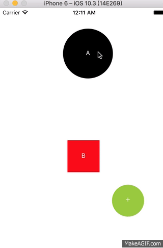
<Draggable x={75} y={100} renderSize={56} renderColor='black' renderText='A' isCircle shouldReverse onShortPressRelease={()=>alert('touched!!')}/>
<Draggable x={200} y={300} renderColor='red' renderText='B'/>
<Draggable/>
<Draggable x={50} y={50}>
<YourComponent/>
</Draggable>
</View>
);
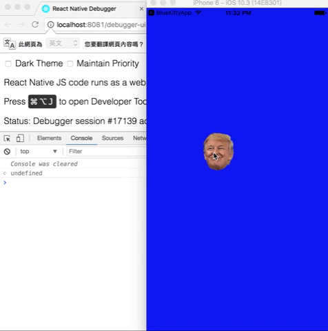
 in my project =>
return (
    <View style={{backgroundColor: 'blue', flex: 1}} >
        <Draggable
            imageSource={require('./trump1.png')}
            renderSize={80}
            x={200}
            y={300}
            onDragRelease={this._changeFace}
            onLongPress={()=>console.log('long press')}
            onShortPressRelease={()=>console.log('press drag')}
            onPressIn={()=>console.log('in press')}
            onPressOut={()=>console.log('out press')}
        />
    </View>
);
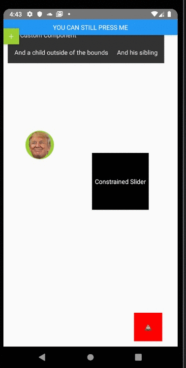
Props spec & Example
Properties
| Prop | Type | Example | Default | Description |
|---|---|---|---|---|
| renderText | string | 'ANY' | '+' | text of draggable |
| isCircle | bool | {true} | --- | render as circle |
| renderSize | number | {36} | {36} | draggable size |
| imageSource | source | require('./img/xxx.png') | --- | image source |
| renderColor | string | 'black' | --- | Colors |
| children | Component | <Text>Sup</Text> |
--- | children to render as draggable |
| shouldReverse | bool | {false} | {false} | should draggable spring back to start when released |
| disabled | bool | {false} | {false} | should draggable be disabled |
| debug | bool | {false} | {false} | should show a debug visualization |
| touchableOpacityProps | Object | { activeOpactiy: .1 } | --- | props passed to TouchableOpacity component |
| animatedViewProps | Object | { accessibilityHint: 'drag' } | --- | props passed to Animated.View component |
| x | number | {0} | 0 | initial position x |
| y | number | {0} | 0 | initial position y |
| z | number | {1} | 1 | z-index / elevation |
| minX | number | {0} | --- | min X value for left edge of component |
| minY | number | {0} | --- | min Y value for top edge of component |
| maxX | number | {0} | --- | max X value for right edge of component |
| maxY | number | {0} | --- | max Y value for bottom edge of component |
Events
| Event | Type | Arguments | Description |
|---|---|---|---|
| onDrag | func | event, gestureState | called every frame component is moved |
| onShortPressRelease | func | event | called when a press is released that isn't a long press or drag |
| onDragRelease | func | event, gestureState | called when a drag is released |
| onLongPress | func | event | called when a long press is started |
| onPressIn | func | event | called when a press is started |
| onPressOut | func | event | called when a press is stopped, or the component is dragged |
| onRelease | func | event, wasDragging | called at the end of interaction, regardless if press or drag |
Methods (not supported above V2.0.0)
| Method | params | Description |
|---|---|---|
| reversePosition | --- | manually reset Draggable to start position |
| getPosition | --- | use onDragRelease callback instead. get the value of pageX, pageY |
What's next?
This Draggable is used to be a Draggable Button in my project. Let me know if you have any idea or demand, let's discuss and develop it.


