Material-Calendar-View is a simple and customizable calendar widget for Android based on Material Design. The widget has two funcionalities: a date picker to select dates (available as an XML widget and a dialog) and a classic calendar. The date picker can work either as a single day picker, many days picker or range picker.
We described a simple usage of the component in this article.
- Material Design
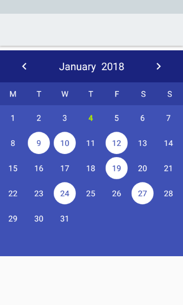
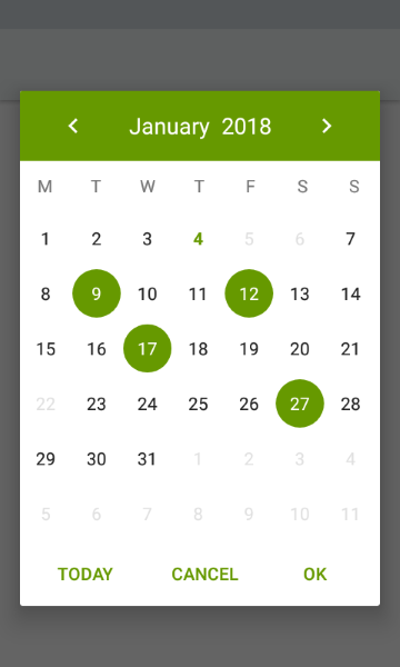
- Single date picker
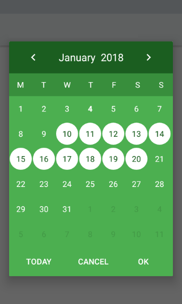
- Many dates picker
- Range picker
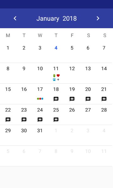
- Events icons
- Fully colors customization
- Customized font
Make sure you are using Java 8 in your project. If not, add below code to build.gradle file:
android {
    compileOptions {
        sourceCompatibility JavaVersion.VERSION_1_8
        targetCompatibility JavaVersion.VERSION_1_8
    }
}
Make sure you have defined the mavenCentral() repository in project's build.gradle file:
allprojects {
    repositories {
        mavenCentral()
    }
}
Add the dependency to module's build.gradle file:
dependencies {
    implementation 'com.applandeo:material-calendar-view:1.9.2'
}
To your XML layout file add:
<com.applandeo.materialcalendarview.CalendarView
    android:id="@+id/calendarView"
    android:layout_width="match_parent"
android:layout_height="match_parent" />List<CalendarDay> calendarDays = new ArrayList<>();
Calendar calendar = Calendar.getInstance();
CalendarDay calendarDay = new CalendarDay(calendar);
calendarDay.setImageResource(R.drawable.sample_icon);
calendarDays.add(event);
//or if you want to specify event label color
calendarDay.setLabelColor(Color.parseColor("#228B22"));
calendarDays.add(calendarDay);
CalendarView calendarView = (CalendarView) findViewById(R.id.calendarView);
calendarView.setCalendarDays(calendarDays);You can use our utils method to create Drawable with text
CalendarUtils.getDrawableText(Context context, String text, Typeface typeface, int color, int size);Take a look at sample_three_icons.xml and adjust it to your project
calendarView.setOnCalendarDayClickListener(new OnCalendarDayClickListener() {
    @Override
    public void onDayClick(CalendarDay calendarDay) {
        Calendar clickedDayCalendar = calendarDay.getCalendar();
    }
});
...or long click:
calendarView.setOnCalendarDayLongClickListener(new OnCalendarDayLongClickListener() {
    @Override
    public void onDayLongClick(CalendarDay calendarDay) {
        Calendar clickedDayCalendar = calendarDay.getCalendar();
    }
});If you want to get all selected days, especially if you use multi date or range picker you should use the following code:
List<Calendar> selectedDates = calendarView.getSelectedDates();...or if you want to get the first selected day, for example in case of using single date picker, you can use:
Calendar selectedDate = calendarView.getFirstSelectedDate();Calendar calendar = Calendar.getInstance();
calendar.set(2019, 7, 5);
calendarView.setDate(calendar);Calendar min = Calendar.getInstance();
Calendar max = Calendar.getInstance();
calendarView.setMinimumDate(min);
calendarView.setMaximumDate(max);List<Calendar> calendars = new ArrayList<>();
calendarView.setDisabledDays(calendars);List<Calendar> calendars = new ArrayList<>();
calendarView.setHighlightedDays(calendars);List<Calendar> calendars = new ArrayList<>();
calendarView.setSelectedDates(calendars);...or if you want to remove selected dates:
calendarView.clearSelectedDays();- Don't pass more than one calendar object to method above if your calendar type is
CalendarView.ONE_DAY_PICKER. - If your calendar type is
CalendarView.RANGE_PICKERyou have to pass full dates range. To get it you can use our utils methodCalendarUtils.getDatesRange(Calendar firstDay, Calendar lastDay).
calendarView.setOnPreviousPageChangeListener(new OnCalendarPageChangeListener() {
    @Override
    public void onChange() {
        ...
    }
});

calendarView.setOnForwardPageChangeListener(new OnCalendarPageChangeListener() {
    @Override
    public void onChange() {
        ...
    }
});If you want to use calendar in the picker mode, you have to use the following tags:
app:type="one_day_picker"app:type="many_days_picker"app:type="range_picker"
If you want to display event icons in the picker mode, add:
app:eventsEnabled="true"
- Header color:
app:headerColor="[color]" - Header label color:
app:headerLabelColor="[color]" - Previous button image resource:
app:previousButtonSrc="[drawable]" - Forward button image resource:
app:forwardButtonSrc="[drawable]" - Abbreviations bar color:
app:abbreviationsBarColor="[color]" - Abbreviations labels color:
app:abbreviationsLabelsColor="[color]" - Calendar pages color:
app:pagesColor="[color]" - Selection color in picker mode:
app:selectionColor="[color]" - Selection label color in picker mode:
app:selectionLabelColor="[color]" - Days labels color:
app:daysLabelsColor="[color]" - Color of visible days labels from previous and next month page:
app:anotherMonthsDaysLabelsColor="[color]" - Disabled days labels color:
app:disabledDaysLabelsColor="[color]" - Highlighted days labels color:
app:highlightedDaysLabelsColor="[color]" - Today label color:
app:todayLabelColor="[color]"
...or in code:
CalendarView calendarView = (CalendarView) findViewById(R.id.calendarView);
calendarView.setHeaderColor([color]);
calendarView.setHeaderLabelColor([color]);
calendarView.setForwardButtonImage([drawable]);
calendarView.setPreviousButtonImage([drawable]);To use custom view for calendar cells create XML file (like in example below) and set it using setCalendarDayLayout(@LayoutRes layout: Int) method. XML file must contain TextView with id dayLabel and can contain ImageView with id dayIcon. Do not set colors or textStyle here, it will be overwritten.
<LinearLayout xmlns:android="http://schemas.android.com/apk/res/android"
    xmlns:tools="http://schemas.android.com/tools"
    android:layout_width="match_parent"
    android:layout_height="wrap_content"
    android:background="?attr/selectableItemBackgroundBorderless"
    android:orientation="vertical">

    <!--REQUIRED-->
    <TextView
        android:id="@+id/dayLabel"
        ... />

    <!--CAN BE SKIPPED-->
    <androidx.appcompat.widget.AppCompatImageView
        android:id="@+id/dayIcon"
        ... />

</LinearLayout>If you want to customize specyfic cells create list of CalendarDay objects and pass it by setCalendarDays() method like in example below:
val list = listOf(
    CalendarDay(Calendar.getInstance()).apply {
        labelColor = [color resource]
        backgroundResource = [drawable resource]
        backgroundDrawable = [drawable]
        selectedLabelColor = [color resource]
        selectedBackgroundResource = [drawable resource]
        selectedBackgroundDrawable = [drawable]
    }
)

calendarView.setCalendarDays(list)
In the future CalendarDay will replace EventDay.
- To create font directory Right-click the res folder and go to New > Android resource directory. — The New Resource Directory window appears.
- In the Resource type list, select font, and then click OK.
- Note: The name of the resource directory must be font.
- Add your ttf or otf fonts in font folder. As an example we ad sample_font.ttf and sample_font_bold.ttf
- On a DatePickerBuilder apply
.typefaceSrc(R.font.sample_font)for setting sample_font to callendar and its abbreviations. - Optionally apply
.todayTypefaceSrc(R.font.sample_font_bold)to differentiate today date font form the rest of dates in calendar view
If you want to disable the swipe gesture to change the month, you have to use the following tag:
app:swipeEnabled="false"
...or in code:
calendarView.setSwipeEnabled(false);If you want to change default first day of week:
app:firstDayOfWeek="[day]"
...or in code:
calendarView.setFirstDayOfWeek([CalendarWeekDay]);By default the first day is monday or sunday depending on user location.
To translate months names, abbreviations of days, "TODAY", "OK" and "CANCEL" buttons, just add below tags to your strings.xml file:
<string name="material_calendar_monday">M</string>
<string name="material_calendar_tuesday">T</string>
<string name="material_calendar_wednesday">W</string>
<string name="material_calendar_thursday">T</string>
<string name="material_calendar_friday">F</string>
<string name="material_calendar_saturday">S</string>
<string name="material_calendar_sunday">S</string>

<array name="material_calendar_months_array">
    <item>January</item>
    <item>February</item>
    <item>March</item>
    <item>April</item>
    <item>May</item>
    <item>June</item>
    <item>July</item>
    <item>August</item>
    <item>September</item>
    <item>October</item>
    <item>November</item>
    <item>December</item>
</array>

<string name="material_calendar_today_button">Today</string>
<string name="material_calendar_positive_button">OK</string>
<string name="material_calendar_negative_button">Cancel</string>DatePickerBuilder builder = new DatePickerBuilder(this, listener)
.pickerType(CalendarView.ONE_DAY_PICKER);
DatePicker datePicker = builder.build();
datePicker.show();To use another picker type replace CalendarView.ONE_DAY_PICKER with CalendarView.MANY_DAYS_PICKER or CalendarView.RANGE_PICKER.
private OnSelectDateListener listener = new OnSelectDateListener() {
    @Override
    public void onSelect(List<Calendar> calendars) {
        ...
    }
};new DatePickerBuilder(this, listener)
.date(Calendar.getInstance()) // Initial date as Calendar object
.minimumDate(Calendar.getInstance()) // Minimum available date
.maximumDate(Calendar.getInstance()) // Maximum available date
.disabledDays(List<Calendar>) /// List of disabled days
.headerColor(R.color.color) // Color of the dialog header
.headerLabelColor(R.color.color) // Color of the header label
.previousButtonSrc(R.drawable.drawable) // Custom drawable of the previous arrow
.forwardButtonSrc(R.drawable.drawable) // Custom drawable of the forward arrow
.previousPageChangeListener(new OnCalendarPageChangeListener(){}) // Listener called when scroll to the previous page
.forwardPageChangeListener(new OnCalendarPageChangeListener(){}) // Listener called when scroll to the next page
.abbreviationsBarColor(R.color.color) // Color of bar with day symbols
.abbreviationsLabelsColor(R.color.color) // Color of symbol labels
.abbreviationsBarVisibility(int) // Visibility of abbreviations bar
.pagesColor(R.color.sampleLighter) // Color of the calendar background
.selectionColor(R.color.color) // Color of the selection circle
.selectionLabelColor(R.color.color) // Color of the label in the circle
.daysLabelsColor(R.color.color) // Color of days numbers
.aotherMonthsDaysLabelsColor(R.color.color) // Color of visible days numbers from previous and next month page
.disabledDaysLabelsColor(R.color.color) // Color of disabled days numbers
.highlightedDaysLabelsColor(R.color.color) // Color of highlighted days numbers
.todayColor(R.color.color) // Color of the present day background
.todayLabelColor(R.color.color) // Color of the today number
.dialogButtonsColor(R.color.color); // Color of "Cancel" and "OK" buttons
.maximumDaysRange(int) // Maximum number of selectable days in range mode
.navigationVisibility(int) // Navigation buttons visibility
.typefaceSrc(R.font.sample_font) // Calendar font
.todayTypefaceSrc(R.font.sample_font_bold) // (Optional) calendar today date font
.firstDayOfWeek(CalendarWeekDay) // Default is monday or sunday depending on user location- Added customized font support
- Added ability to set custom view for cells
- Added ability to set first day of a week
- Migrated to kotlin
- Added ability to set maximum selectable days range
- Added more color customizations (Event label, today background)
- Added ability to hide date picker navigation buttons
- Added selected/focused state to calendar days (thanks victor-accarini)
- Added a setEvent option for the DatePickerBuilder (thanks victor-accarini)
- Migration to AndroidX
- Added ability to set highlighted days (thanks domyn)
- Added Javadocs for DatePickerBuilder (many thanks EdricChan03)
- Added support for events (images) in picker calendars (many thanks thavelka for your contribution) --> Customization
- Added method which let you set selected dates programmatically --> Setting selected dates
- Now, the first day of a week depends on device location (thanks thavelka)
- Removed Glide dependency
- Added support for Drawable in EventDay object (You can set any drawable you want) --> Adding events with icons
- Added ability to set header colours (background, label and arrows) programmatically --> Colors customization
- More color customization (abbreviations, calendar pages, labels colors)
- Changed onNavigationButtonClickListeners to onCalendarPageChangeListeners
- Added page change listeners to dialog pickers
- Added onDayClickListener to pickers (not dialog pickers)
- Added ability to insert list of disabled days
- Bug fixes
- Bug fixes
- Added ability to set minimum and maximum available date
- Added "Today" button to dialog picker
- Added many days picker
- Added range picker
- Added listeners for previous and forward arrow buttons
- Added build-in DatePicker dialog
- Bugs fixes
- Initial build
It would be great if you decide to use our component in your project. It’s open source, feel free. Write to us at hi@applandeo.com if you want to be listed and we will include your app in our repo. If you have any questions or suggestions just let us know.
Copyright 2017, Applandeo sp. z o.o.

Licensed under the Apache License, Version 2.0 (the "License");
you may not use this file except in compliance with the License.
You may obtain a copy of the License at

   http://www.apache.org/licenses/LICENSE-2.0

Unless required by applicable law or agreed to in writing, software
distributed under the License is distributed on an "AS IS" BASIS,
WITHOUT WARRANTIES OR CONDITIONS OF ANY KIND, either express or implied.
See the License for the specific language governing permissions and
limitations under the License.


