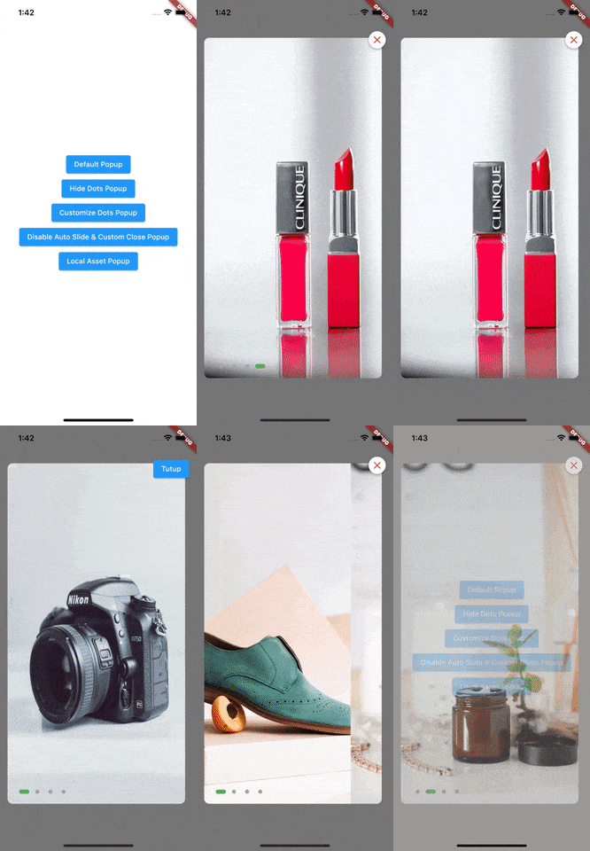
Popup Banner
Popup Banner is a package to show banner slider using modal dialog. We can set the image location, auto slide settings, dots indicator and others.
Features
- Customizable Popup
- Custom Close Button
- Load Image From Network & Local
- Auto Slider & Timer
- Custom Dots Indicator Position & Color
Getting started
You must add the library as a dependency to your project.
dependencies:
 popup_banner: ^1.0.0
You should then run flutter packages get
Example Project
There is a detailed example project in the example folder. You can directly run and play on it. There are code snippets from example project below.
Default Popup
PopupBanner(
  context: context,
  images: [
    "https://tinyurl.com/popup-banner-image",
    "https://tinyurl.com/popup-banner-image2",
    "https://tinyurl.com/popup-banner-image3",
    "https://tinyurl.com/popup-banner-image4"
  ],
  onClick: (index) {
    debugPrint("CLICKED $index");
  },
).show();
Hide Dots Popup
PopupBanner(
  context: context,
  images: [
    "https://tinyurl.com/popup-banner-image",
    "https://tinyurl.com/popup-banner-image2",
    "https://tinyurl.com/popup-banner-image3",
    "https://tinyurl.com/popup-banner-image4"
  ],
  useDots: false,
  onClick: (index) {
    debugPrint("CLICKED $index");
  },
).show();
Customize Dots Popup
PopupBanner(
  context: context,
  images: [
    "https://tinyurl.com/popup-banner-image",
    "https://tinyurl.com/popup-banner-image2",
    "https://tinyurl.com/popup-banner-image3",
    "https://tinyurl.com/popup-banner-image4"
  ],
  dotsAlignment: Alignment.bottomCenter,
  dotsColorActive: Colors.blue,
  dotsColorInactive: Colors.grey.withOpacity(0.5),
  onClick: (index) {
    debugPrint("CLICKED $index");
  },
).show();
Disable Auto Slide & Custom Close Popup
PopupBanner(
  context: context,
  images: [
    "https://tinyurl.com/popup-banner-image",
    "https://tinyurl.com/popup-banner-image2",
    "https://tinyurl.com/popup-banner-image3",
    "https://tinyurl.com/popup-banner-image4"
  ],
  autoSlide: false,
  customCloseButton: ElevatedButton(
    onPressed: () => Navigator.pop(context),
    style: ElevatedButton.styleFrom(
      primary: Colors.blue,
    ),
    child: const Text(
      "Close",
      style: TextStyle(
        color: Colors.white,
      ),
    ),
  ),
  onClick: (index) {
      debugPrint("CLICKED $index");
  },
).show();
Local Asset Popup
PopupBanner(
  context: context,
  images: [
    "assets/images/popup-banner-local-image.jpg",
    "assets/images/popup-banner-local-image2.jpg",
    "assets/images/popup-banner-local-image3.jpeg",
    "assets/images/popup-banner-local-image4.jpg"
  ],
  fromNetwork: false,
  onClick: (index) {},
).show()
Contributions
- If you found a bug, open an issue.
- If you have a feature request, open an issue.
- If you want to contribute, submit a pull request.
Version compatability
See CHANGELOG for all breaking (and non-breaking) changes.
Made with


