figplotter
Plotting infrastructure for Python using matplotlib.
Install
You can easily install figplotter using pip.
In your home directory:
pip install figplotter --user
In the system (requires superuser privileges):
sudo pip install figplotter
Example
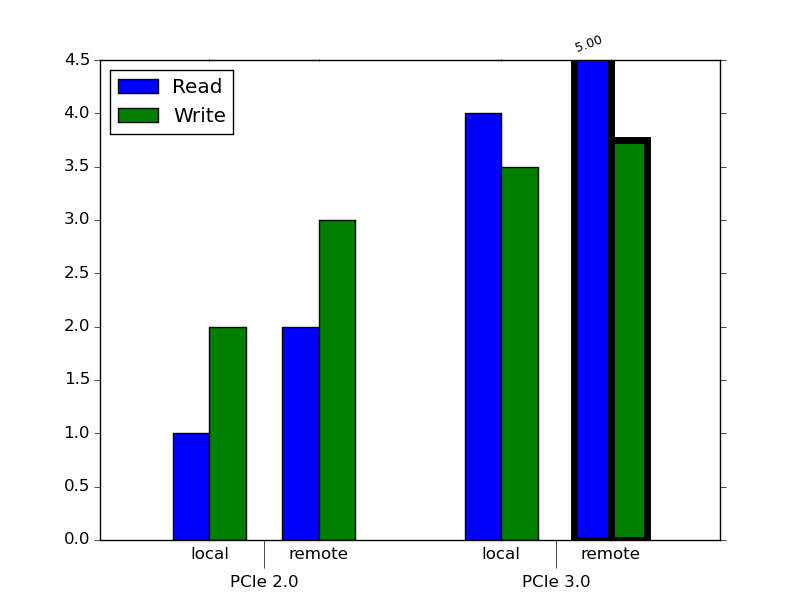
This is the code to generate a figure with two-level clustering using figplotter:
from figplotter.utils import clusterize
from figplotter.plot import figure, cluster_series_2
# We can set the properties of the bars with bar-granularity. All properties
# offered by matplotlib are supported. Bars are selected by using data
# identifiers. In a two-level clustering figure, three fields are specified:
# cluster_level1::cluster_level2::series.
# Wildcards can be used in any field to select groups of bars.
# Selectors do not need to specify all fields (e.g. 'Read' is equivalent to
# '*::*::Read').
style_series = {
    'Read' : { 'bar::color' : 'b' }, # Set color for all 'Read' bars
    'Write': { 'bar::color' : 'g' }, # Set color for all 'Write' bars
    'PCIe 3.0::remote::*' : { 'bar::linewidth': 5 } # Use different line width
                                                    # for the two bars in the
                                                    # 'PCIe 3.0::remote' cluster
}
# We can also set the axis properties. In a two-level clustering figure the
# properties of the ticks and labels can be configured independently for the
# two levels of clusters (tick/ticklabel and major_tick/major_ticklabel).
style_axis = {
    '*': { 'tick::direction'      : 'inout', # Use different tick styles for
           'major_tick::direction': 'out' }, # major and normal ticks
    'x': { 'major_tick::length'   : 20,      # Use longer tick for major ticks
           'major_tick::top'      : False,   # Disable major ticks on the top
           'major_ticklabel::y'   : -0.05 }  # Offset labels for major clusters
                                             # so the don't overlap with the
                                             # labels for minor clusters
}
# Figures/axes are created just like in matplotlib
fig = figure()
ax = fig.add_subplot(111)

read  = [1, 2,   4,    5]
write = [2, 3, 3.5, 3.75]
clusters_1 = [ 'PCIe 2.0', 'PCIe 3.0' ]
clusters_2 = [ 'local', 'remote' ]
# Helper functions are provided to reshape data as expected by the plotting
# functions
data = clusterize({ 'Read': read, 'Write': write}, [clusters_1, clusters_2])

cluster_series_2(ax,
                 data,
                 [clusters_1, clusters_2],
                 ylim = (0, 4.5),
                 style_series = style_series,
                 style_axis = style_axis)

fig.show()