OverBoard
OverBoard is a lightweight yet powerful dashboard to monitor your experiments.
Load remote experiments in real-time through SSH/FTP and others.
Custom visualisations (tensors and any custom plot with familiar MatPlotLib syntax).
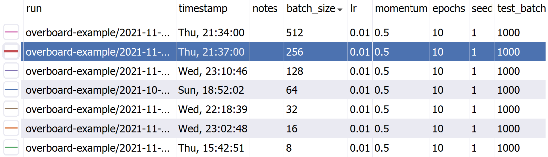
A sortable table of hyper-parameters with Python-syntax filtering.
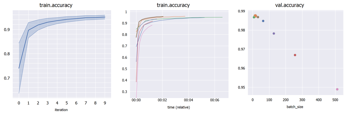
Plot percentile intervals (shaded plots), custom X/Y axes, and hyper-parameters (bubble plots).
Installation
You can install the dependencies with:
-
With Conda:
conda install pyqt=5.12 pyqtgraph=0.11 -c conda-forge -
With pip:
pip install pyqt5==5.12 pyqtgraph==0.11
Finally, OverBoard itself can be installed with: pip install fs==2.4 overboard
(Conda seems to be too strict when installing PyFileSystem/fs, so pip should be preferred.)
Optional:
-
pip install fs.sshfsto support remote files through SSH. -
PyOpenGL 3.1 (either through conda or pip) if you intend to use custom 3D plots with PyQtGraph.
-
MatPlotLib if you intend to use it for custom plots.
Installation - logger only
Your scripts can log data without installing the full GUI and its dependencies (so your remote GPU cluster does not need PyQt at all).
Just use: pip install overboard_logger
And remember to import overboard_logger instead of overboard in your scripts.
Usage
-
Main interface:
python3 -m overboard <logs-directory> -
Logging experiments is simple:
from overboard import Logger

with Logger('./logs') as logger:
  for iteration in range(100):
    logger.append({'loss': 0, 'error': 0})
You can also pass in a meta keyword argument, which can be a dict with hyper-parameters names and values (or other meta-data), to help organize your experiments. These will be displayed in a handy table, which supports sorting and filtering. The meta data can also be an argparse.Namespace, which is useful if your hyper-parameters are command-line arguments parsed with argparse.
By default a unique folder (using the current timestamp) is created for the logs. For full documentation on initialization arguments and other methods, type pydoc overboard on the command-line (Python built-in doc viewer).
You can also check the examples directory:
-
examples/basic.py: A minimal example. Generates some test logs. -
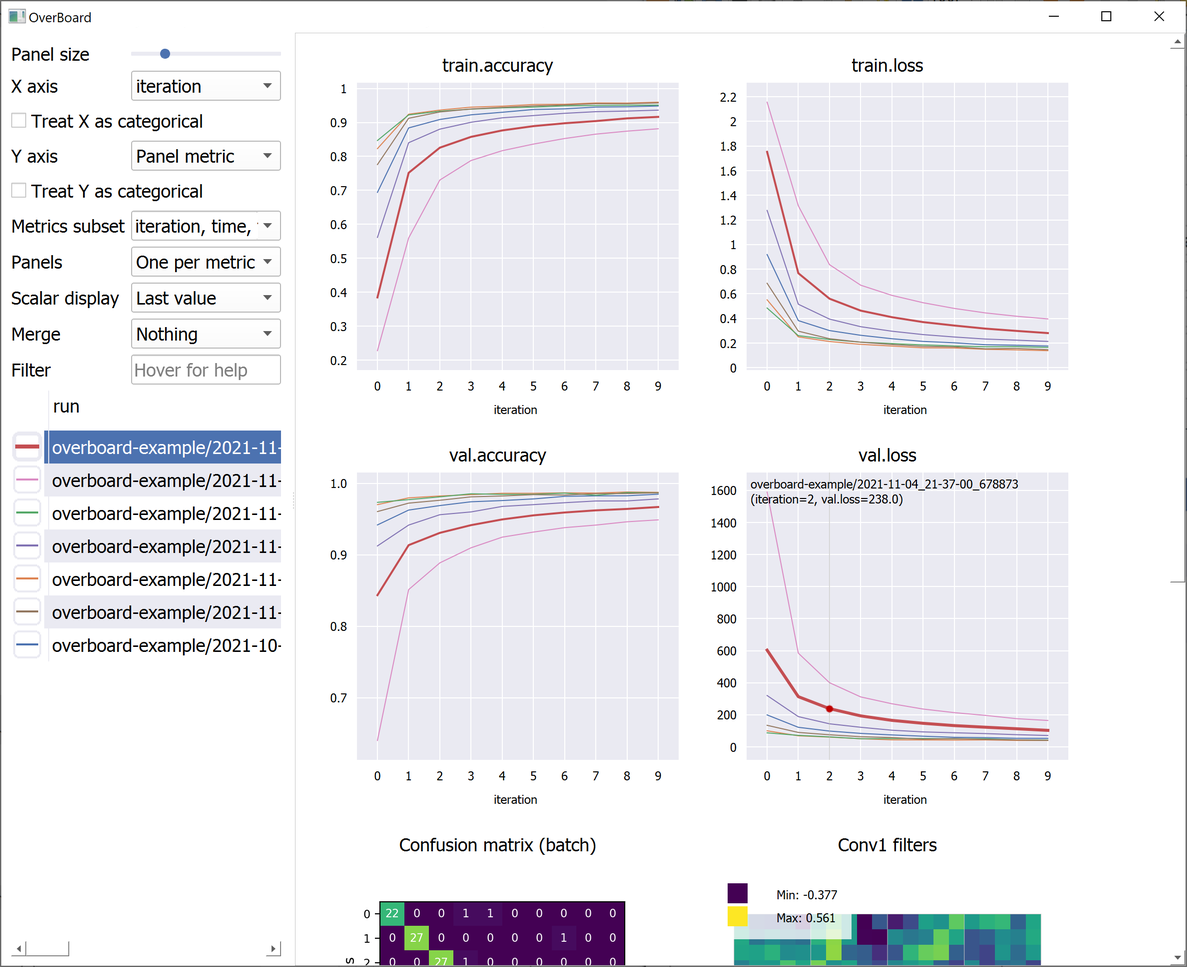
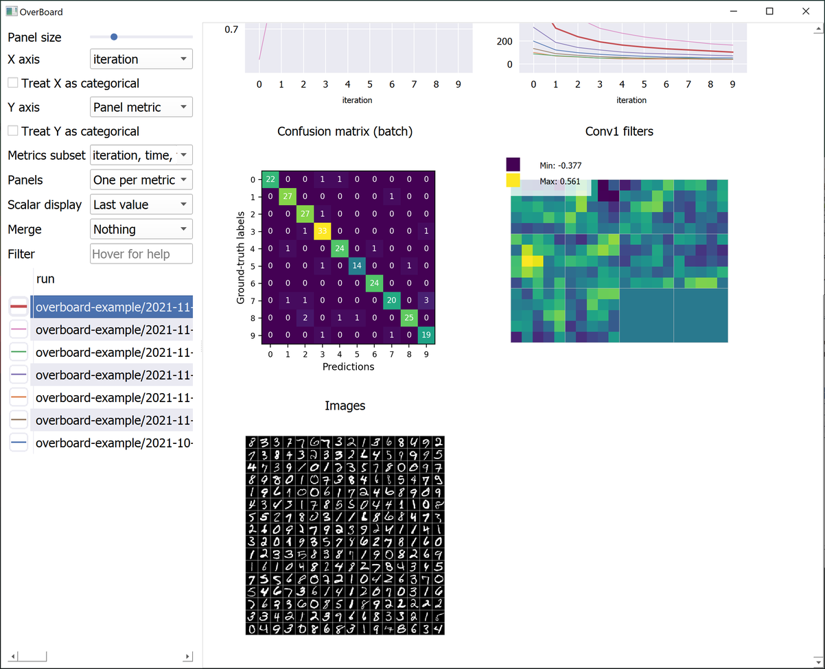
examples/mnist.py: The mandatory MNIST example. Also shows a custom MatPlotLib plot (a confusion matrix). -
examples/example_2d.py: Example custom 2D plot, with PyQtGraph (faster than MatPlotLib). -
examples/example_3d.py: Example custom 3D plot, with PyQtGraph. Requires PyOpenGL.
A note about importing: You can either import the Logger class from overboard or from overboard_logger. If you installed the "logger only" version as described above (no dependencies), then you can only import from overboard_logger.
Remote experiments
It's as simple as:
python -m overboard ssh://username:password@hostname/path-to-experiments
...replacing your SSH user name, password, host name/server, and the directory where OverBoard should look for experiments. The default port is 22, which you can override with :23 or another port number after the host name.
There are a number of other settings, which you can append after the path. For example, append ?keepalive=60&config_path=~/.ssh/config to set the keepalive packets interval to 60 seconds, and specify an OpenSSH configuration file path.
Other remote file systems are available by using appropriate prefixes (e.g. ftp://).
Interface tips & tricks
-
Click a plot title to hide it (moving it to the bottom) or to show it again.
-
Click a plot line to select that experiment in the table, and vice-versa.
-
Use the mouse wheel to zoom and drag to pan in a plot or custom visualization.
-
Click the "A" button in the bottom-left of a plot to reset the zoom/pan.
-
Choose an hyper-parameter as the "X axis" in the sidebar to compare different hyper-parameters graphically (bubble plot). Click a bubble to highlight that experiment. If the hyper-parameter is numerical but has wildly different orders of magnitude, check "Treat X as categorical". By default, each bubble's Y coordinate (e.g. accuracy) is taken from the last iteration; in "Scalar display" you can choose the maximum or minimum across iterations.
-
If you have multiple runs with different random seeds (stored as hyper-parameter "seed" for example), select "Merge: seed" in the sidebar to merge them into shaded plots (you can then select whether to show the mean, median, range or standard deviations).
-
You can split all experiments into different plots by selected "Panels: One per run" in the sidebar, and selecting a metric to plot in "Y axis". Similarly, they can be split by a hyper-parameter value (e.g. a different algorithm in each panel, but each has multiple plots/runs).
Author
João Henriques, Visual Geometry Group (VGG), University of Oxford

