anchor - UI constraints for Pythonista
Python wrapper for Apple iOS UI view layout constraints, available as anchor.py on GitHub. Run the file to see a sample constraint-driven layout.
Constraints?
Constraints are used to determine how views are laid out in your UI. They are an alternative to the x, y, frame method used in Pythonista by default.
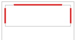
Constraints are defined as equations, which are dynamically evaluated as the dimensions or views of your UI change. For example, the following constraint places the Cancel button always beside the Done button:
cancel_button.at.trailing == done_button.at.leading_padding

(Here, 'trailing' and 'leading' are same as 'right' and 'left', but automatically reversed if your device is set for a right-to-left language.)
Constraints can use the following attributes:
left, right, top, bottom, width, heightleading, trailingcenter_x, center_ylast_baseline, first_baseline-
left_margin, right_margin, top_margin, bottom_margin, leading_margin, trailing_margin- Use these when you want to leave a standard margin between the view and the edge of its superview (inside margin).
-
left_padding, right_padding, top_padding, bottom_padding, leading_padding, trailing_padding- Use these when you want to leave a standard margin between the view and the view next to it (outside margin).
Why would I need them?
It depends on your style and preferences regarding building UIs.
You can create pretty much all the same layouts and achieve the same level of dynamic behavior just using Pythonista's regular frame, flex attribute and the layout method.
The reason to consider constraints is that they, and the convenience methods in this wrapper, provide perhaps a more human way of expressing the desired layout. You can use one-liners for "keep this view below that other view, no matter what happens", or "this view takes over the top half of the screen, with margins", without fiddling with pixel calculations or creating several ui.Views just for the layout.
Anatomy of a constraint
Constraints have this syntax:
target_view.at.attribute == source_view.at.attribute * multiplier + constant
Notes:
-
targetview is now constrained and unaffected by settingx,y,frameorcenter- but you can read these values if you need to know the absolute shape and position of a view.sourceview is unaffected and remains in the 'frame mode', until used on the left side of constraint. - Relationship can be
==,<=or>=(but nothing else). - You can also
/a multiplier or-a constant, and have several multipliers and constants, but they will only be combined per type (i.e.* 6 + 1 / 3 - 5is the same as* 2 - 4). - Multiplier can be zero or the source left out of the equation, but only if the target attribute is a size attribute, e.g.
target.at.height == 100
- Target and source attributes cannot mix...:
- size and position attributes
- vertical and horizontal position attributes
- absolute and relative position attributes (e.g.
leadingandleft)
These are all Apple restrictions, and the wrapper checks for them to avoid an ObjC exception and a Pythonista crash. Please let me know if you find other crashing combos.
Enabling constraints
Pythonista UI views do not natively support constraints, of course, so we need to enable them.
The explicit option is to call enable on the UI view, maybe at view creation. For example:
import anchor, ui
label = anchor.enable(ui.Label(alignment=ui.ALIGN_CENTER))
label.at.width == 100
An alternative is to use already-enabled versions of every Pythonista UI view class, defined in anchor.py, so you can save a little typing by importing it like this:
from ui import *
from anchor import *

label = Label(alignment=ALIGN_CENTER)
label.at.width == 100
Convenient view alignment
Enabled views have an align attribute that supports aligning matching attributes of views. For example, aligning the heights of two views:
search_field.align.height(search_button)

Using align is especially convenient when you need to align several views at once:
view_a.align.center_x(view_b, view_c)
In addition to all the regular constraint attributes like height and center_x in the examples above, align supports aligning the composite attributes size and center.
Convenient view placement within superview
Creating individual constraints can quickly become a bit of a bore. Thus the wrapper includes a number of methods for "docking" views.
For example, the following places constraints to the top and both sides, leaving height still undefined:
view.dock.top()
Following docking methods are available:
all, center, horizontal, vertical, between, top, bottom, leading, trailing, top_leading, top_trailing, bottom_leading, bottom_trailing
The most specialized of these is the between method, which docks the view to provided other views, and to the superview on the sides where you do not provide a view. Below is an example that docks the view to buttons at top and bottom - leading and trailing are left to be connected to the sides of the superview.
result_area.dock.between(
  top=search_button,
  bottom=done_button)
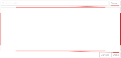
(Yes, between() with no arguments has the same effect as all().)
By default, dock methods leave a margin between the edges of the superview and the view. This can be adjusted with the fit parameter:
-
Dock.MARGIN(the default) - standard margin -
Dock.TIGHT- no margin -
Dock.SAFE- align to the safe area insets, if applicable
You can also change the default by setting the Dock.default_fit parameter, e.g.:
Dock.default_fit = Dock.TIGHT
Many dock methods support share and constant parameters.
share parameter can be used to define how much of the superview's area the view should take:
view.dock.top(share=.5)
This is only exact if you use TIGHT fit, as there is no way to dynamically account for the space taken by margins.
constant parameter can be used to adjust the margins manually, although I feel that this is probably bad layout design.
Layout guides
A significant advantage of constraint-based layouts is ability to use layout guides, which act similarly to views for layout purposes, without really being views and without impacting your view hierarchy in any way.
Guides always have an owning view and are straightforward to create:
guide = anchor.Guide(view)
Since guides are never displayed, their constraints can be ambiguous. For example, if you want to use a guide as a vertical divider between two views, the height of the guide does not need to be defined:
guide.at.width == 50
view_a.at.trailing == guide.at.leading
view_b.at.leading == guide.at.trailing
Guides only respond to a limited set of layout attributes: left, right, top, bottom, leading, trailing, center_x, center_y, width, height. Using other attributes with guides will raise an AttributeError.
Debugging constraints
When you constrain a view, you have to unambiguously constrain both its position and size. If you miss something, the view usually is not visible at all.
An example of an ambiguous constraint definition could be:
view_a.dock.top()
view_b.dock.between(top=view_a)
... which can leave the height of view_a undefined, and make size of both views ambiguous. (But not necessarily - if view_a is a Label, for example, it has a natural height which makes the constraints above fully defined.)
To debug constraints, you can either check an individual view for problems with:
view.at.is_ambiguous
... or check your whole view hierarchy by:
anchor.check_ambiguity(root_view)
This will print out the whole hierarchy, indicating which views use constraints, and which of those are ambiguous.
GridView
I find myself often creating small apps that need a clean UI, but nothing fancy, just boxes to show content in. Then I again code something quickly, placing a varying amount of squares on the screen with ad hoc math.
Picture below is an example of such app, a dashboard for my e-Golf.
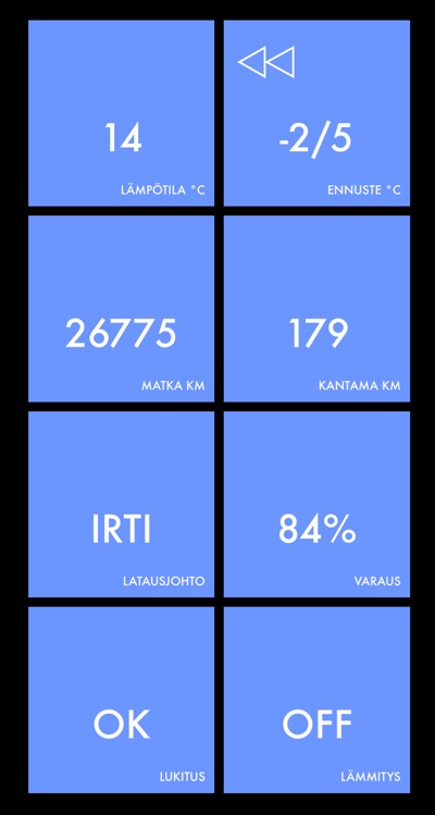
To avoid creating these types of screens over and over again, I created (yet another) GridView class. Its claim to fame lies in the fact that it does not scroll, neither do you need to set the size of the grid as fixed "x times y"; instead, you can just keep adding subviews to it, and it will use a bit of math to try to keep the layout as pleasing as possible.
Basic usage is simple:
gv = GridView()

for view in my_views:
  gv.add_subview()
GridView constructor takes a number of arguments, to fine-tune the layout:
-
gap- distance between boxes when tightly packed. Default is UIKit Standard 8 pt. -
count_x,count_y- use these if you need to restrict the number of boxes in either direction. -
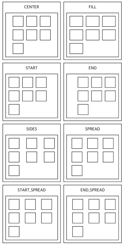
pack_x,pack_y,pack- control the packing behaviour in either direction, or use thepackoption to set both at ones. Picture below demonstrates different horizontal packing values. Default packing value in both directions isGridView.CENTER.
The views in the grid are always squares, unless you use FILL.
Right now this class is part of the anchor module, even if it does not use constraints - might split it later.
