


The quickest and easiest way to go from analysis...
The easiest way to set up scikit-plots is to install it using pip with the following command:
-
by
pypi:pip install -U scikit-plots
-
by
pypi.anaconda.org:## (Optionally) Install the lost dependency packages ## wget https://raw.githubusercontent.com/scikit-plots/scikit-plots/main/requirements/default.txt curl -O https://raw.githubusercontent.com/scikit-plots/scikit-plots/main/requirements/default.txt pip install -r default.txt
## Try Ensure all dependencies installed pip install -U -i https://pypi.anaconda.org/scikit-plots-wheels-staging-nightly/simple scikit-plots -
by
GITHUBto use@<branches>or@<tags>, If any:- Branches:
## pip install git+https://github.com/scikit-plots/scikit-plots.git@<branches>
## Latest in Development
pip install git+https://github.com/scikit-plots/scikit-plots.git@main
##
## Works with standard Python (CPython), Added C, Cpp, Fortran Support
##
pip install git+https://github.com/scikit-plots/scikit-plots.git@maintenance/0.4.x
##
## Works with standard Python (CPython), Works with PyPy interpreter
##
pip install git+https://github.com/scikit-plots/scikit-plots.git@maintenance/0.3.x
pip install git+https://github.com/scikit-plots/scikit-plots.git@maintenance/0.3.7
- Tags:
## pip install git+https://github.com/scikit-plots/scikit-plots.git@<tags>
pip install git+https://github.com/scikit-plots/scikit-plots.git@v0.4.0rc3
pip install git+https://github.com/scikit-plots/scikit-plots.git@v0.3.9rc3
pip install git+https://github.com/scikit-plots/scikit-plots.git@v0.3.7
- Branches:
-
You can also install scikit-plots from source if you want to take advantage of the latest changes:
## Forked repo: https://github.com/scikit-plots/scikit-plots.git
git clone https://github.com/YOUR-USER-NAME/scikit-plots.git
cd scikit-plots
## (Optionally) Add safe directories for git
bash docker/script/safe_dirs.sh
## download submodules
git submodule update --init
# pip install -r ./requirements/all.txt
pip install -r ./requirements/build.txt
## Install development version
pip install --no-cache-dir -e . -v
-
## (Optionally) Try Development [build,dev,test,doc]
## For More in Doc: https://scikit-plots.github.io/
python -m pip install --no-cache-dir --no-build-isolation -e .[build,dev,test,doc] -v
## [cpu] refer tensorflow-cpu, keras, transformers
## [gpu] refer Cupy tensorflow lib require NVIDIA CUDA support
pip install "scikit-plots[cpu]"
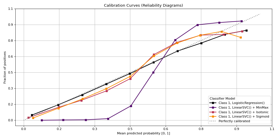
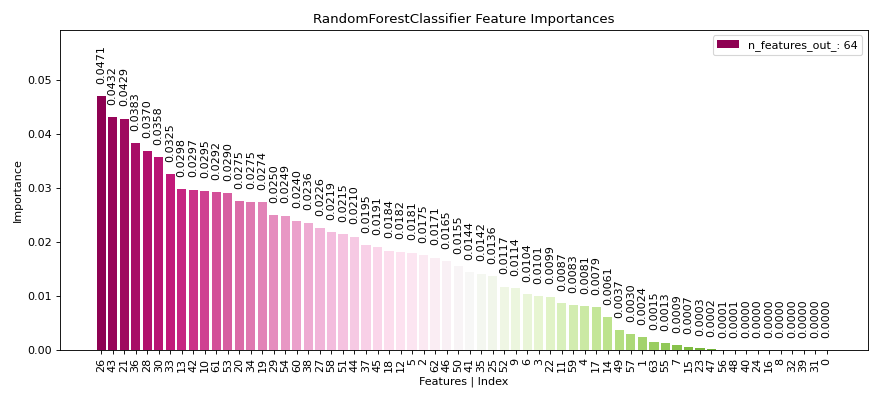
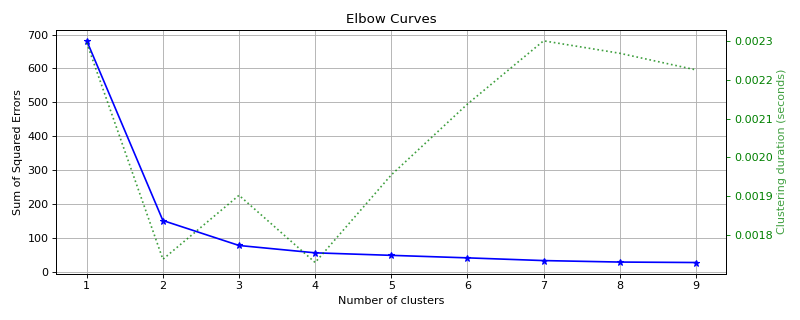
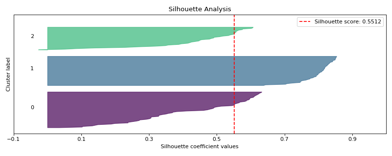
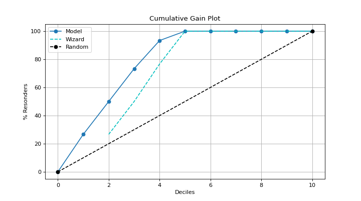
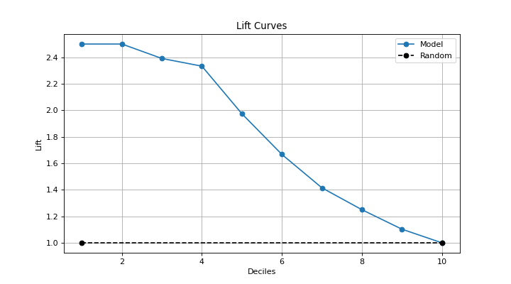
| Sample Plot 1 | Sample Plot 2 |
|---|---|
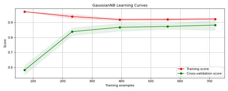
|
|
|
|
|
|
|
|
|
|
|
|
Scikit-plots is the result of an unartistic data scientist's dreadful realization that visualization is one of the most crucial components in the data science process, not just a mere afterthought.
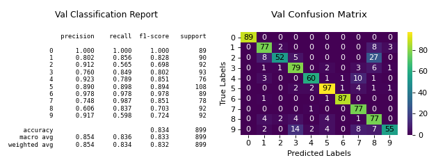
Gaining insights is simply a lot easier when you're looking at a colored heatmap of a confusion matrix complete with class labels rather than a single-line dump of numbers enclosed in brackets. Besides, if you ever need to present your results to someone (virtually any time anybody hires you to do data science), you show them visualizations, not a bunch of numbers in Excel.
That said, there are a number of visualizations that frequently pop up in machine learning. Scikit-plots is a humble attempt to provide aesthetically-challenged programmers (such as myself) the opportunity to generate quick and beautiful graphs and plots with as little boilerplate as possible.
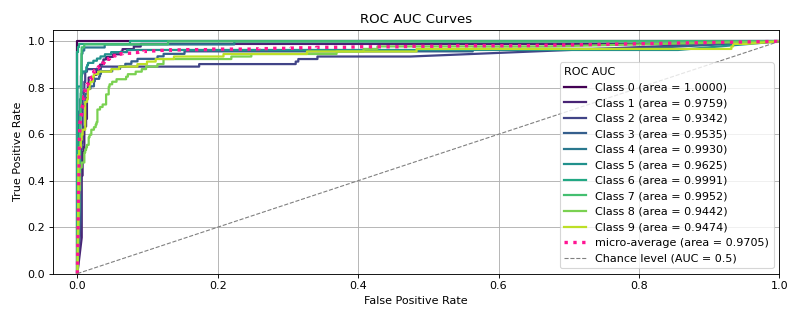
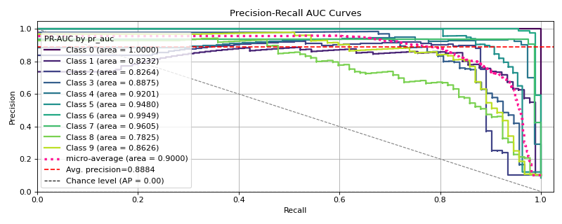
Say we use Keras Classifier in multi-class classification and decide we want to visualize the results of a common classification metric, such as sklearn's classification report with a confusion matrix.
Let’s start with a basic example where we use a Keras classifier to evaluate the digits dataset provided by Scikit-learn.
# Import Libraries
# Before tf {'0':'All', '1':'Warnings+', '2':'Errors+', '3':'Fatal Only'} if any
import os; os.environ['TF_CPP_MIN_LOG_LEVEL'] = '3'
# Disable GPU and force TensorFlow to use CPU
import os; os.environ['CUDA_VISIBLE_DEVICES'] = ''

import tensorflow as tf
# Set TensorFlow's logging level to Fatal
import logging; tf.get_logger().setLevel(logging.CRITICAL)

import numpy as np
from sklearn.datasets import load_digits
from sklearn.model_selection import train_test_split

# Loading the dataset
X, y = load_digits(return_X_y=True)

# Split the dataset into training and validation sets
X_train, X_val, y_train, y_val = train_test_split(
  X, y, test_size=0.33, random_state=0
)

# Convert labels to one-hot encoding
Y_train = tf.keras.utils.to_categorical(y_train)
Y_val = tf.keras.utils.to_categorical(y_val)

# Define a simple TensorFlow model
tf.keras.backend.clear_session()
model = tf.keras.Sequential([
    # tf.keras.layers.Input(shape=(X_train.shape[1],)),  # Input (Functional API)
    tf.keras.layers.InputLayer(shape=(X_train.shape[1],)),
    tf.keras.layers.Dense(64, activation='relu'),
    tf.keras.layers.Dense(64, activation='relu'),
    tf.keras.layers.Dense(10, activation='softmax')
])

# Compile the model
model.compile(optimizer='adam',
              loss='categorical_crossentropy',
              metrics=['accuracy'])

# Train the model
model.fit(
    X_train, Y_train,
    batch_size=32,
    epochs=2,
    validation_data=(X_val, Y_val),
    verbose=0
)

# Predict probabilities on the validation set
y_probas = model.predict(X_val)

# Plot the data
import matplotlib.pyplot as plt
import scikitplot as sp
sp.get_logger().setLevel(sp.sp_logging.WARNING)
# Plot precision-recall curves
sp.metrics.plot_precision_recall(y_val, y_probas)
plt.show()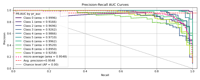
Pretty.
Although Scikit-plot is loosely based around the scikit-learn interface, you don't actually need scikit-learn objects to use the available functions. As long as you provide the functions what they're asking for, they'll happily draw the plots for you.
The possibilities are endless.
See the changelog for a history of notable changes to scikit-plots.
Explore the full features of Scikit-plot.
Reporting a bug? Suggesting a feature? Want to add your own plot to the library? Visit our.
-
scikit-plots, “scikit-plots: vlatest”. Zenodo, Aug. 23, 2024. DOI: 10.5281/zenodo.13367000.
-
scikit-plots, “scikit-plots: v0.3.8dev0”. Zenodo, Aug. 23, 2024. DOI: 10.5281/zenodo.13367001.

![dependabot[bot]](https://avatars.githubusercontent.com/u/49699333?size=120)