TkDial
This is a library containing some circular rotatory dial-knob widgets for Tkinter. It can be used in place of normal sliders and scale.


Installation
pip install tkdial
Dial Widget
Usage
Simple Example:
import tkinter as tk
from tkdial import Dial

app = tk.Tk()

dial = Dial(app)
dial.grid(padx=10, pady=10)

app.mainloop()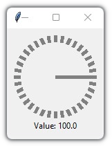
Example 2
import tkinter as tk
from tkdial import Dial

app = tk.Tk()

# some color combinations
color_combinations = [("yellow", "red"), ("white", "cyan"), ("red", "pink"), ("black", "green"),
                    ("white", "black"), ("blue", "blue"), ("green", "green"), ("white", "pink"),
                    ("red", "black"), ("green", "cyan"), ("cyan","black"), ("pink", "blue")]

for i in range (12):
    dial = Dial(master=app, color_gradient=color_combinations[i],
                unit_length=10, radius=40, needle_color=color_combinations[i][1])
    if i<6:
        dial.grid(row=1, padx=10, pady=10, column=i)
    else:
        dial.grid(row=2, padx=10, pady=10, column=11-i)

app.mainloop()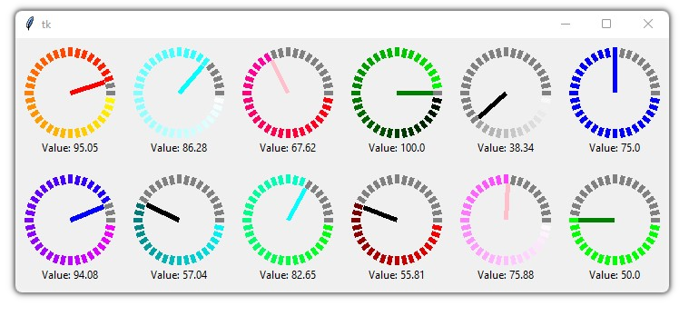
Example 3
Implemented with CustomTkinter
import customtkinter
from tkdial import Dial

customtkinter.set_appearance_mode("Dark")

app = customtkinter.CTk()
app.geometry("350x400")

app.grid_columnconfigure((0,1), weight=1)
app.grid_rowconfigure((0,1), weight=1)

frame_1 = customtkinter.CTkFrame(master=app)
frame_1.grid(padx=20, pady=20, sticky="nswe")

dial1 = Dial(master=frame_1, color_gradient=("green", "cyan"),
             text_color="white", text="Current: ", unit_length=10, radius=50)
dial1.grid(padx=20, pady=20)

dial2 = Dial(master=frame_1, color_gradient=("yellow", "white"),
             text_color="white", text="Position: ", unit_length=10, radius=50)
dial2.grid(padx=20, pady=20)

dial3 = Dial(master=frame_1, color_gradient=("white", "pink"),
             text_color="white", text=" ", unit_length=10, radius=50)
dial3.grid(row=0, column=1, padx=20, pady=20)

dial4 = Dial(master=frame_1, color_gradient=("green", "green"),
             text_color="white", text="", unit_width=15, radius=50)
dial4.grid(row=1, column=1, padx=20, pady=20)

app.mainloop() 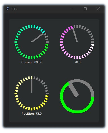
Arguments:
| Parameters | Description |
|---|---|
| master | The master parameter is the parent widget |
| bg | The default background color of the dial widget |
| width | Define width of the widget manually (optional) |
| height | Define height of the widget manually (optional) |
| x | Determines the horizontal position of the dial in the canvas |
| y | Determines the vertical position of the dial in the canvas |
| start | The start point of the range from where the needle will rotate |
| end | The end point of the range |
| radius | Determines the distance of the unit lines between the center and the edge and also the length of the needle line |
| unit_length | Specify the length of the lines |
| unit_width | Specify the width of the lines |
| unit_color | Specify the color of the unit lines |
| needle_color | Specify the color of the needle line |
| color_gradient | Specify which color gradient will be used for the units |
| text | A string that will be displayed under the dial object with value |
| text_color | Specify the color of the text that will be displayed under the dial object |
| text_font | Specify the font of the text that will be displayed under the dial object |
| integer | A boolean (True/False), displays only the integer value in text if True (default=False) |
| scroll | A boolean (True/False), enables mouse scroll in dial (default=True) |
| scroll_steps | Number of steps per scroll |
| state | Specify the state of the needle |
| command | Call a function whenever the needle is rotated |
Methods:
| Methods | Description |
|---|---|
| .get() | get the current value of the dial |
| .set() | set the value of the dial |
| .configure() | configure parameters of the dial |
Scroll Knob
Usage
Simple Example
import tkinter
from tkdial import ScrollKnob

app = tkinter.Tk()

knob = ScrollKnob(app, start=0, end=100, steps=10)
knob.grid()

app.mainloop() 
Different Knob styles:
import customtkinter
from tkdial import ScrollKnob

app = customtkinter.CTk()
app.geometry("500x500")

knob1 = ScrollKnob(app, radius=250, progress_color="#87ceeb", steps=10,
                 border_width=40, start_angle=90, inner_width=1, outer_width=1,
                 text_font="calibri 20", text_color="#87ceeb", bar_color="black")
knob1.grid(row=0, column=0)

knob2 = ScrollKnob(app, radius=200, progress_color="#7eff00",
                 border_width=40, start_angle=90, inner_width=1, outer_width=0,
                 text_font="calibri 20", text_color="#7eff00", integer=True,
                 fg="#212325")
knob2.grid(row=1, column=0)

knob3 = ScrollKnob(app, text=" ", radius=250, progress_color="white",
                   bar_color="#2937a6", border_width=30, start_angle=0, inner_width=5,
                   outer_width=0, text_font="calibri 20", steps=1, text_color="white", fg="#303ba1")
knob3.grid(row=0, column=1)

knob4 = ScrollKnob(app, text=" ", steps=10, radius=200, bar_color="#242424",
                   progress_color="yellow", outer_color="yellow", outer_length=10,
                   border_width=30, start_angle=270, inner_width=0, outer_width=5, text_font="calibri 20",
                   text_color="white", fg="#212325")
knob4.grid(row=1, column=1)

app.mainloop() 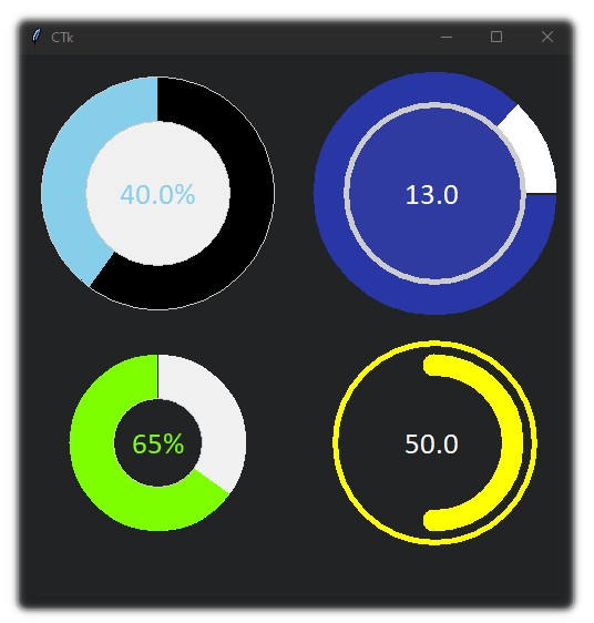
Arguments:
| Parameters | Description |
|---|---|
| master | The master parameter is the parent widget |
| bg | The default background color of the knob widget |
| width | Define width of the widget manually (optional) |
| height | Define height of the widget manually (optional) |
| start | The start point of the range from where the bar will rotate |
| end | The end point of the range |
| radius | Define the radius of the knob |
| border_width | Define the width of progress bar with respect to the outer and inner ring |
| start_angle | Determines the angle from where to rotate |
| text | A string that will be displayed on the knob with value |
| text_color | Specify the color of the text that will be displayed on the knob |
| text_font | Specify the font of the text that will be displayed on the knob |
| integer | A boolean (True/False), displays only the integer value in text if True (default=False) |
| fg | Specify the color of the inner circle |
| progress_color | Define the color of the progress bar |
| bar_color | Define the color of the progress bar's background |
| inner_width | Define the width of the inner ring |
| inner_color | Specify the color of the inner ring |
| outer_width | Define the width of the outer ring |
| outer_length | Define the distance between progress bar and outer ring |
| inner_color | Specify the color of the outer ring |
| steps | Number of steps per scroll |
| state | Specify the state of the needle |
| command | Call a function whenever the bar is moved |
Methods:
| Methods | Description |
|---|---|
| .get() | get the current value of the knob |
| .set() | set the value of the knob |
| .configure() | configure parameters of the knob |
Meter
Usage
Simple Example
import tkinter
from tkdial import Meter

root = tkinter.Tk()
dial = Meter(root)
dial.pack(padx=10, pady=10)

root.mainloop()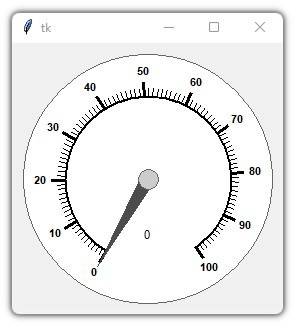
Different Meter Styles:
import customtkinter
from tkdial import Meter

app = customtkinter.CTk()
app.geometry("950x350")

meter1 = Meter(app, radius=300, start=0, end=160, border_width=0,
               fg="black", text_color="white", start_angle=270, end_angle=-270,
               text_font="DS-Digital 30", scale_color="white", needle_color="red")
meter1.set_mark(140, 160) # set red marking from 140 to 160
meter1.grid(row=0, column=1, padx=20, pady=30)

meter2 = Meter(app, radius=260, start=0, end=200, border_width=5,
               fg="black", text_color="white", start_angle=270, end_angle=-360,
               text_font="DS-Digital 30", scale_color="black", axis_color="white",
               needle_color="white")
meter2.set_mark(1, 100, "#92d050")
meter2.set_mark(105, 150, "yellow")
meter2.set_mark(155, 196, "red")
meter2.set(80) # set value
meter2.grid(row=0, column=0, padx=20, pady=30)

meter3 = Meter(app, fg="#242424", radius=300, start=0, end=50,
               major_divisions=10, border_width=0, text_color="white",
               start_angle=0, end_angle=-360, scale_color="white", axis_color="cyan",
               needle_color="white",  scroll_steps=0.2)
meter3.set(15)
meter3.grid(row=0, column=2, pady=30)

app.mainloop()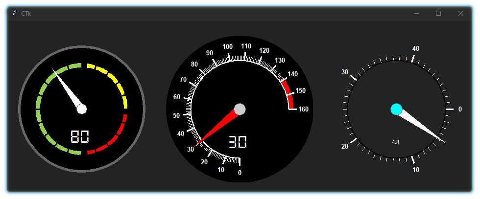
Arguments:
| Parameters | Description |
|---|---|
| master | The master parameter is the parent widget |
| bg | The default background color of the meter widget |
| fg | Specify the color of the meter face |
| width | Define width of the widget manually (optional) |
| height | Define height of the widget manually (optional) |
| start | The start point of the range from where the needle will rotate |
| end | The end point of the range |
| start_angle | Determines the starting angle of the arc |
| end_angle | Determines the final angle of the arc |
| radius | Determines the radius for the widget |
| major_divisions | Determines the number of major lines in the scale |
| minor_divisions | Determines the number of minor lines in the scale |
| scale_color | Specify the color of the meter scale |
| border_width | Define the width of the border case (default=1) |
| border_color | Specify the color of the border case |
| needle_color | Specify the color of the needle line |
| axis_color | Specify which color of the axis wheel |
| text | A string that will be displayed under the meter with value |
| text_color | Specify the color of the text that will be displayed under the meter |
| text_font | Specify the font of the text that will be displayed under the meter |
| integer | A boolean (True/False), displays only the integer value in text if True (default=False) |
| scroll | A boolean (True/False), enables mouse scroll in meter (default=True) |
| scroll_steps | Number of steps per scroll |
| state | Unbind/Bind the mouse movement with the needle |
| command | Call a function whenever the needle is rotated |
Methods:
| Methods | Description |
|---|---|
| .get() | get the current value of the meter |
| .set() | set the value of the meter |
| .configure() | configure parameters of the meter |
| .set_mark() | set markings for the scale. Eg: meter.set_mark(from, to, color) |
JogWheel
Usage
import tkinter
from tkdial import Jogwheel

app = tkinter.Tk()

knob = Jogwheel(app)
knob.grid()

app.mainloop()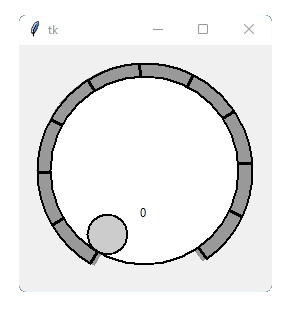
Styles:
import customtkinter
from tkdial import Jogwheel

app = customtkinter.CTk()

wheel_1 = Jogwheel(app, radius=200, fg="#045252", scale_color="white",
                text=None, button_radius=10)
wheel_1.set_mark(0,100, "green")

wheel_1.grid()

wheel_2 = Jogwheel(app, radius=200, fg="#045252", scale_color="white", start_angle=0,
                   end_angle=360, start=0, end=200, text="Volume: ", button_radius=10)
wheel_2.set_mark(0,50, "blue")
wheel_2.set_mark(50, 90, "green")
wheel_2.set_mark(90, 150, "orange")
wheel_2.set_mark(150, 200, "red")
wheel_2.grid()

app.mainloop()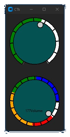
Arguments:
| Parameters | Description |
|---|---|
| master | The master parameter is the parent widget |
| bg | The default background color of the widget |
| fg | Specify the color of the wheel face |
| width | Define width of the widget manually (optional) |
| height | Define height of the widget manually (optional) |
| start | The start point of the range from where the knob will rotate |
| end | The end point of the range |
| start_angle | Determines the starting angle of the arc |
| end_angle | Determines the final angle of the arc |
| radius | Determines the radius for the widget |
| divisions | Determines the number of scale lines in the scale |
| division_height | Determines the height of scale lines |
| scale_color | Specify the color of the knob scale |
| border_width | Define the width of the border case (default=1) |
| border_color | Specify the color of the border case |
| button_color | Specify the color of the knob |
| button_radius | Specify the radius the knob |
| text | A string that will be displayed with value |
| text_color | Specify the color of the text that will be displayed |
| text_font | Specify the font of the text that will be displayed |
| integer | A boolean (True/False), displays only the integer value in text if True (default=False) |
| scroll | A boolean (True/False), enables mouse scroll (default=True) |
| scroll_steps | Number of steps per scroll |
| state | Unbind/Bind the mouse movement with the widget |
| command | Call a function whenever the needle is rotated |
Methods:
| Methods | Description |
|---|---|
| .get() | get the current value of the knob |
| .set() | set the value of the knob |
| .configure() | configure parameters of the knob |
| .set_mark() | set markings for the scale. Eg: meter.set_mark(from, to, color) |
ImageKnob
Usage
import tkinter
from tkdial import ImageKnob

app = tkinter.Tk()

customknob = ImageKnob(app, image="knob.png")
customknob.grid()

app.mainloop()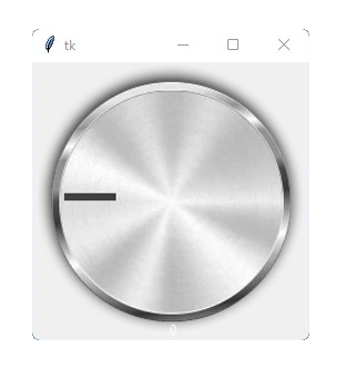
Styles:
# Note: images are not provided, only for reference
import customtkinter
from tkdial import ImageKnob

app = customtkinter.CTk()

customknob = ImageKnob(app, image="knob.png", text_color="white", text="Volume ")
customknob.grid(row=0, column=0)

customknob2 = ImageKnob(app, image="knob2.png", scale_image="scale1.png",text="", scale_width=120)
customknob2.grid(row=0, column=1, padx=20)

customknob3 = ImageKnob(app, image="knob3.png", scale_image="scale2.png",text="",
                        scale_width=50, start_angle=20, end_angle=-240,
                        progress_color="cyan", progress=True)
customknob3.grid(row=0, column=2)

app.mainloop()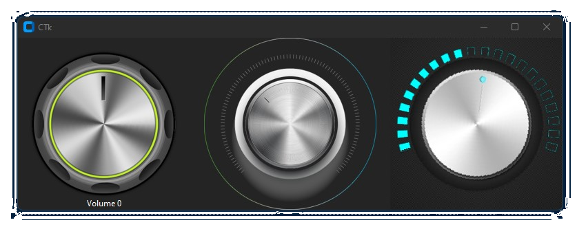
Arguments:
| Parameters | Description |
|---|---|
| master | The master parameter is the parent widget |
| bg | The default background color of the widget |
| width | Define width of the widget manually (optional) |
| height | Define height of the widget manually (optional) |
| start | The start point of the range from where the knob will rotate |
| end | The end point of the range |
| image | pass the knob image |
| scale_image | add a scale image (optional) |
| scale_width | specify relative distance between scale and knob image |
| start_angle | Determines the starting angle of the knob |
| end_angle | Determines the final angle of the knob |
| radius | Determines the radius for the widget |
| text | A string that will be displayed with value |
| text_color | Specify the color of the text that will be displayed |
| text_font | Specify the font of the text that will be displayed |
| integer | A boolean (True/False), displays only the integer value in text if True (default=False) |
| scroll | A boolean (True/False), enables mouse scroll (default=True) |
| scroll_steps | Number of steps per scroll |
| state | Unbind/Bind the mouse movement with the widget |
| command | Call a function whenever the needle is rotated |
Methods:
| Methods | Description |
|---|---|
| .get() | get the current value of the widget |
| .set() | set the value of the widget |
| .configure() | configure parameters of the widget |
Note: Images should be cropped in fixed ratio (1:1) and saved with transparency(png).
Conclusion
This library is focused to create some circular widgets that can be used with Tkinter/Customtkinter easily. I hope it will be helpful in UI development with python.
