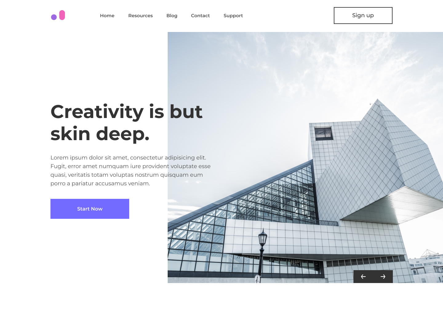
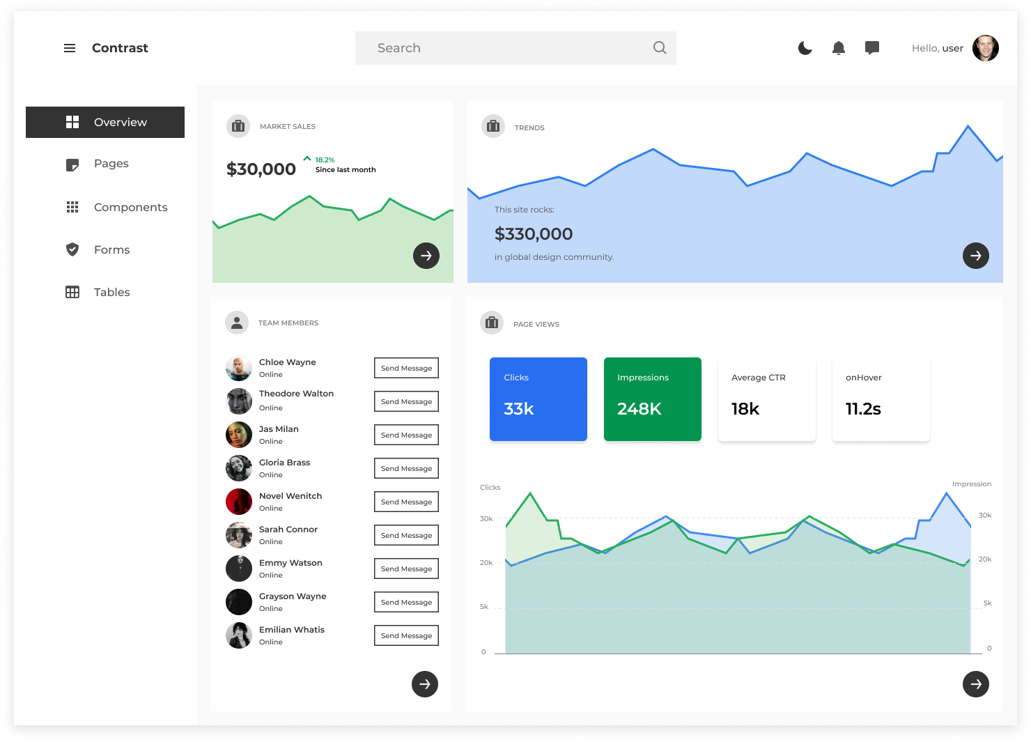
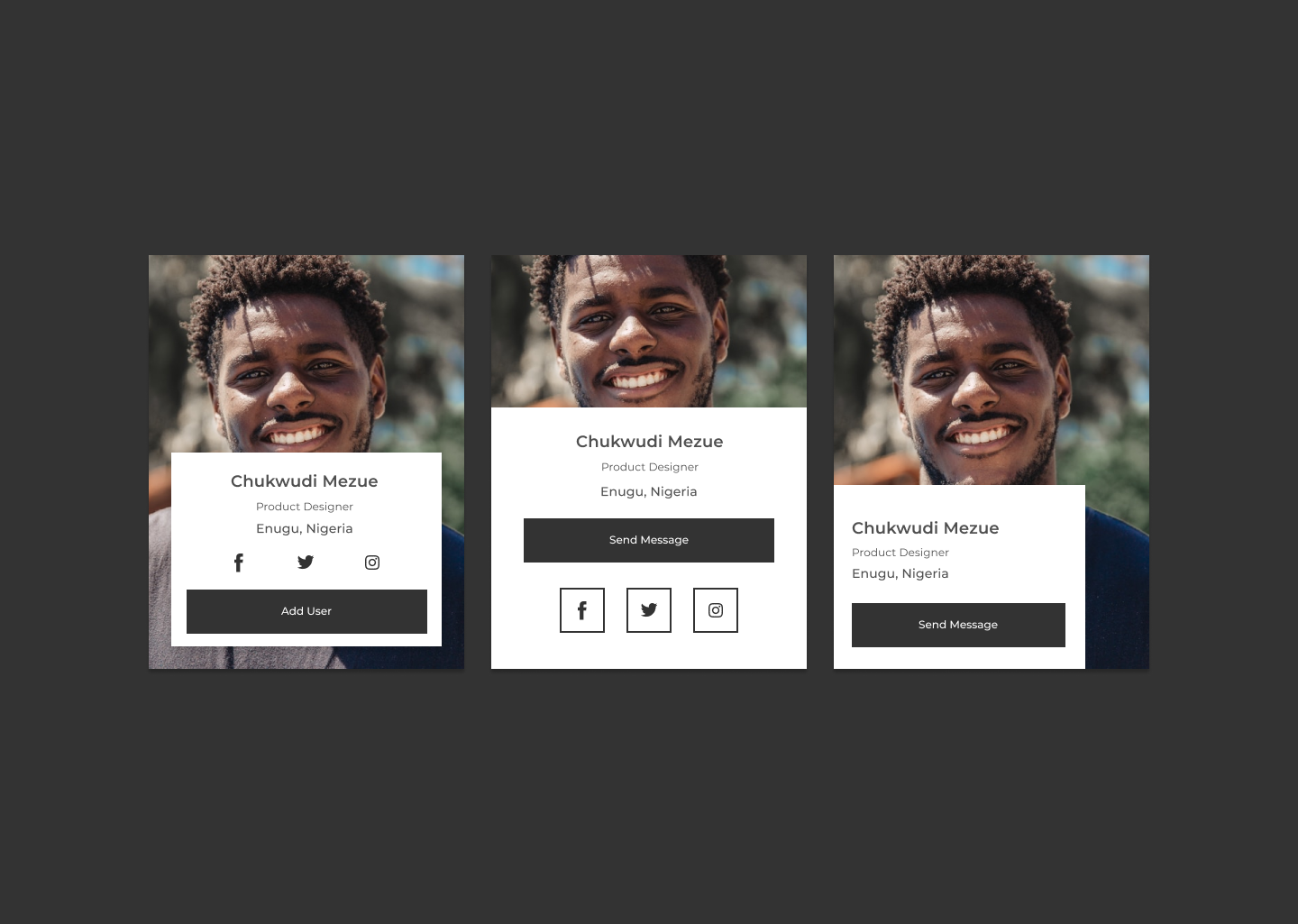
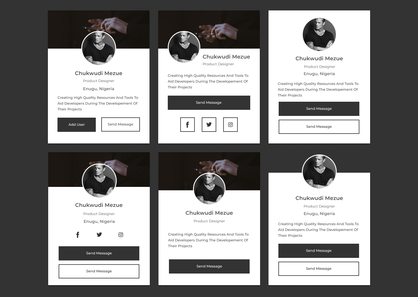
Elegant UI Kit and reusable components for building mobile-first, responsive webistes and web apps
npm install --save cdbreactor
yarn add cdbreactimport React from 'react'
import { CDBAlert } from 'cdbreact'
const Alert = () => {
return (
<CDBAlert color="primary">
A simple alert built with contrast design
</CDBAlert>
)
}
export default Alert;- Check out our documentation here
- Accordion
- Alert
- Autocomplete
- Animation
- Badges
- Breadcrumb
- ButtonToolbar
- Box
- ButtonGroup
- Checkbox
- Carousel
- Button
- Collapse
- Icon
- Footer
- Iframe
- Input
- Card
- Mask
- ListGroup
- InputGroup
- Multiselect
- Notification
- Pane
- DropDown
- Modal
- Progress
- Rating
- Radio
- Panel
- Select
- Slider
- SmoothScroll
- Select 2
- Spinner
- Switch
- Stepper
- Charts
- Navigation
- DatePicker
- FileUploader
- TimePicker
- EditableTable
- Table
- DataTable
- Widgets
- Forms
-
Tailwind grid-How to use tailwind CSS grid templates in your project
-
How to create a Beautiful Responsive Navigation bar Using Tailwind CSS
-
Tailwind form-How to create and style a Responsive Form using Tailwind CSS
-
How to use tailwind CSS padding, margin and border in your project
-
How to create a beautiful React Bootstrap select with icons.
-
How to create a Beautiful Responsive Navigation bar Using Tailwind CSS
-
Tailwind Modal-How to create a React Modal using Tailwind CSS.
-
How to Create a Responsive React Sidebar Design Using Tailwind CSS.
-
How to create a beautiful React Bootstrap select with icons.
-
Bootstrap 5 stepper-How to create a beautiful Bootstrap 5 stepper






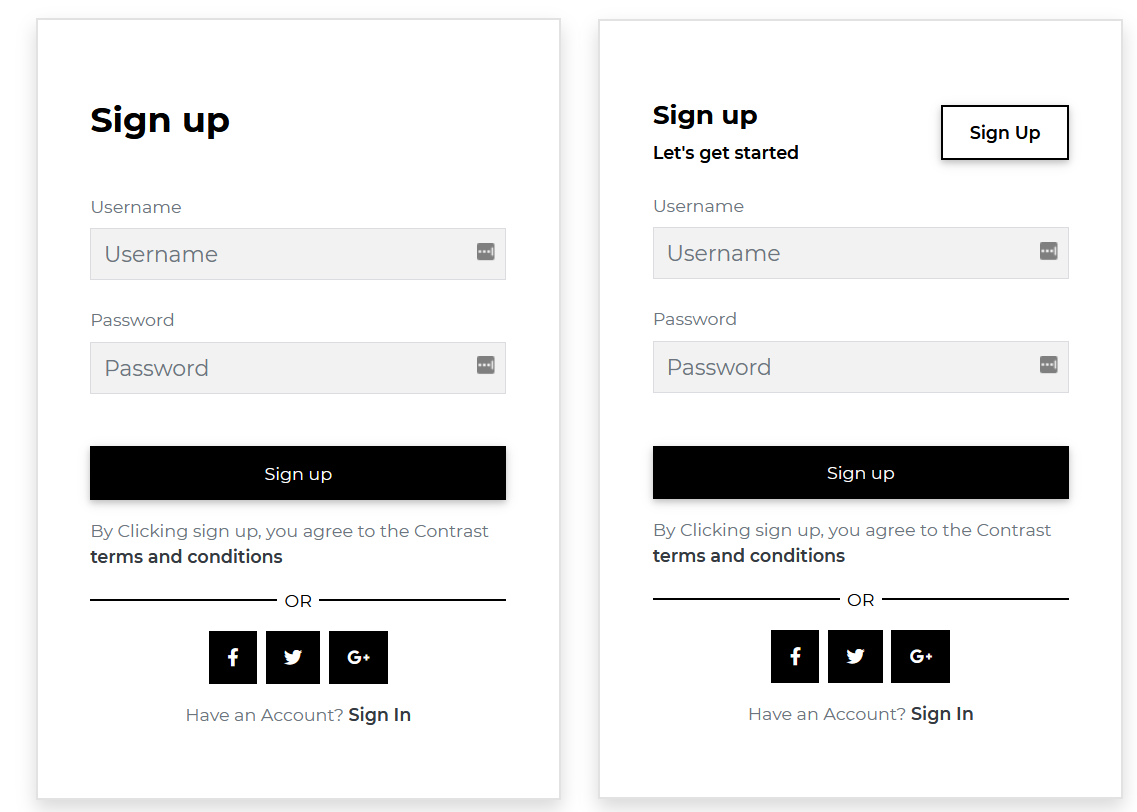
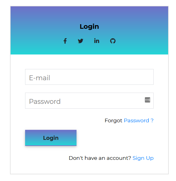
 IE / Edge |
 Firefox |
 Chrome |
 Safari |
 Opera |
|
|---|---|---|---|---|---|
| Mac | N/A | supported | supported | supported | supported |
| Windows | supported | supported | supported | N/A | supported |
See License in <license.pdf> © Devwares
-
Create pull requests
-
Submit bugs
-
Suggest new features
-
Help us Improve our documentation with updates
We truly appreciate everyone who has contributed to this project.
Thank you!


