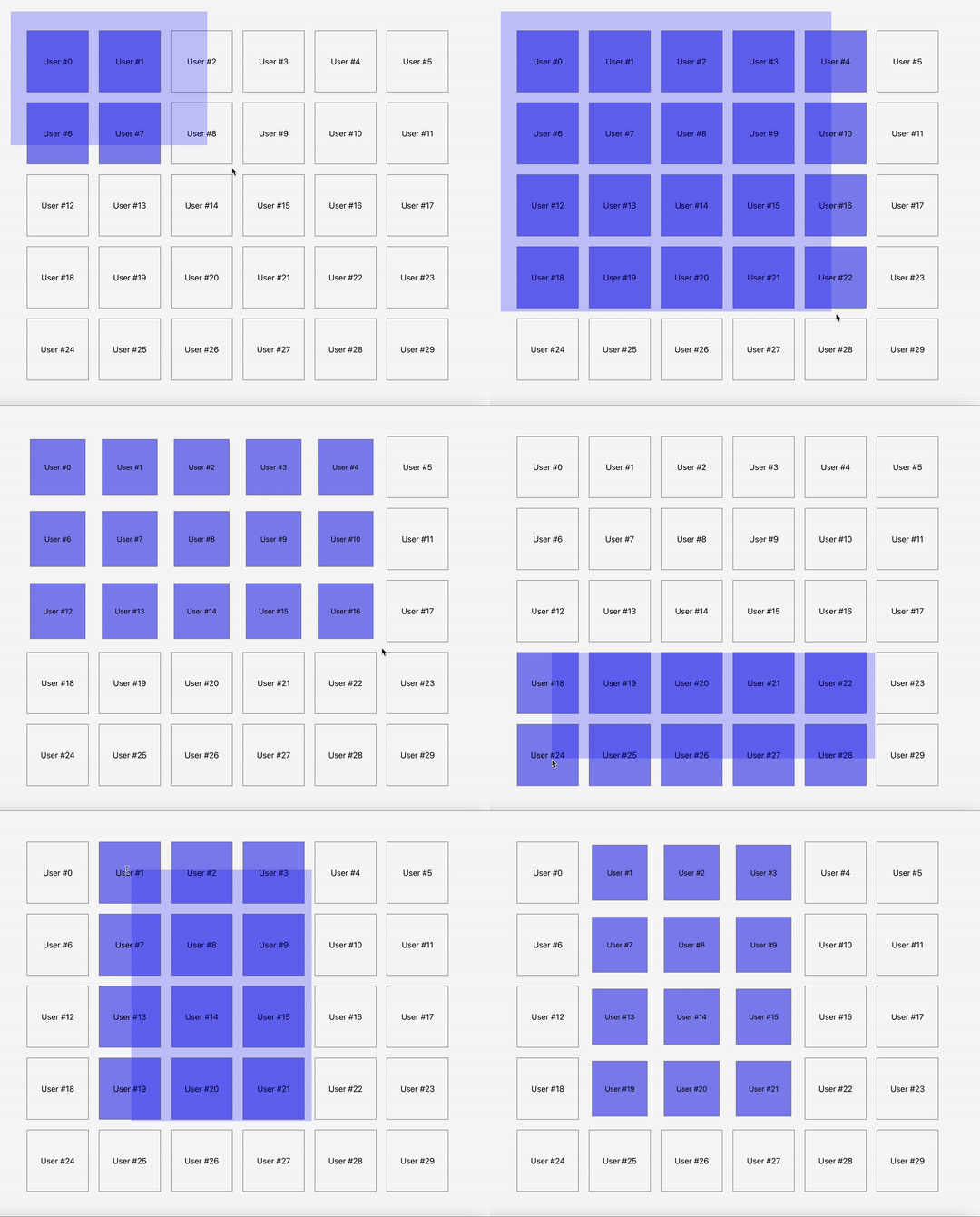
A component for React that allows selecting DOM elements by moving the mouse
The component is designed to visualize the selection of DOM elements by moving the cursor on the screen.
We leave the implementation of further interaction with selected files to you through the callback finishSelectionCallback.
This approach makes the library multipurpose because the further interaction with selected files is always unique.
In one case, you need to get the Id from Datasets and update Redux-store.
Otherwise, you need to add a class to the selected elements and send a request to the server.
No matter how complex your case is, you can implement it with finishSelectionCallback having an array of all selected elements.
DEMO
Installation
npm install --save react-mouse-select
Usage
import { ReactMouseSelect } from 'react-mouse-select';

function App() {
  const borderSelectionContainer = document.getElementById('portal') as HTMLElement;
  const containerRef = useRef<HTMLElement>(null);

  const itemClassName = 'mouse-select__selectable';

  return (
    <div className="App">
      <main className="container" ref={containerRef}>
        {[...Array(10)].map((item, idx) => {
          return (
            <div key={idx} className={itemClassName} data-id={idx}>
              Selectable block
            </div>
          )
        })}
      </main>
      <ReactMouseSelect
        containerRef={containerRef}
        portalContainer={borderSelectionContainer}
        itemClassName={itemClassName}
      />
    </div>
  );
}

export default App;
!!! PLEASE NOTE
You need to add elements with the class itemClassName to the container containerRef.
See the example above.
You also need to add styles to a frame and selected elements to make the selection visible.
You can style the selecting frame with the use of frameClassName and openFrameClassName or leave it invisible.
You can style elements with itemClassName and selectedItemClassName.
Css example:
.mouse-select__selectable {
    width: 100px;
    height: 100px;
    margin: 10px;
    background: gray;
}

.mouse-select__selectable .selected {
    border: 2px solid red;
}

.mouse-select__frame {
    background: red;
    opacity: 0.5;
}
Configuration
The ReactMouseSelect component accepts a few props:
-
containerRef[required]:
Container ref in which selecting should work -
portalContainerdefault = document.body:
Portal container in which the highlighting frame will be rendered. -
sensitivity(number) default = 10:
Sensitivity in pixels. Selection starts working only if the cursor is shifted for the specified number of pixels -
tolerance(number) default = 0:
The number of pixels that must be contained in a frame for the element to be selected -
edgeSize(number) default = 100:
The size of the edge of the viewport. The scroll starts automatically when the cursor enters the borders of this edge If equal 0, scrolling will not work -
onClickPreventDefault(boolean) default = false:
When the selection ends, after the onMouseUp event, the onClick event is dispatched by default
If = true, the event bubbling is prevented after the selection
With a normal click (without selection) the event happens standardly
Useful, when there is a click handler on the container, which shouldn’t happen in case of selection -
itemClassName(string) default = 'mouse-select__selectable':
The class by which it is determined which elements we can select -
selectedItemClassName(string) default = 'selected':
The class that is added to the elements that come into the selecting frame -
frameClassName(string) default = 'mouse-select__frame':
Highlighting frame className -
openFrameClassName(string) default = 'open':
The class that is added to the highlighting frame when it is active -
notStartWithSelectableElements(boolean) default = false:
If true, then the selection will not start with the selected elements, but only with the space between them
It can be useful, if the selecting elements, aside from the selection, are involved in drag and drop -
saveSelectAfterFinish(boolean) default = false:
Keep selected Item ClassName on selected items after selection is complete -
startSelectionCallback(function(e: MouseEvent) => void;):
Callback that calls at the start of the selection (when the frame appears) -
finishSelectionCallback(function(items: Element[], e: MouseEvent) => void;):
Callback that calls at the end of the selection
Development plans
If you want, you can help me with the development of this library.
-
DONE: Add auto scroll if the cursor moves to the boundary of the browser window.
-
Support of touch events for mobile devices
-
Performance tuning by looping through the array, not of all elements but required ones
Idea:
We have an array of selected elements and an array of non-selected elements. In case one side of the frame is increased, iterate over the array of non-selected elements and move them to the selected ones. In case two sides of the frame are reduced, iterate over the array of selected elements and move them to the non-selected ones. -
For the component ease of use, add WrapperComponent in which a render container and a portalContainer will be implemented.
-
Callbacks trigger for each element entering or leaving the selection.


