Plot a pretty confusion matrix (like Matlab) in python using seaborn and matplotlib
Created on Mon Jun 25 14:17:37 2018 @author: Wagner Cipriano - wagnerbhbr
This module get a pretty print confusion matrix from a NumPy matrix or from 2 NumPy arrays (y_test and predictions).
pip install pretty-confusion-matriximport numpy as np
import pandas as pd
from pretty_confusion_matrix import pp_matrix
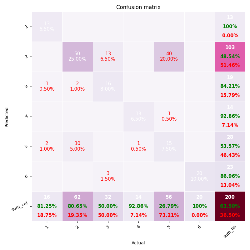
array = np.array([[13, 0, 1, 0, 2, 0],
[0, 50, 2, 0, 10, 0],
[0, 13, 16, 0, 0, 3],
[0, 0, 0, 13, 1, 0],
[0, 40, 0, 1, 15, 0],
[0, 0, 0, 0, 0, 20]])
# get pandas dataframe
df_cm = pd.DataFrame(array, index=range(1, 7), columns=range(1, 7))
# colormap: see this and choose your more dear
cmap = 'PuRd'
pp_matrix(df_cm, cmap=cmap)import numpy as np
from pretty_confusion_matrix import pp_matrix_from_data
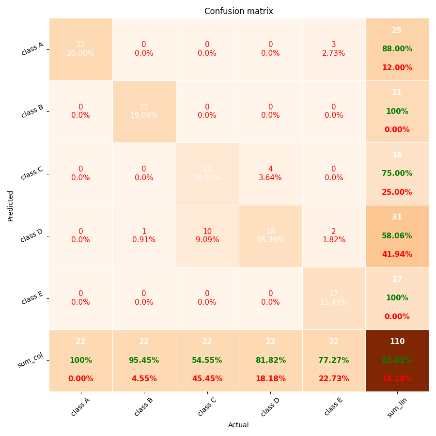
y_test = np.array([1, 2, 3, 4, 5, 1, 2, 3, 4, 5, 1, 2, 3, 4, 5, 1, 2, 3, 4, 5, 1, 2, 3, 4, 5, 1, 2, 3, 4, 5, 1, 2, 3, 4, 5, 1, 2, 3, 4, 5, 1, 2, 3, 4, 5, 1, 2, 3, 4, 5, 1, 2,
3, 4, 5, 1, 2, 3, 4, 5, 1, 2, 3, 4, 5, 1, 2, 3, 4, 5, 1, 2, 3, 4, 5, 1, 2, 3, 4, 5, 1, 2, 3, 4, 5, 1, 2, 3, 4, 5, 1, 2, 3, 4, 5, 1, 2, 3, 4, 5, 1, 2, 3, 4, 5, 1, 2, 3, 4, 5])
predic = np.array([1, 2, 4, 3, 5, 1, 2, 4, 3, 5, 1, 2, 3, 4, 4, 1, 4, 3, 4, 5, 1, 2, 4, 4, 5, 1, 2, 4, 4, 5, 1, 2, 4, 4, 5, 1, 2, 4, 4, 5, 1, 2, 3, 3, 5, 1, 2, 3, 3, 5, 1, 2,
3, 4, 4, 1, 2, 3, 4, 1, 1, 2, 3, 4, 1, 1, 2, 3, 4, 1, 1, 2, 4, 4, 5, 1, 2, 4, 4, 5, 1, 2, 4, 4, 5, 1, 2, 4, 4, 5, 1, 2, 3, 4, 5, 1, 2, 3, 4, 5, 1, 2, 3, 4, 5, 1, 2, 3, 4, 5])
pp_matrix_from_data(y_test, predic)You can customize the labels in axis, whether by DataFrame or vectors.
To plot the matrix with text labels in axis rather than integer, change the params index and columns of your dataframe.
Getting the example one above, just change the line df_cm = pd.DataFrame(array, index=range(1, 7), columns=range(1, 7)) by
col = ['Dog', 'Cat', 'Mouse', 'Fox', 'Bird', 'Chicken']
df_cm = pd.DataFrame(array, index=col, columns=col)
It'll replace the integer labels (1...6) in the axis, by Dog, Cat, Mouse, and so on..
It's very similar, in this case you just need to use the columns param like the example below.
This param is a positional array, i.e., the order must be the same of the data representation.
In this example Dog will be assigned to the class 0, Cat will be assigned to the class 1, and so on and so forth.
Getting the example two above, just change the line pp_matrix_from_data(y_test, predic), by
columns = ['Dog', 'Cat', 'Mouse', 'Fox', 'Bird']
pp_matrix_from_data(y_test, predic, columns)
It'll replace "class A, ..., class E" in the axis, by Dog, Cat, ..., Bird.
More information about "How to plot confusion matrix with string axis rather than integer in python" in this Stackoverflow answer.
You can choose the layout of the your matrix by a lot of colors options like PuRd, Oranges and more... To customizer your color scheme, use the param cmap of funcion pp_matrix. To see all the colormap available, please do this:
from matplotlib import colormaps
list(colormaps)
More information about Choosing Colormaps in Matplotlib is available here.
b) Plot Confusion Matrix Using Categorical Labels
a) How to plot confusion matrix with string axis rather than integer in python
b) Plot-scikit-learn-classification-report
c) Plot-confusion-matrix-with-string-axis-rather-than-integer-in-Python


