Flutter Color Picker Wheel
Flutter Color Picker Wheel is an easy to use widget which can be heavily customized.
- You can use the WheelColorPicker directly by providing list of colors you want to include and animation configs.
- You can use the WheelColorPickerEntryContent and manage OverlayEntry yourself.
- This library provides some presets which make it even easier to use this component.
How to use
Add the dependency to your pubspec.yaml
flutter_color_picker_wheel: ^0.0.1
Showcase
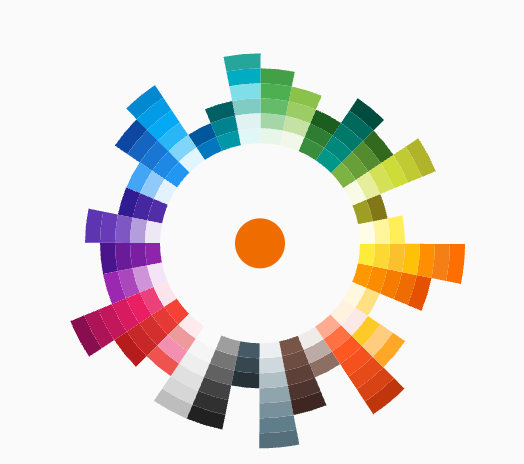
 Fan Default Preset Fan Default Preset |
 Fan Simple Preset Fan Simple Preset |
 Sun Ray Default Sun Ray Default |
 Sun Ray Simple Sun Ray Simple |
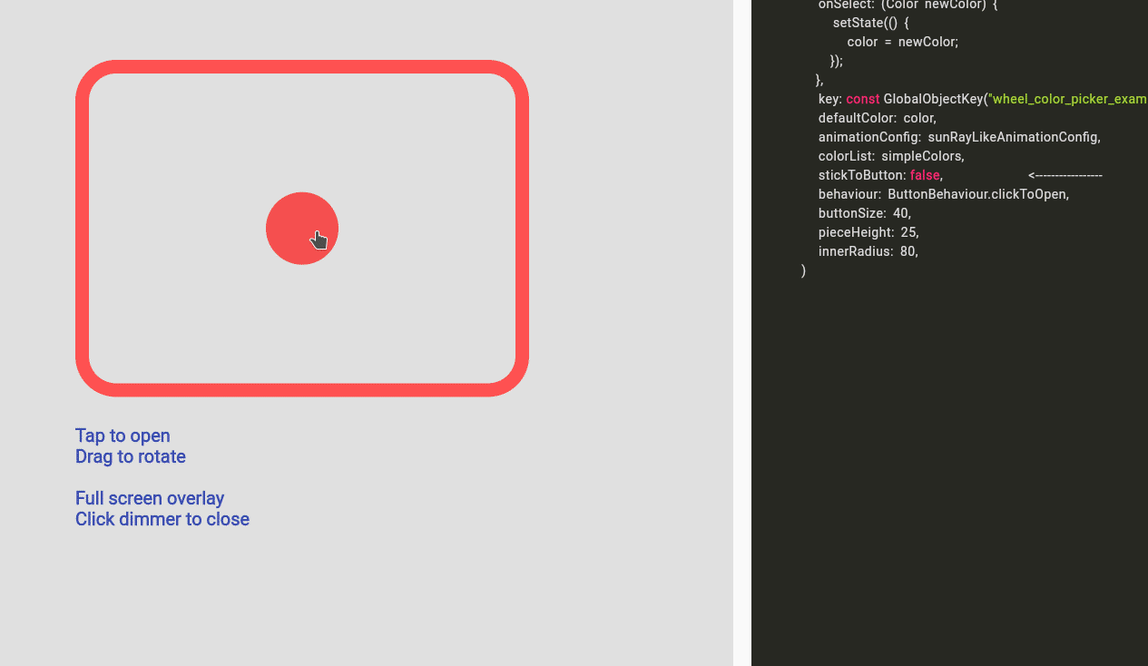 Detached Full Screen without Gap Detached Full Screen without Gap |
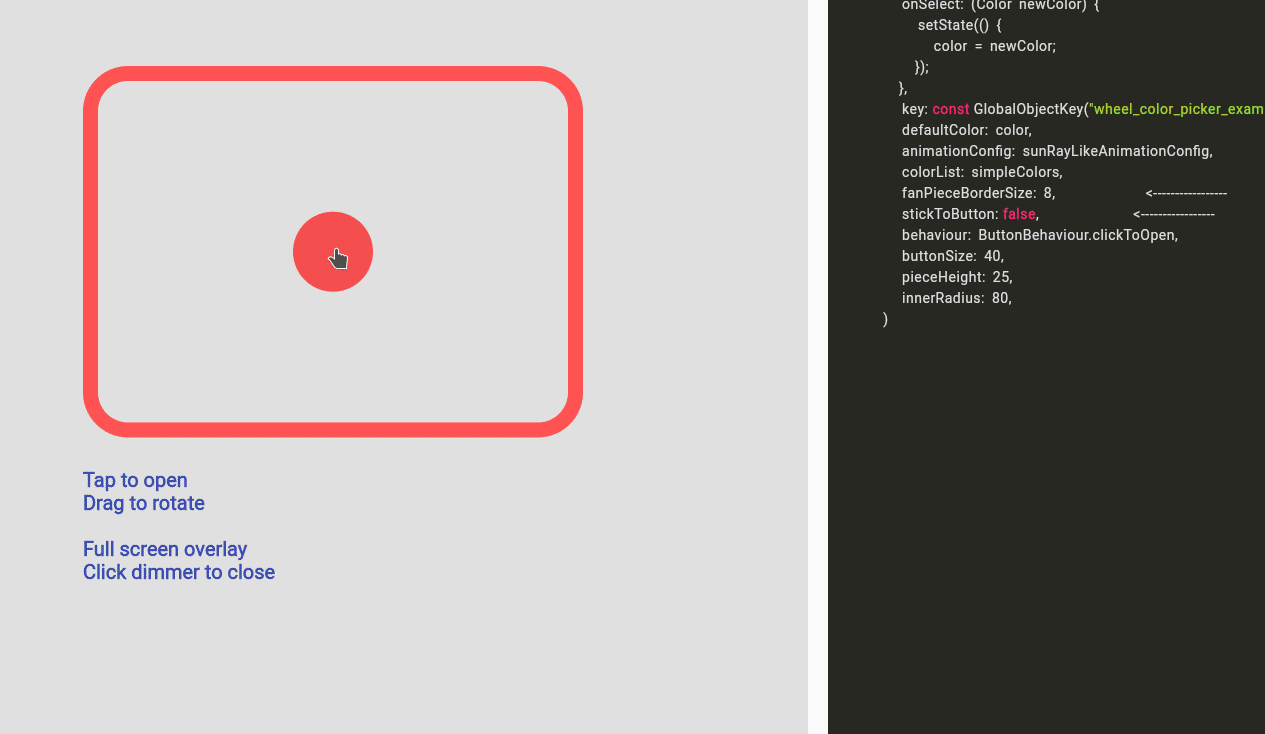 Detached Full Screen with Gap Detached Full Screen with Gap |
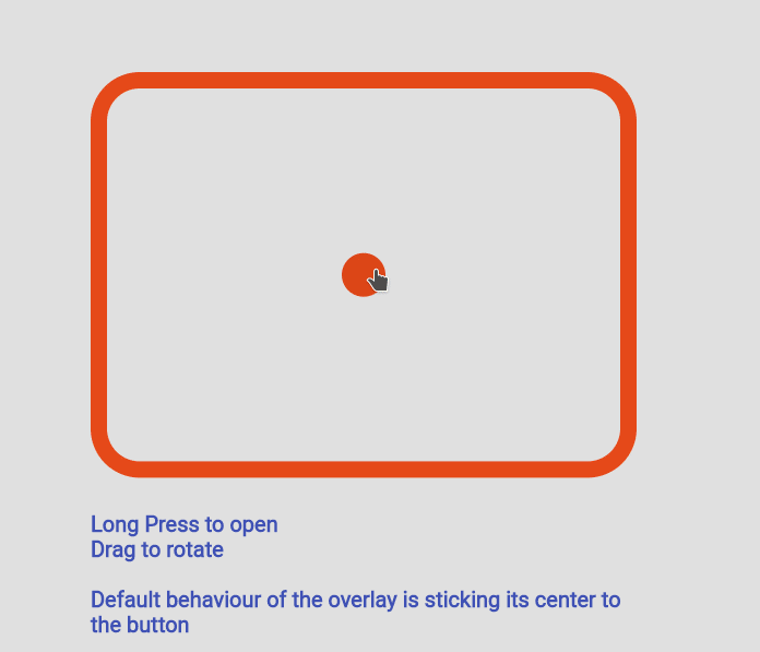
 Custom Color Set Custom Color Set |
 Custom Animation Custom Animation |
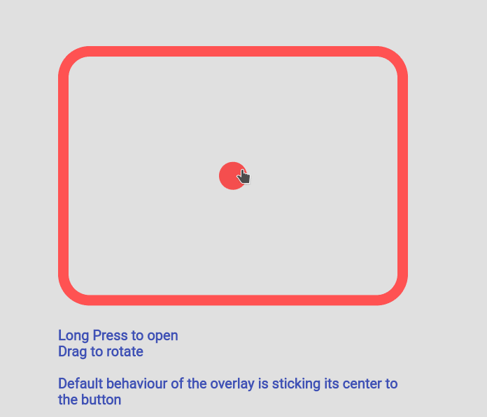
 Manage Your Own OverlayEntry Manage Your Own OverlayEntry |
Example Code
you can find more examples in the example path of this repository
Simple Usecase
import 'package:flutter_color_picker_wheel/flutter_color_picker_wheel.dart';
Color color; /// you want to initialize this color in the initState method
Widget myButton = WheelColorPicker(
onSelect: (Color newColor) {
setState(() {
color = newColor;
});
},
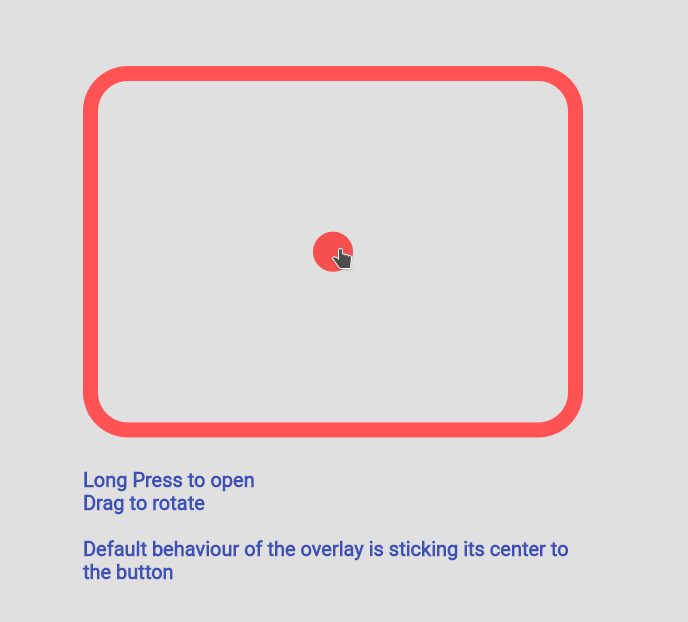
/// long press to open, another behaviour is clickToOpen to open
behaviour: ButtonBehaviour.longPressToOpen,
/// inital color
defaultColor: color,
/// fanLikeAnimationConfig is a preset, you can import this from the package
animationConfig: fanLikeAnimationConfig,
/// simpleColors is a preset, you can import this from the package
colorList: simpleColors,
/// size of the clickable button in the middle
buttonSize: 40,
/// height of each piece (outerRadius - innerRadius of a piece)
pieceHeight: 25,
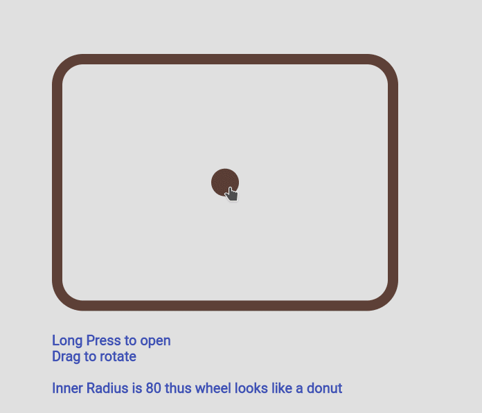
/// starting radius of the donut shaped wheel
innerRadius: 80,
); Custom Color Set
WheelColorPicker(
	onSelect: (Color newColor) {
		setState(() {
			color = newColor;
		});
	},
	defaultColor: color,
	animationConfig: fanLikeAnimationConfig,
	colorList: const [
		[Colors.red, Colors.redAccent, Colors.deepOrange],
		[Colors.black26, Colors.black45, Colors.black87],
		[Colors.blue, Colors.blueAccent, Colors.blueGrey],
		[Colors.deepPurpleAccent, Colors.purpleAccent],
	],
	buttonSize: 40,
	pieceHeight: 15,
	innerRadius: 80,
);
Custom Animation
WheelColorPicker(
onSelect: (Color newColor) {
setState(() {
color = newColor;
});
},
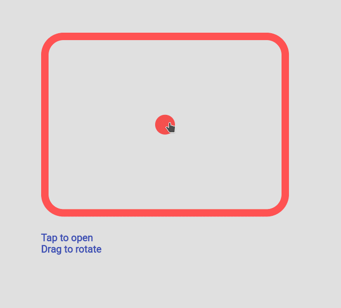
behaviour: ButtonBehaviour.clickToOpen,
defaultColor: color,
animationConfig: const FanAnimationConfig(
animationDurationInMillisecond: 1000,
rayAnimationConfig: RayAnimationConfig(
curve: Curves.easeInQuad,
enabled: false,
),
scaleAnimationConfig: ScaleAnimationConfig(
curve: Curves.easeInOutCubic,
enabled: true,
animationStartDelay: 0,
animationFinishDelay: 0.2,
),
opacityAnimationConfig: OpacityAnimationConfig(
curve: Curves.linear,
enabled: true,
animationStartDelay: 0.2,
animationFinishDelay: 0,
),
rotationAnimationConfig: RotationAnimationConfig(
curve: Curves.easeInQuad,
enabled: true,
animationFinishDelay: 0.4
)
),
colorList: defaultAvailableColors,
buttonSize: 40,
pieceHeight: 25,
innerRadius: 80,
)Using WheelColorPickerEntryContent

Note: This use case is a bit complicated.
If you decided to go this route there are several core ideas that you need to wrap your head around.
-
WheelOverlayEntryContentshould be generated only ONCE but not generated each build. You can have a new OverlayEntry, but you only need oneWheelOverlayEntryContent. This helps us to have a decent performance. - To stick the
WheelOverlayEntryContentto some component, you want to use LayerLink. SeeWheelColorPickeras an example - You need to provide
AnimationControllerto the Widget, thus you want to extend some ticker provider, eg.SingleTickerProviderStateMixin
Example:
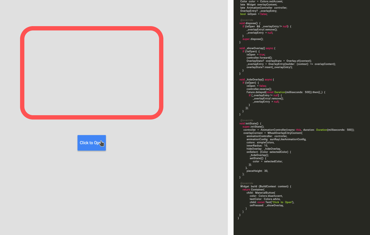
class ExampleUseOverlayOnlyState extends State<ExampleUseOverlayOnly> with SingleTickerProviderStateMixin {
	Color color = Colors.redAccent;
	late Widget overlayContent;
	late AnimationController controller;
	OverlayEntry? _overlayEntry;
	bool isOpen = false;

	@override
    void dispose() {
		if (_overlayEntry != null) {
			_overlayEntry!.remove();
			_overlayEntry = null;
		}
		controller.dispose();
		super.dispose();
	}

	void _showOverlay() async {
		if (!isOpen) {
			isOpen = true;
			controller.forward();
			OverlayState? overlayState = Overlay.of(context);
			_overlayEntry = OverlayEntry(builder: (context) => overlayContent);
			overlayState?.insert(_overlayEntry!);
		}
	}

void _hideOverlay() async {
	if (isOpen) {
		isOpen = false;
		controller.reverse();
		Future.delayed(const Duration(milliseconds: 500)).then((_) {
			if (_overlayEntry != null) {
				_overlayEntry!.remove();
				_overlayEntry = null;
			}
		});
	}
}

@override
void initState() {
	super.initState();
	controller = AnimationController(vsync: this, duration:Duration(milliseconds: 500));
	overlayContent = WheelOverlayEntryContent(
		animationController: controller,
		animationConfig: sunRayLikeAnimationConfig,
		colors: simpleColors,
		innerRadius: 200,
		pieceHeight: 20,
		pieceBorderSize: 5,
		hideOverlay: _hideOverlay,
		onSelect: (Color selectedColor) {
			_hideOverlay();
			setState(() {
				color = selectedColor;
			});
		},
	);
}

@override
Widget build(BuildContext context) {
	return Container(
		padding: const EdgeInsets.all(150),
		child: Column(
			children:[
				Expanded(
					flex:12,
					child: Container(
						height: 500,
						width: 500,
						decoration: BoxDecoration(
							borderRadius: BorderRadius.circular(45),
							border: Border.all(
								width: 15,
								color: color
							)
						),
					)
				),
				const Expanded(flex:2, child: SizedBox()),
				Expanded(
					flex:2,
					child: MaterialButton(
						color: Colors.blueAccent,
						textColor: Colors.white,
						child: const Text("Click to Open"),
							onPressed: _showOverlay,
						)
					),
				]
			)
		);
	}
}
